There’s a newsfeed (RSS/XML) you can subscribe to.
Seven years after closing up shop, I am updating this site with important news. And that news is we got paid to write a signage evaluation report for the TTC!
Somebody tell that tenured metrosexual Mark QueenKingwell that the TTC font isn’t remotely “reminiscent of” Gill Sans or Transport. What letter was he comparing, the O?
I was at the unveiling of Museum station yesterday. And now I give up.
This just in: The original tile design of the TTC, now 50 years old, was “a mistake.” Who says? Adam Giambrone, age 29.
I see I was right all along.
A last stand for TTC preservationists: TTC staff are trying to get permission to destroy and renovate all but six subway stations any way they want. As such, they’re trying to do an end run around the Toronto Preservation Board. Read how TTC plans to “diversify” – and destroy – its heritage 
I’ll be setting up individual pages for Endangered Stations later, but for now, look at my Flickr set of photos from the Cumberland exit at Bay station. According to documents I have, every sign you see there will be removed and destroyed and replaced with fake Helvetica. (There will also be a new pylon sign outside in yet another slightly new variation.) I asked the architects whose names were on the drawings if I had correctly identified those signs, but of course there was no response. So I’m taking that as a yes.
There’s a public meeting about the proposed renovations to Vic Park on February 6. Want to go? We could arrive as a posse.
Explanation of columns and inscriptions at Museum station.
Story on the Museum débâcle (not “kitsch”) by esteemed colleague Weisblott.
Large update to Year 1 in review.
“Kitsch” as applied to Pape and Museum station renovations (for real).
Request for higher standard of drafting in TTC station renderings so they won’t look like they were drawn in crayon.
And on that topic, new renderings of the signage and tile destruction at Pape:
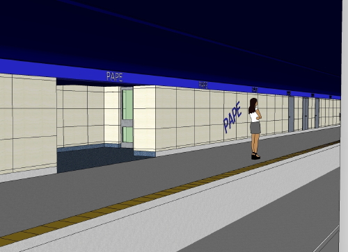
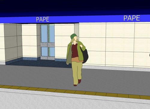
Rendering from Vic Park: Note the baby-blue “tiles” and absurd angle of signage (which doesn’t even face the train)
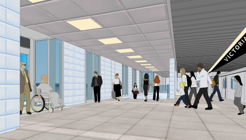
Many more photos of Museum station, including two taken through the keyhole in the work area:
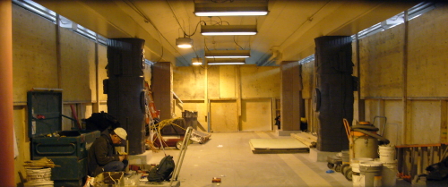
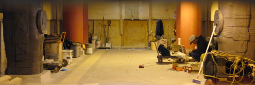
A new page just for Museum station, with proof these people still don’t know how to letterspace their own type even after admitting they screwed it up on the Sheppard line.
Three items for you.
Hell, let’s have some good news: They painted the letters on the walls of Donlands station. 
Two new items, one of them a shocker! 
Another giant piece from Ed Keenan in Eye Weekly, this time about the Toronto Preservation Board and its “collision course with the TTC.” Juicy quotes from Adam Vaughan (emphasis added):
[The TTC acts like it is] too cheap to be special... The old subway stations were beautiful, and they found their own economy. It’s the roots of the wealthiest transit system in the world in terms of being able to generate passengers and off-peak passengers.... That finds its roots in the attention to detail of the earlier generations who used to run it....
When we built the subway, we built it as one big project. That in and of itself is what the design of the subway speaks to – [a time] when we had the confidence and the ability and the vision to build infrastructure the size and the scope of the Bloor subway line. That’s an amazing mindset compared to what we have today, where if we’re really lucky we could add a station and if we do, it should just be bare concrete because everyone will think we’re rich if we do it any other way. We didn’t just sort of go to a computer and print some signs, we designed a friggin’ typeface. 
I did in fact address the Toronto Preservation Board yesterday, and I got exactly what I wanted: They’re planning to designate all the stations currently slated for renovations, the Bloor-Danforth line, and the Yonge-University line from St. George to Eglinton as heritage properties. This may not have enormous practical effect, but it’s still important. 
Press coverage in Now (p. 26 in the print version). I can assure you I am not, nor was I, quite that ungrammatical. But still.
I am supposedly addressing the Toronto Preservation Board tomorrow, 2007.11.09, at 15:10 hours for exactly five minutes. Apparently some poor sap from the TTC (not the one person who really knows the file) will be stuck defending its official position of knocking down walls, destroying signs, and typographic ethnic cleansing (all fake Helvetica all the time). 
Video from my presentation at ATypI is now posted (see blog).
We’re in the Tubby today. Suddenly I am a “ ‘font’ man.” I guess that’s true. Correction, though: I didn’t apply for a “job” with the TTC to count their signs; it was merely a solicited proposal. 
TTC Type & Tile Tour (TTTT): I’m hosting a tour of Bloor-Danforth TTC stations. We‘ll look at priceless old typography, unique tiles, and the TTC’s crappy and half-arsed replacements for both.
Starts at Victoria Park (new!) next Sunday, October 28, at 1400 hours sharp. 
Two new items of documentation:
HEY LOOKIT: Another feature from New York City transit signage for the TTC to clone. 
This one was somewhat buried, so here’s a bigger pitch: Ontario College of Art and Design student José Ongpin has concisely encapsulated 50 years of typographic history in four information-dense illustrations, published here (PDF) by permission. 
Well, “Inscribed in the Living Tile” seems to be going over fine. Something like 870 Diggs, a good reception on MetaFilter, and a nice piece by Ed Keenan in Eye Weekly praising my “entertainingly deadpan prose.”
I’m pleased. Now, one question: Has anyone at the TTC read it? (Another question: Has Steve Munro?)
Also: The truth about station-domination advertising in the TTC. Did you know that about one-third of people were always opposed to it? And that up to 13% of people think it interferes with signage?
Oh, and another thing: If station domination is so noncontroversial, why were two special constables in place to protect these workmen as they papered over St. George? (One of the constables sat bored on a bench the whole time, the other simply shot the shit with the guys.) 
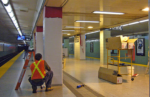
OK, it’s ready: “Inscribed in the Living Tile” (shorter version). It’s 50 pages and 2 MB in size, so give it a while.
Speaking notes also posted (2007.09.18). 
Everything you ever wanted to know about TTC signage comes out on Sunday. In time for my (second) presentation at ATypI Brighton, I’ll release the 50-page, 16,000-word, 50-image, 70-citation research paper, “Inscribed in the Living Tile.” More concise speaking notes from the conference will come along later. 
I’m giving a presentation at the ATypI conference in Brighton in two weeks on TTC signage. So let’s start a countdown: 14 Days to ATypI (intro). 
Toronto’s national newspaper has deigned to notice the effacement of Museum station. But, in an example of lazy journalism, Alex Bozikovic calls up that old standby, Matt Blackett, for a quote. What the hell does he have to do with it?
There’s no mention of the fact that the entire Museum reno is nothing more than a corporate tax dodge for the benefactors of the obscure Toronto Community Foundation. Jack Diamond’s quote essentially states that, unless a Toronto subway station is “like the art-nouveau Paris Metro or the London Underground,” every single station should and must be renovated “to give an impression of what’s happening above ground.” (Quick: What would Bessarion look like then? Greenwood?) We need wholesale gutting of that kind because the Bloor-Danforth line is a clone of the London Underground. Funny, I thought we were only cloning New York.
There were, however, some spot-on remarks from architect Michael McClelland. And maybe because he’s out of town or something, we didn’t see a quote from another standby, Steve Munro, who, very much to his credit, opposes the whole misadventure.
Now, I am the person – the only person – who filed a written call to cancel the Museum Renaissance. I am the first two hits on Google for "Museum Renaissance". I just finished writing three whole pages, for publication in September, on the true history of this misadventure. (In this context, the grande dame of the ROM, Bill Thorsell, used the word “miasma.” It goes downhill from there.) Not only was I not even asked for a quote, I have to sit here and read a story that gives Giambrone yet another opportunity to reiterate his corporate talking point about imposing Sheppard signage on everything, which is the problem.
When I was writing for newspapers and magazines, I at least canvassed more than the usual suspects. 
I have finished a 13,000-word paper on type in the Toronto subway. You will, however, have to wait till September to read it. 
Redesigned the homepage. I’d wager you think that photograph is officially impossible to take. 
The Star today runs an encomium to Rahul Bhardwaj, president of the Toronto Community Foundation. The title actually claims Bhardwaj is responsible for beaux gestes, but fails to mention the mal geste of inducing TTC to spend five million bucks each tarting up Museum, Osgoode, and St. Patrick stations, destroying old signs in the process and replacing them with Sheppard-style signs. (Did the Egyptians use fake Helvetica?)
I thought we were now in a cost-cutting environment. If the 26 Dupont bus is expendable, why aren’t these megaprojects expendable?
Additionally, why am I the only one who objects to the fact that TTC handed architect Jack Diamond’s firm $500,000 without a tender to doll up a few drawings, only the most recent of which even includes directional signage?
And a fun fact about Bhardwaj: The article claims he lives in the Beach. He must drive there, since I saw him entering the Hayden St. parking garage payment area on Friday after work. Perhaps I should have buttonholed him. 
Ed Keenan publishes an interview with Bob Brent, the former TTC manager who oversaw the Sheppard signs:
What’s really lacking really hit home to me when I was [at Sheppard station] in a wheelchair in 2005 unexpectedly – I didn’t know how to navigate out of the station. There are all of these elevators, well, which one do I take to get out of the station? They have a sign that tells you where you are and what’s upstairs, but you don’t have a little visual of the station. I was going to North York General Hospital and it took me a half hour to get out of the station.... [I] finally made my way out after half an hour. But I wasn’t very strong, I’d lost a lot of weight after a couple operations. So that was a real striking moment.
And then a few months later I was going to a New Year’s Eve party and my friends were picking me up at the corner and it took me 15 minutes to get out with a walker. I couldn’t find an exit that would let me get out with a walker.
The man who approved the signs cannot get himself out of the subway station that uses nothing but those signs.
Something that also might be going on here is mistaking a meticulously crafted assembly guide (the TTC signage manual) for a good system, or equating the two. 
I am cautiously optimistic about good news coming down the pike sooner rather than later, but it is too early to publish it as yet. 
Adam Giambrone told Eye Weekly that only I am complaining about the function of the Sheppard-style signs. Now that TTC seems to have agreed not to destroy any old signs, it’s time to call Giambrone’s bluff.
What is your experience with how well the Sheppard-style signs work? Write in with your comments. Remember, this isn’t about looks, appearance, or æsthetics. 
I seem to have confirmation of a suspicion. It seems that when I bring up the issue of signage, vaguely a public-space issue and specifically one concerning the TTC, city mandarins act like the source was Steve Munro and journalists act like the person to ask for a comment is Matt Blackett.
We visit Steve’s Web site for informed observations based on decades of experience and years of collected documents (and now, custom runs of TTC computer data). I have read his entire site and I value it. But Steve has no qualifications whatsoevoer to discuss functional aspects of signage, although he did a bang-up job cataloguing the multiplicity of sign formats at Eglinton station. Steve’s been really pissy about the whole issue, which, if he were honest, he would admit is not his issue. So why doesn’t everybody stop going to his site or acting like he’s some kind of authority? He isn’t.
Blackett has been upfront about deflecting reporters’ questions (but not all reporters’). I appreciate that. But this isn’t about Spacing and he isn’t the source.
We know that Adam Giambrone reads Steve’s blog and responds to it, sometimes immediately. Not a single person in the employ of the TTC has talked to me, by any method, since this campaign began. (Giambrone’s assistant, however, has.)
So: As I feared, the only blog the TTC reads is Steve Munro’s (maybe they think there aren’t any others), and reporters try to induce Matt Blackett to steal the show from me. It’s a little Pavlovian: You hear “TTC,” you read Steve Munro. You hear “signage,” you mail Matt Blackett. Please stop. 
Sympathetic article by Ed Keenan in Eye Weekly. Highlight: Public documentation that the manager who oversaw the Sheppard-style signs can’t figure them out himself today. Lowlight: Wunderkind Giambrone’s passive-aggressive bitching that no complaints have been lodged about the Sheppard signs “except, of course, by Joe Clark.” NOT VERY CRICKET, THAT. 
Part 1 and Part 2 of Keenan’s extended megamix blog posting based on our subway tour. 
Tomorrow’s Now has an article that describes the Paul Arthur signs as “failed” (then goes on to list their advantages) and gives the last word to Matt Blackett. But it does offer the new information that Giambrone wants to hire a TTC archivist. 
I attended the TTC meeting today.
We observed a moment of silence for the late Don Léger. Station cleanup, including the cleaning of St. George that was the genesis of my Save TTC Signs activity, was under his domain.
If you submitted correspondence to the TTC General Secretary expecting it to be reproduced in the correspondence file, it wasn’t. The only correspondence on signage was from me. I’m sure that was an oversight.
TTC managed to completely destroy the impact of my letter on the claimed adequacy of Sheppard-style signs. How? My included photographs were reproduced as an almost solid field of black:
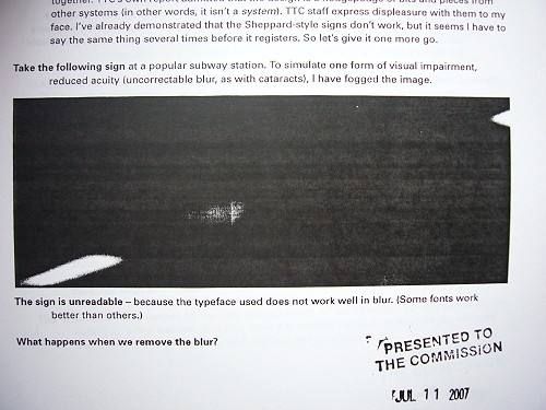
It prints fine on my laser printer and I am hardly about to submit an unprintable document. (In fact, it’s a tagged PDF.) And photos from the TTC in other documents included today reproduced as well as could be expected from monochrome printers:
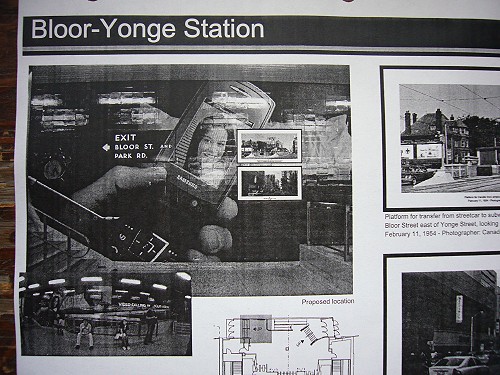
I’m sure it’s coincidence.
Giambrone: “This is an ongoing issue and I know staff are doing quite a lot of work on this,” particularly concerning St. George and the standard. My letters concerning that standard and my call for cancellation of Museum Renaissance were referred to staff for response. A follow-up E-mail asking staff to please stay on topic, and not to answer every question with “We have a sign standard that we apply to new stations,” was simply “received.” Giambrone: “If we were to take down a sign, which we aren’t right now, at St. George station, we would preserve it.” They have decided to do nothing in the way of sign destruction right now, ostensibly.
Maybe I’ll get around to writing a large post about it later, but the unblurred TTC photo above shows the proposed location of TTC memorabilia displays at Yonge & Bloor. TTC’s own photo shows that the location of a display case for memorabilia is completely taken over by a station-domination campaign, which additionally overwhelms the old-style sign to the point of invisibility. 
Partial victory. I received the following last night from Adam Giambrone’s assistant Kevin Beaulieu:
Direction has been given to Commission staff to keep the Paul Arth[u]r signage in place at St. George station until the station is scheduled to be renovated under the station modernization program. St. George is not yet scheduled for modernization, so there is no apparently immediate threat to the signage.
I was trying to sit on this until I clarified what the real issues were – i.e., St. George is set for cleaning, not “modernization,” during which process the signs could be removed as long as they are preserved. Then of course there is the issue of Pape and other stations that are set to be “modernized,” which is TTC’s euphemism for “a delicious opportunity to rip out every old sign and put up our untested signs.”
I was trying to sit on that, at least till the Wednesday TTC meeting when I might have something in hardcopy, but Blackett was in a big rush to break news on what is by his own admission my issue, so I have to publish too, I guess. Superficially it seems like he’s being supportive, and maybe he thinks that’s what he’s doing. But he’s taking over my issue. And we aren’t done yet.
This is not all of what I want, and, true to form, when you ask TTC a question on signage they come back with the answer to some other question.
At a time like this, one’s only option is to quote the Joker: “Can somebody tell me what kind of world we’re living in when a man dressed up as a bat gets all of my press?” It’s my campaign. Don’t go asking Blackett for an opinion (you never canvass me on his campaigns), and Blackett, please don’t declare victory on my behalf. 
Fisking Steve Munro: Since Steve Munro simply refuses to post my comments, or intersperses his own bons mots through them, and/or sends me nastygrams about my tone or whatever, let me respond to his post in a place he cannot touch.
Also, let me lay a bet on what’s going to happen now. I’ve worked on this file for six months, in which time it has been almost completely ignored by the only transit blog the TTC reads, Steve Munro’s. Now he’s got a huge posting, and TTC managers will use that as a source from which to cherry-pick the latest set of harebrained and mismatched signage concepts. Too cynical? Well, prove me wrong, TTC.
The proposed work at Eglinton Station does not involve moving the outer walls of the station back two feet. What is proposed is that safety alcoves 5 × 7 feet will be cut into the walls to provide refuges for workers when trains come through the station. With some careful placement, the existing signage should not be disturbed at all.
That’s news to me, but not necessarily unwelcome news. I was reporting what a TTC architect told me. If I’d had a written document to cite, I would have.
As for other stations, there is a press conference later this week that will cover already approved changes at various locations.
I wonder who will and will not be invited.
At this point I have not commented on how effective the signs are and I will leave that to the professional critics of such matters. However, a few points do jump out easily.
I appreciate Steve’s acknowledgement that effectiveness is the issue. He’ll muddy the waters later, though.
Any major change in signage style costs money. At the end of the day, how much better will the station be for our effort?
We’ll have test results to answer just that question.
Will someone new decry the chosen design only to start the cycle anew?
People’s opinions about “design” are all well and good, but not relevant at first instance, if at all.
Pape station is still in more or less original Bloor-Danforth style. If the decision is to preserve this style, then the new signage needs to be created in the same manner as the old. However, one claim made for the new mixed-case signs is that they are more legible for people with vision problems. Whether this is true or not, the argument will be trotted out. If the debate is between “preservation” and “accessibility”, I know already which one will win. One is a “nice to have” while the other is a “must have”.
Quick: Prove to me how a fake Helvetica is actually “accessible” to low-vision readers. Good luck with that, because I can prove it isn’t, and already have.
The claim was that having a pictograph for each station would simplify wayfinding for those who cannot read the station names. Maybe, but this assumes that we have meaningful symbols for each station and most people know them.
Not all the icons would have been “meaningful.” Paul Arthur did not get to the stage of field-testing icons for all the subway stations. Had he done so, quite a few of them would have been arbitrary. And that might have been a cause of objection from native speakers of English, but they aren’t the audience for the pictographs. The question is not “Does the picture match the name?” but “Can people who can’t read the name learn and remember the picture?” There’s a good chance they couldn’t, in which case the pictographs would have no empirical justification.
St. George was a trial, not an iconic Toronto installation, and it’s “historic” only because the TTC never got around to taking down all of the signs.
A bit of a lazy misrepresentation of my purpose here. We are not attempting to dip St. George station in amber and never change it. Sure, take down the Paul Arthur signs. They’re 14 years old and they were a prototype. Just do not destroy them. This is a simple enough point. 
Fisking Steve Munro’s commenters: Special to Karl Junkin!
I think the loss of a font is not much of an issue, really
Except that the aboriginal TTC font is found nowhere else. If we take your advice to the fullest degree, it gets expunged from the entire subway and lives on only in photos and one retail outline font.
It does play a role in the design, but it is the design that should decide the font, not the font that decides the design,
No, Karl, function decides the font.
and that is what I really think is backwards about this whole subject, especially the view of Joe Clark on this matter (I really don’t think fonts on their own are worth historical preservation, and I consider myself both a designer and transit enthusiast).
But you’re not a very good reader. Tell me where I advocated “historical preservation” of “fonts on their own.” You’re the one advocating that fonts be expunged if necessary.
Confidential to Trevor (who may be surprised to learn that Massimo Vignelli designed the Washington Metro signage along with the New York MTA’s):
The very idea of saving elements of a single station to maintain history seems to place bad (at least, outdated) form before function.
I know! What a ridiculous idea. Now tell me who was proposing that.
“Elements of a single station” do not have to be locked in place forever. Take the Paul Arthur signs down, sure, but keep them – somewhere. And don’t go off the deep end in the other direction – do not rip out every sign in a station because of a corporate statement, based on no facts at all, that the current sign “standard” is just fine. 
Two new letters filed with TTC – a call for cancellation of Museum Renaissance and redirection of TTC’s share of its cost into signage and wayfinding research and a response to claims by Gary Webster and Adam Giambrone that the current TTC sign “standard” is adequate. (Quick: What buses and streetcars run “westbound” from Bathurst?)
Added a few details about the page header and my upcoming presentation on TTC typography at the prestigious ATypI conference this September in Brighton. 
Coverage roundup:
An editor from Now dropped me a line to tell me a stringer was covering the story. Oddly, I haven’t heard from her. He also tried to induce me to hand over my photos for free.
New Flickr set on the disastrous Museum Renaissance renderings.
I’ll be submitting letters to the TTC tomorrow that will also be posted here. 
I have reason to believe within the next couple of days there will be Adequate Good News, and possibly in the medium term there will be Significant Good News. I’m gonna wait till I have something to link to, though. 
Added my notes on statements by General Manager Gary Webster on signage at the June 2007 TTC meeting. This would be where he told the Commission the current sign “standard” is just fine. 
We relaunch – as Save TTC Signs. I’ve already sent letters to all TTC Commissioners and their executive assistants; to the TTC; to Paul Arthur’s widow; and to the head of the ROM library and archives, where Paul Arthur’s papers reside.
Upcoming addition: Full pages on the current state of signage at stations that are scheduled for renovation, like Pape.
We’re now “on the Facebook.” (21:58 ¶)