I submitted this letter to the TTC on 2007.07.09. (Also available as a tagged PDF.)
At the Commission’s June 2007 meeting, under questioning from Commissioner Bill Saundercook, General Manager Gary Webster came out as the only person inside or outside the TTC who thinks the current sign “standard” – the Sheppard-style signs – is adequate. Statements to the media later made by Chief Commissioner Adam Giambrone have backed him up.
The former TTC manager who oversaw their development admit the Sheppard signs were thrown together. TTC’s own report admitted that the design is a hodgepodge of bits and pieces from other systems (in other words, it isn’t a system). TTC staff express displeasure with them to my face. I’ve already demonstrated that the Sheppard-style signs don’t work, but it seems I have to say the same thing several times before it registers. So let’s give it one more go.
Take the following sign at a popular subway station. To simulate one form of visual impairment, reduced acuity (uncorrectable blur, as with cataracts), I have fogged the image.

The sign is unreadable – because the typeface used does not work well in blur. (Some fonts work better than others.)
What happens when we remove the blur?
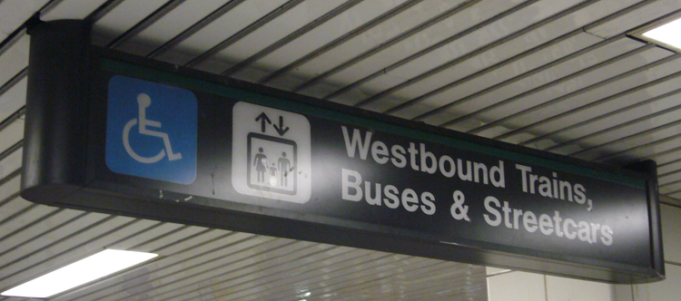
We discover that the sign actually has two pictographs and reads Westbound Trains, Buses & Streetcars. Clear as a bell now. Except that this sign is located at Bathurst station, where the only vehicles that run westbound are trains. No buses or streetcars run westbound from Bathurst.
So if you have one kind of visual impairment, you can’t use the sign at all. If you can see it clearly, the sign lies to you.
How much more proof does TTC need that Sheppard-style signs do not work? (I could tell you what’s functionally wrong with the eastbound sign at Bathurst, for example.) Sheppard-style signs were never tested, they’re a clone of a 40-year-old New York system, they were assembled by nonexperts by randomly copying other signs, and they simply are not viable for new or existing subway stations.
We know that two people in the city like them. Those two people run the TTC; the generals are countermanding the own troops. But personal preferences, even the preferences of TTC executives and commissioners, are ungermane. Function is all that matters, and signs that meet the current “standard” don’t have it.