(Brendan Lynch)
Presented at the ATypI 2007 conference,
Brighton, U.K., September 2007
The Toronto subway has a typographic heritage all its own, starting with a unique font. But, with renovation after renovation and after a series of new station additions, signage and wayfinding in the system are a total mess. The latest “standard” in Toronto subway signage uses fake Helvetica and is a clone of Massimo Vignelli’s work from 40 years ago.
This document is published online at joeclark.org/atypi-ttc.
This document is not a script for my in-person presentation at ATypI on 2007.09.16. Papers are not presentations.
Ontario College of Art and Design student José Ongpin (2006) has concisely encapsulated 50 years of typographic history in four information-dense illustrations, reproduced here (PDF) by permission.
You might not expect something typographically unique to come out of Toronto, a B-tier city that stands in the shadow of A-tier cities even in the minds of some residents. But the margins are where originality can thrive, and the typography of the Toronto subway is a prime example. It is also an example of subverting, ignoring, and actively destroying a special typographic heritage – quite an achievement considering that the type involved is almost a foot high and permanently sandblasted into subway walls.
(After Filey 1996.)
1954: Subway opens (Yonge line)
1963: Branch added (University)
1966: East-west line added (Bloor-Danforth), extended 1968
1973, 1974: Yonge line extended
1978: Spadina branch added to Yonge-University line
1985: New east-end line opened (Scarborough RT); new station added (North York Centre, 1987)
1996: New station added (Downsview)
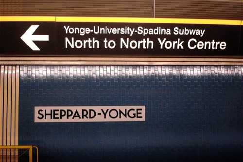
2002: New north-end line opened (Sheppard)
The Toronto subway, operated by the Toronto Transit Commission (TTC), opened in 1954. It started with a single 11-station line running under Yonge Street (pronounced “Young”; it’s the main commercial street and divides east from west). The subway has been expanded repeatedly. Today, Toronto has four subway lines.
After all those additions, the Toronto subway still has a mere 69 stations – slightly more than the District Line in the London Underground. Vast areas of the city have no subway service and must rely on buses and (aging) streetcars, virtually all of which connect with the subway.
Only 23 stations are wheelchair-accessible. By Ontario provincial law (AODA 2005), the entire transit system must be accessible to people with disabilities by the year 2020. TTC runs an expensive, limited, and unwieldy paratransit service, Wheel-Trans, for people who cannot use the regular transit system.
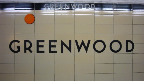
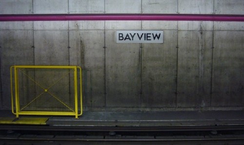
Older subway stations, and a few new ones, have what is known as a washroom-tile æsthetic. (Even a former chair of the TTC called it that [Cowan 2006]: Riders “pass through this location, look around and see early Canadian washroom architecture.”) The walls were originally finished in glossy tiles in pastel colours, mostly since replaced. While trim colours vary, basic wall colour is not random and repeats itself in stations on either side of three stations on the Bloor-Danforth line (Spadina, St. George, and Bay; Blackett 2007), which act as a focal point. Some of the colours in use are cream, beige, green, white, and pale blue, always with small straplines of contrasting tile colours at the top of the wall.
Toronto has a bad habit of wishing it were New York, but one point of comparison is public-transit usage. In both cities, people of all walks of life and socioeconomic classes take public transit, including the subway. Unlike some American cities, the TTC is not the preserve of Toronto’s poor. A lot of people use it, and in recent years many of those people are more willing than ever to admit they love it.
Spearheaded chiefly by Spacing – a local thrice-yearly magazine, with high production values, that covers Toronto urban issues – a new culture of transit fans has developed. Transit fandom has led to blog and newspaper articles (Scrivener 2006), a gallery showing of transit-inspired photos (Spacing 2006), and an entire BarCamp-like unconference, the Toronto Transit Camp (2007).
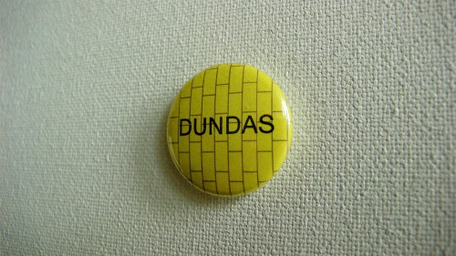
Transit fandom led to phrases like “69-station club” entering the lexicon, referring to anyone who has visited every station. It led to Spacing’s line of lapel buttons showing subway-station names in (usually) the correct font against the right tile pattern.
(Brendan Lynch)
At the outset, TTC tried to squash transit fandom like a bug.
TTC wrote a cease-and-desist letter to the creator of a Toronto subway map that uses anagrams of station names (Martz 2006), claiming it could be mistaken for the real thing, a statement that says a lot about TTC’s own information and wayfinding.
TTC (2006a) used the term “ ‘rogue’ ” to refer to a subway efficiency guide (Lerner 2006) that tells you which subway car to sit in to arrive at the exit door of your destination station.
TTC’s published policies permit noncommercial photography on its property, but one blog editor, David Topping, was forced to stop work on a 69-station-club-style photo essay of every station. He endured a lecture from the TTC chair at the time and was eventually issued a photo permit, ordinarily given only to commercial photographers (Topping 2006).
TTC refused to license the Spacing subway buttons – but that did not hurt much, as 60,000 would be sold in two years (Clayton 2006).
More recently, TTC has come to realize that fans are exactly the wrong people to alienate. For example, the Commission sent several employees, including the acting chief general manager and the elected chair of the TTC, to Transit Camp.
Like Spacing itself, these transit fans tend to be under 35 years of age. (So is the aforementioned chair of the TTC, Adam Giambrone, age 29.) That means the subway was already in its second or third decade when they were born. It also means that the age of the Toronto subway is coincidentally situated in a mid-century period that now has a kind of retro chic. You won’t find Eames chairs in a subway station, but a certain halo effect of mid-century modernism has boosted the design profile of the Toronto subway.
One point of pride for the new breed of transit fan is the bathroom-tile æsthetic (Howell 1990), which a vocal minority adamantly like because of its honesty. Yes, our subway really does resemble a public restroom, and we’re fine with that.
And those tiles are where the story of type in the Toronto subway begins.
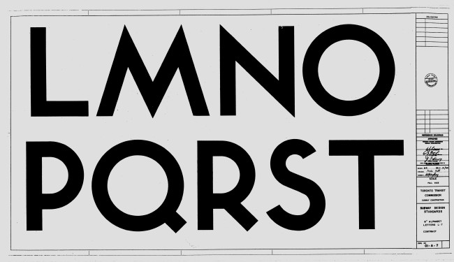
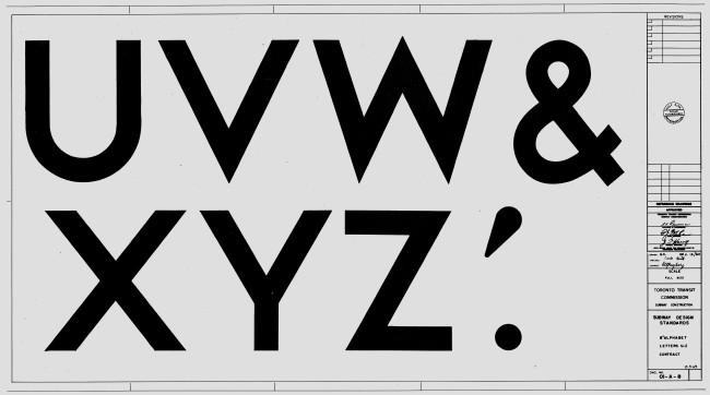
The Toronto subway has a typeface all its own. You can compare it to a few other fonts, but no other face is exactly the same. And, for 50 years, pretty much the only place you found it was on permanent, virtually indestructible wall signage.
The typeface, in its original form, is a geometric sansserif in upper case only, with ten numerals, ampersand, period, and apostrophe, and an arrow (though a few other arrows are found on period signage).
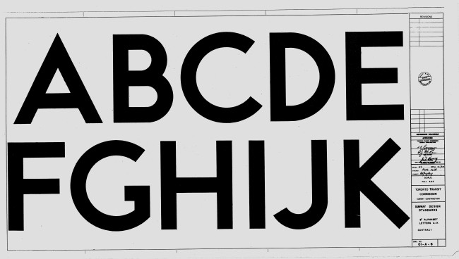
Features:
Near-perfect circles for C, G, O, and Q.
Similarity of upper and lower bowls of B.
Near symmetry of E and F along a horizontal midline.
An X that looks like a multiplication sign (clearly an incorrect form).
A Futura-like S made of two hooks.
Strokes that tend toward straight lines (even the stem of the distinctive low-waist R) and terminate at right angles.
Spiky corners on M, N, V, and W that descend below the baseline or project above the cap height.
The typeface is often misidentified at Gill Sans, a typeface that will later become important in TTC typographic history. Even highly expert designers have misidentified the face as Gill. Vaguely comparable typefaces are Verlag, Bernhard Gothic, Metro, Neutraface, and Eagle.
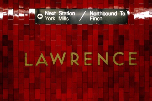
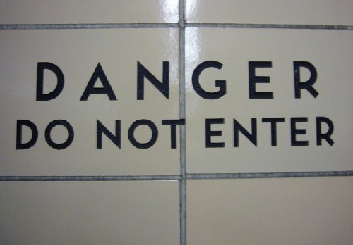
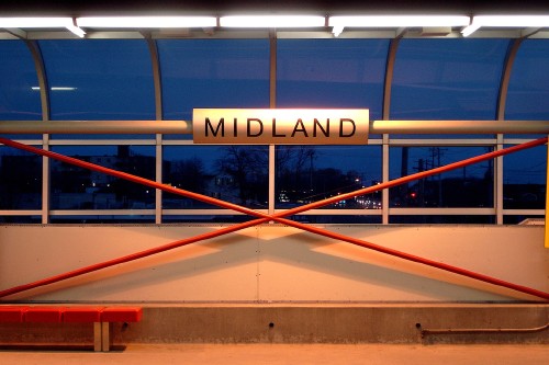
Inside the original or old stations, the name of the station, very widely letterspaced, is sandblasted into the tile, usually right across the borders between tiles. The letterforms are painted a contrasting colour. (The colour isn’t broken up by the borders between tiles.) The effect is subtly three-dimensional and gives a feeling of permanence.
(Craig James White)
(Craig James White)
At my station, Greenwood, station-identification letters are 10″ high and are spaced 3⅜″ apart (spacing of 0.3375 em).
Other word- and letterspacings are used.
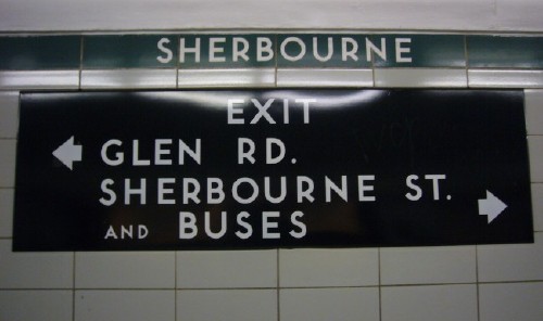
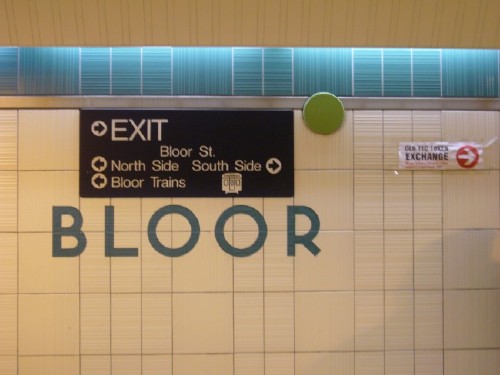
Old directional signage – signage telling you where to go within a station – typically uses white characters in the TTC font. There are a range of materials:
Black enamelled steel. Signboards are trapezoidal in profile (edges angle outward to the wall). Mounting hardware is internal and hidden.
(Craig James White)
Flat signs made of steel (not necessarily enamelled).
Backlit plastic signs.
White signboards with painted-on type in the TTC font – old and now rare, but common in the 1950s or 1960s.
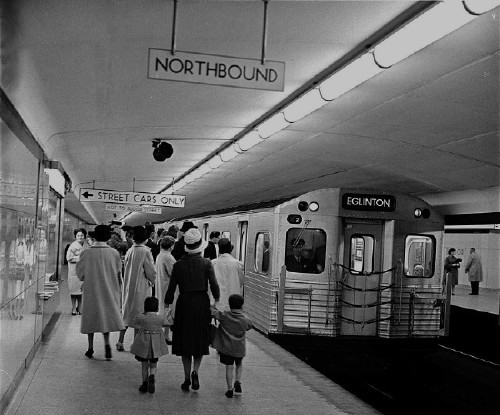
Bloor station. Note glossy Vitrolite wall tiles, black-on-white signs
(Toronto Archives, date untranscribed)
Enamelled steel is accepted as a long-lasting material for signage, but the TTC’s enamel signs have been durable – most of these signboards have apparently stood in place without serious damage or decay for 40 or more years. The signs are forgiving of vandalism.
By all accounts, no one alive today knows who designed the Toronto subway typeface. The original drawings (TTC 1960) do not credit an artist. (Since the drawings are dated 1960.12.12, they were drawn after the first installation of letters on a subway wall. That makes the absence of credit even more surprising; it may mean the designer had already been forgotten six years after the subway opened.)
The subway typeface does not have a name, although the TTC claims (2007a) it is known internally as the Station font. That name has not taken root with transit fans outside the TTC. No stable name for the typeface in common use apart from “the TTC font.”
There is actually a degree of variation.
Two original stations, St. Clair and Eglinton, appear to use a light weight not found anywhere else.
The S in type inscribed on coloured straplines along the tops of subway walls looks different from the regular S (top hook does not extend as far to the right).
There is one commercially available version of the TTC font – Toronto Subway (Quadrat 2004) by David Vereschagin, who spent weeks taking pencil rubbings of letters on station walls (LeBlanc 2005). The font can be critiqued on a number of grounds:
The weight of the font seems to match neither the lighter St. Clair/Eglinton weight nor the book or medium weight found on other stations.
The lower case was created from scratch, doesn’t really match the upper case, and has questionable letterforms (like q with a tail that points up to the right from the end of the descender).
TTC staff believe they have their own outline version of the font, one that was designed in-house, but could not confirm that claim even after they double-checked.
The TTC typeface is a distinctive feature of the Toronto subway system. But it has not been uniformly applied. Only in some 1954-era subway stations do you find reasonably consistent use of the TTC font. Every addition or renovation has added new fonts and new signage types to what should be a consistent system. It’s happened over and over again during different eras.
All the original Yonge-line stations save for Eglinton have been remodelled – in many cases, because the original tiles, a glassy large-format material known under the trade name Vitrolite, decayed and cracked.
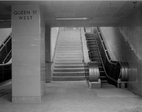
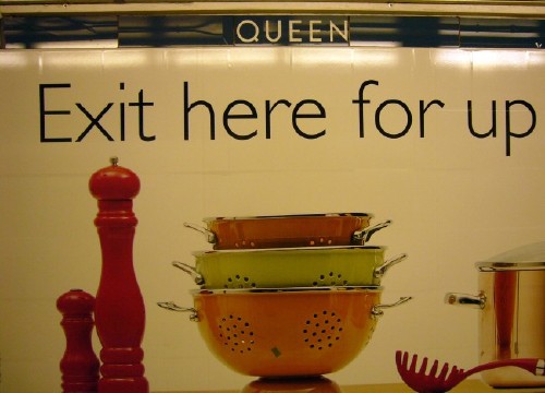
Queen station, showing Vitrolite tiles and original font
(Toronto Archives, date untranscribed)
Original TTC-font station designations were removed and replaced.
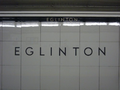
To this day, Eglinton retains its original Vitrolite tiles on most walls and, like St. Clair, still uses its light weight of the TTC font. But fonts were changed on most other stations on the original Yonge line.
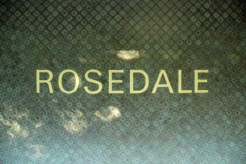
College, Davisville, Dundas (pronounced [ˈdʌnˌdæs]), King, Rosedale, and Union use Univers.
(David Topping)
Queen uses an extremely unappealing scrunched Helvetica.
Wellesley and Summerhill retain the original TTC font.
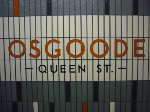
The University end of the Yonge-University-Spadina line has seen its share of renovations. Osgoode and St. Andrew use a mixture of the old TTC font and Helvetica.
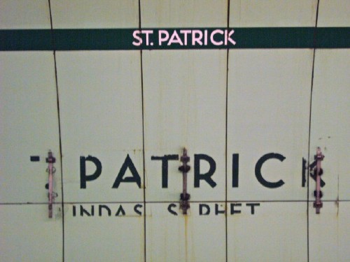
But some stations, like Museum, Queen’s Park, and St. Patrick, have not been renovated. Signage is decaying at Queen’s Park and St. Patrick – letters are fading to nothing, and people are scratching graffiti into the voids.
The Yonge-University line was extended in the 1970s along Spadina Rd. All those new stations had a public-art component, some of it quite spectacular. And all of them used Univers for station names on walls.
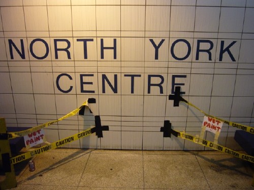
There was a minor expansion of the Yonge line in the 1980s – a planned station between Sheppard and Finch at the northern end was finally opened, albeit without wheelchair access. This North York Centre station uses Helvetica.
The Spadina branch was extended one stop in the mid-1990s to Downsview, the new terminus (formerly Wilson). The station features “Helvetica” signage of a variety that will be described shortly. The name “Downsview” is blasted into the walls in mixed-case letterspaced Helvetica, making it the only subway station in the TTC with mixed-case station identification. (A streetcar bay at Spadina, built later, reads “Spadina” in mixed-case Helvetica.)
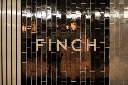
Stations in the Scarborough RT typically use Helvetica on custom-made curved metal signboards, a distinctive and futuristic look.
(Craig James White)
(Craig James White)
There are other variations in station identification. Most stations use sandblasted letters, but some, like Wilson, use flimsy and illegible clear plastic panels. The streetcar system has exactly one underground station, located west of Union station at the edge of Lake Ontario. This Queen’s Quay Ferry Docks station uses all-caps Helvetica blasted into tile.
The TTC had a unique typographic legacy and, by accident or design, destroyed it. But, it turns out, that would not be the last time.
Designers long ago began pointing out that the TTC uses a jumble of typefaces, but even a casual visitor will notice indications that signage in the TTC has recently slipped to seriously dysfunctional levels. In some stations you come upon hand-lettered signs pasted on pillars by TTC employees: Obviously they’ve been hounded for directions by baffled riders, have given up waiting for assistance from the signmakers at head office and have taken matters into their own hands. Their sloppy signage makes the whole system look seedy, like a store that’s about to go bankrupt.
That quote is actually from 1994 (Fulford), but it could apply to any era from the 1970s to present.
For some reason, signage in the TTC is under the control of the marketing and public affairs department rather than, say, engineering or architecture. Placement of signage in the marketing department essentially equates wayfinding signage with advertising.
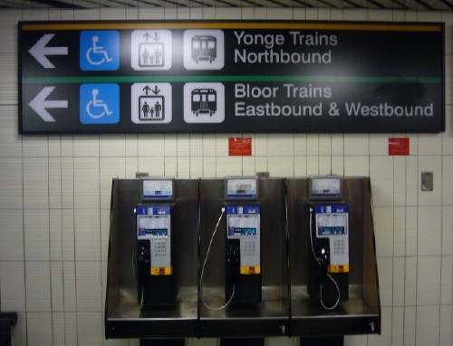
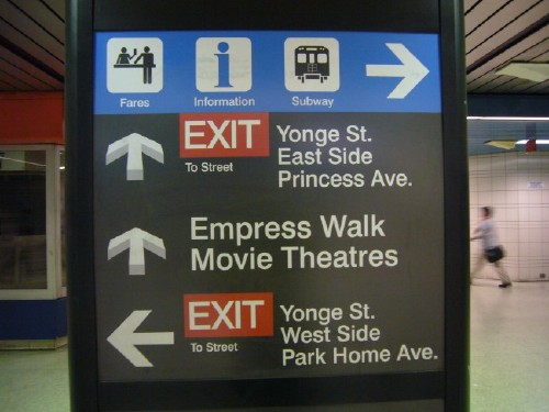
TTC subways have inconsistent directional signage. In fact, it’s a total mess.
A great many of the original enamelled-steel signs from the 1950s or 1960s are still in place. Most are attractive and most appear to be functional, though a few small signs with multiple arrows look confusing.
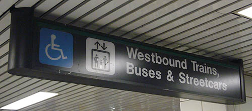
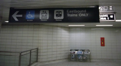
Signs were posted in the 1980s and (more commonly) the 1990s using Helvetica and a number of different arrows and pictographs. A common form uses an arrow cut out of negative space in a positive circle.
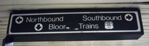
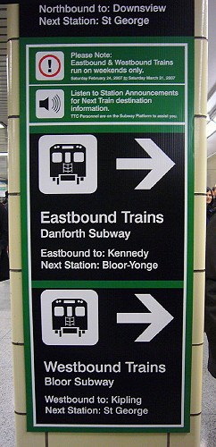
Southbound Trains and Northbound Bloor?
Information architecture leaves a great deal to be desired, as does basic legibility of Helvetica.
Many stations have signage in Univers. Some signage blasted into walls is set in Univers even in stations that otherwise use the TTC font (e.g., a “Southbound” notation at Wellesley).
Collector booths at subway entrances can have up to 17 different signs (rarely fewer than six even at extra booths that are unattended except at rush hour).
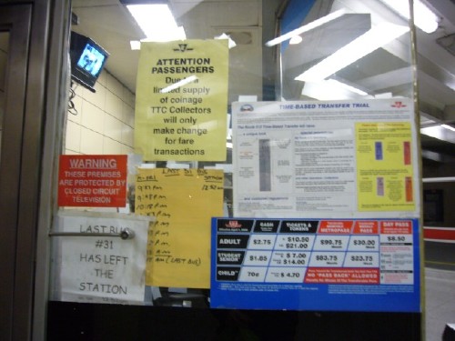
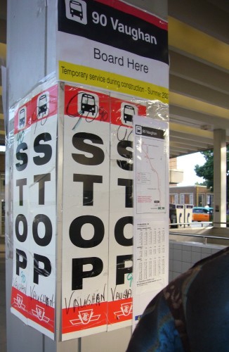
Handwritten signs were found everywhere in the TTC until a belated and righteously executed crackdown in July 2007 (Clark 2007g).
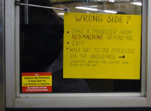
Signs ink-jet-printed at home or by the TTC (typically in Times caps or Comic Sans) are also found.
Some directional signs were created using a pantograph machine that digs away the (black) top layer of a signboard, showing the (white) underlying substrate. Those signs use a monoline font.
It’s possible to find all of those signage types, and others, in a single station. One east-end station, Main Street, is a living time capsule of TTC signage types. On the ground floor, every era of TTC signage is visible in the same room.
The list of TTC signage problems continues.
Signs recently installed on the windows of subway-car doors patronizingly tell passengers to be considerate; block the view through the window; and use Frutiger.
Signage inside buses and streetcars uses a number of faces, including Futura.
In unusual cases (a “Thank you!” for moving back in the bus), some vehicle signage uses cursive fonts.
Signs in new buses had to be recalled because they got an accent wrong in a French translation (McGran 2006). (French emergency signage was mandated even though barely 2% of Torontonians speak French and almost none of them are unilingual [Statcan 2003].) Other signs in buses still have French-language errors the TTC hasn’t noticed yet.
Bus and streetcar schedules posted on poles at street level use a TTC-specific notation – multiple columns of hours, minutes, and abbreviations typeset in Helvetica – that civilians can barely understand.
Station-domination campaigns, in which an advertiser takes over all or part of a station (including pillars, floors, walls, and stair risers), actively subverts signage and wayfinding.
An architectural standard (TTC, undated, but likely pre-1990) states:
All signs shall be designed to be legible.... Normal readability is assumed to be 1:500. That is, a one-unit[-]high letter can be read from a distance of 500 units.... The design and number of signs shall avoid clutter and confusion.... The type face for all station signs shall be Helvetica Light [with all upper case for station names and exit signs, mixed case for “(o)ther”].
In recognition of the problem, in 1990 the TTC commissioned a new signage system via a request for proposals (RFP; TTC 1990a).
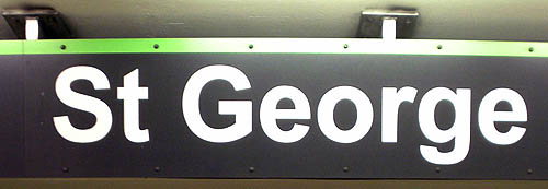
The addition of necessary signage over the years to keep up with transit improvements and ongoing development around the stations, as well as the upgrading of signage as stations have been renovated, has resulted in a signage format which is similar but inconsistent in its application in all stations. In many cases, signage which has been added has, of necessity, been placed in a position blocking other signage, giving an unsystematic and cluttered look resulting in customer confusion. This is especially true in some of the high-volume transfer stations such as St. George and Bloor.
The RFP required “[a]n awareness of the problems of the visually impaired,” “[a]n awareness of the impact on the literacy impaired,” and “[a]n awareness of the multicultural make-up of Metropolitan Toronto.”
Paul Arthur Visucom Ltd. was actively solicited to respond to the RFP and eventually won the contract. Paul Arthur (1924–2001) was a British-born Canadian graphic designer and was the son of architect Eric Arthur, the author of a seminal book about Toronto’s history, Toronto: No Mean City (1986). Arthur was famous for the pictograph system he developed for Expo 67 in Montreal (Arthur 1968); he claimed to have coined the word “signage”; and he wrote or cowrote several books, including Wayfinding: People, Signs and Architecture (Arthur & Passini 1992).
Working with Lance Wyman Ltd. (the same Lance Wyman who designed the 1968 Mexico City Olympics graphics and subway signs), Arthur designed a prototype system. Cost for initial research was capped at $104,480 (TTC 1990b).
Gill Sans was used as the base font. Arthur’s reports to the TTC from the 1990s use the same rationale for selecting Gill, albeit restated a few ways.
“We have selected a letterform for verbal messages that harmonizes very well with the original lettering used to identify stations in the mid-fifties. It is called Gill Sans. It is highly legible and readily available to sign makers” (Arthur R1).
“The decision to recommend this letterform was not based exclusively on its legibility, although that is important, but there are, however, many other equally legible letterforms. Nor was it based solely on historical accuracy.
“The real reason lies in the fact that as the new system is implemented no one wants to see the ‘old’ signs looking decidedly different or ‘old-fashioned.’ Besides, many of these ‘old’ signs may well stay forever as they are deeply etched on station walls and cannot be removed, except at great expense.
“The nice thing about Gill Sans is that it is so close to the original lettering that these original signs will look like they are part of the ‘new’ system” (Arthur R2).
“This elegant typeface, designed in the late Twenties by the renowned Eric Gill, is very close to the original letterform that was used in signs for the first subway built in Toronto. Its use in the new info system will act as a bridge with older signs that will still be in evidence for many years to come” (Arthur 1991).
Arthur (R3) viewed all “candidate” sansserif faces as equally legible.
Once the decision was made to select a sanserif over a serif face, there is very little, if anything, to choose from between the candidates from the standpoint of legibility. They are all equally so and there is, moreover, relatively little difference in legibility between regular and bold weights. They, too, are equal in this regard.
The choice of Gill Sans is based on the fact that it is strikingly similar to the Futura-like letters originally used in signs for the first stations that were built.
Arthur and the TTC made efforts to improve accessibility for low-vision people and others with relevant disabilities, but conducted no legibility testing of fonts.
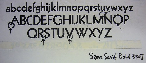
Additionally, Arthur misidentified the original TTC font.
“With respect to typeface, Gill Sans was selected specifically to maintain close resemblance to the original San Serif Bold 330J typeface etched on the subway walls in the 1950s” (Arthur 1993a).
“[T]he original typeface etched on subway station walls in the 50s... is a letterform called Sans Serif Bold 330 J (from Cooper & Beatty’s typebook). It is strikingly similar to Futura and to Gill Sans, both of which were designed in the mid-20s. Gill Sans was selected specifically to maintain this close resemblance to the original type style” (Arthur 1993b).
Arthur’s photocopies from an uncited specimen book (R4) show that San(s) Serif Bold 330( )J is nothing more or less than Kabel.
Redrawing and simplifying the TTC logotype.
Drawing a specific arrow (thick head and single-line shaft).
Eliminating confusing names for subway lines, like Yonge-University-Spadina and Bloor-Danforth. Instead, all lines were numbered, and the existing but underplayed line colours would go into serious use for the first time.
Rationalizing terminology, so that the subway became “rapid transit” while all other forms became “transit.”
Simplified route maps in subway stations. Among other things, one candidate subway-line map showed only the stations you could actually reach on that line, not the stations behind the current station.
Adding pictographs to station identities.
Covering the existing tile straplines (in contrasting but not meaningful colours) with new straplines in yellow, green, or other line colours, a station picto, and the station name in Gill caps.
(Luke Tymowski)
Under this system, what used to be Bay station on the Bloor-Danforth subway line became Bay station, with a specific icon, on green Line 2. Signage not only used the line colour, it named the line colour: GREEN LINE. That was useful, because two of the three existing line colours, yellow and green, can be difficult or impossible to distinguish for colourblind people (protans more than deutans).
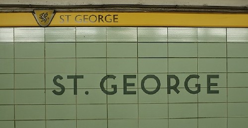
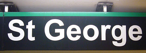
The Arthur redesign was user-tested. Initially, a prototype sign system was to be installed at busy Union station at the south end of downtown, which connects (via separate buildings) with commuter and inter-city rail lines. Extensive documentation was drawn up to specify signs for Union station. But ultimately St. George was chosen as a test site. It is a downtown station that acts as an interchange between the Bloor-Danforth and Yonge-University-Spadina lines (that is, between yellow Line 1 and green Line 2). The budget for the entire design and installation of the sign prototype was between $220,000 and $315,000 (Arthur 1992c,d).
Halves of either platform (the same halves, sitting on top of one another on two floors) was refitted with Arthur’s signage, while the other half remained unchanged. Testing was carried out by Generations Research Inc. (1994) at a cost of $35,000 (TTC 1993). Four groups were included in the total testing base (n = 538):
The “general population,” meaning riders without disabilities who could read English (n = 301).
The visually impaired (n = 75).
A “multicultural” group, that is, English-as-a-second-language speakers (n = 109).
An English-speaking group “with a low level of literacy,” often students (n = 53).
All groups stated a preference for the Arthur redesign. Only the results for the general population were statistically significant, and the test concerned user attitudes rather than performance in tasks. (Some questions were asked about how often the users had had problems with TTC signage in the past.)
Visually-impaired people rated both old and new signs lower than any other group, but “rated the [p]rototypes as superior.” Additionally, “there were many indications of advantages (though not significant) for the [p]rototypes, while there were no indications of advantages for the old current signage.”
Some specific findings:
The general population rated the Arthur signs more highly than the old ones “for ‘having colours that help you use the TTC’ and for being ‘attractive.’ ” The visually-impaired group also appreciated the colours.
The visually-impaired and low-literacy groups scored the prototypes higher than old signs for having “easy-to-see letters.”
The research can be criticized on a number of grounds.
No users with mobility impairments, particularly wheelchair users, were tested. However, at the time no subway stations were wheelchair-accessible.
The research was an opinion survey only, not a performance test. There was no testing that involved asking comparable groups to carry out a task (like getting from point A to point B) with one or the other of the signage systems.
What was tested were two all-or-nothing options – unmodified old signs or unmodified new signs. Had a third set of signs been tested, it might have been possible to triangulate which features actually worked better and which had no performance benefit.
The use of Gill was presumably an attempt to emulate the London Underground signage, whose (New) Johnston typeface was a precursor to, and is often mistaken for, Gill Sans. It might have been a nostalgic product of Arthur’s British upbringing. Gill has a number of deficiencies when it comes to signage, ranging from its notorious confusion of I, l, and 1 to a system of weights that ranges from too light to too heavy. (Some of Arthur’s original drawings show the use of a Gill variant with a real numeral 1. Others show the usual Gill Sans form of 1, a simple vertical line.) While few, if any, engineered signage fonts were available in the early 1990s, Gill Sans nonetheless is not one of those.
Icons for each station were ostensibly to be decided upon with community input, but inevitably some residents or users would be dissatisfied. Some subway stations, like Dundas West, do not really have identities that can be summed up in pictographs, meaning that some icons would be arbitrary. (Even so, since the icons are meant for illiterate people, the test is not “Does the icon match the name of the station?” but “Does the icon work to distinguish the station from all the others?”)
Overhead maps always showed subway-line directions as horizontal lines, even for routes running north and south. But straightening out the loop of the Yonge-University-Spadina line (from Finch down to Union up to Wilson) put both ends of the map at direction north, N. There were not a lot of options given that the signboards were horizontal. But existing TTC bus and streetcar route maps posted on poles at street level tend to use a vertical orientation even for east-west routes. Sign orientation dictates map orientation.
There was too much usage of all-upper-case type.
Designing the pictographs for all stations represented an enormous amount of work in distilling the meaning of station names, their histories, or their locations into a simple picture. Most icons for stations were drawn laboriously by Lance Wyman, who often had trouble summing up station identities in one glyph. Arthur originally assumed that researching the origins of station names would be tedious, but found a local historian, Mike Filey, who had the information at the ready (Arthur 1992b). At least a dozen pictographs were drawn, sometimes in more than one version.
“[T]hese icons represent considerably more than a mere design program. They cannot, for example, just be created on a purely arbitrary basis with esthetics as the sole criterion. They must be understandable across a wide spectrum of age and cultural diversity and they must be acceptable to the specific communities served by the individual stations so identified nonverbally” (Arthur 1992c).
Ultimately only four icons were part of the St. George test.
St. George used a winged dragon or a mortarboard (meaningful only to the highly educated).
Bay used wavy water lines.
Museum used a knight’s helmet.
Spadina (an aboriginal word) actually used a feathered Indian headdress.
While the actual icons were never really tested for effectiveness, many subjects in the user test did remark on them.
Press coverage of the St. George experiment tended to be strictly factual, but it attracted a few hostile responses, notably from Novosedlik and Russell (1993), who renamed many of Arthur’s solutions as problems.
Veteran tube jockeys [sic] as well as first-time riders are now confronted with a confusing array of new signs and symbols that violate the most basic rules of communication, sending the mind on flights of analytical fancy instead of sending the passenger down the right track.
For veterans who have formed a clear mental map of the simple underground network, there is not only new nomenclature to deal with, but a brand new vocabulary of visual icons to get used to.... And for the newcomer, it is oblivious to the streets under which the lines are running....
[T]he overall quality of execution is poor. Ill-conceived line weights and proportions create closure where there should be openness, and oversized symbols create crowding where there should be comfort.
The choice of Gill Sans ignores the letterforms of the original station design, and has to live cheek by jowl with more recent signage in Helvetica (which bears no resemblance to the original either).... Once again, the Toronto Transit Commission has demonstrated a complete ignorance of its own design heritage and the basics of visual style and communication.... That’s what happens when you let an engineer do a designer’s job.
Arthur replied (1993a) that Gill was selected to at least match the original typeface, and pointed out (1993b) that “signs inside Rapid Transit stations have been in a mishmash of typefaces, styles, and weights from Futura to Univers to Helvetica.” (Almost no signage on walls uses Futura. Inside subway cars and other vehicles, yes.)
The Spadina branch, Arthur claimed elsewhere, runs under Spadina Rd. for only 20% of its distance. And Paul Arthur was, of course, a graphic designer of long standing, not an engineer.
In what would soon become a prophetic statement, Arthur concluded (1993b):
In the long run, however, it is not really a question of “design” that matters. The prototype is currently being tested and monitored by an independent research company. We’ll soon know whether the public likes it. And if it thinks it represents an improvement, we shall have been justified in the only court that does matter.
The estimated cost of refitting the entire system with Paul Arthur signs was $8 million (Arthur 1992e). But the elected commissioners who run the TTC refused to spend the money. The new, well-tested system was never implemented – yet there is no record of that decision’s being made. It was not presented to the elected TTC commissioners for a vote in 1993 or 1994. All evidence, or lack thereof, indicates the project was killed in-house and in secret.
Furthermore, after the user test was completed, TTC implied it would begin tinkering with Arthur’s designs all by itself, presumably tweaking them to precisely suit one or another of the complaints of the test subjects. Arthur (1994) objected strenuously – to the “uncontrolled” user test and to the implication that a designer’s work could be discarded if untrained people disagreed with it.
[I]t was perfectly obvious... that virtually all of the ideas that we were recommending have been rejected, or at least drastically altered in design – with certain minor exceptions that we more or less inherited from the previous era. Our signs are apparently being redesigned on the basis of faults the focus groups found with them. Of course it was expected that these findings would be taken into account in the overall evaluation, but were they the only yardstick that should have been applied? [...]
What never occurred to us (and I may say has never before occurred in my very active practice covering four decades in the US and Canada) was that we would be totally ignored following this evaluation process and that the reasons for our actions would not be solicited at all, nor would we have an opportunity to make alternative recommendations. We had, after all, worked closely with the Commission for three whole years on this project, and nothing was done or included in it without a sound reason based upon logic and considerable experience, as well as agreement in principle from our employer.
And yet, despite all this, the opinions of focus groups, exposed to our work for very brief periods of time in limited circumstances, have been considered to be of more weight than our own.... I get the strong impression that the signs, when they eventually appear, will to all intents and purposes have actually been designed by the focus groups. [...]
The idea that the designer’s reasons behind his work of three years should have been totally excluded from any consideration whatever is not going to go unremarked by a lot of people who were full of praise for what we did and who may well comment on the TTC’s waste of almost four hundred thousand dollars (if you include our fees and the cost of the prototype at St George) – all of it quite arbitrarily thrown in the trash can.
My entire professional life has been spent in an attempt to bring distinction and credibility to my profession. The TTC has managed to demonstrate that design, however, is of little or no account when measured against the random (you certainly would not want to call them “considered”) comments by some people attending a few focus groups.
In response, the TTC (MacLachlan 1994) essentially admitted it would tinker with the Arthur design in-house:
At the outset let me say I am quite disappointed with the tone and comments in this letter.... Any person skilled in wayfinding practice would know that the purpose of any wayfinding system is to ensure that the user/customer is able to comprehend the system upon first use and be able to find his or her way. If the system or any of its components are not comprehendible at the outset, then the system is of little or no value to our customers.... These [focus] groups did not provide random comments but rather “considered” comments.
Many of the signage elements or building blocks of your and TTC staff’s recommendation were... well received and are being incorporated. Others resulted in design/communication problems and are being further reviewed or removed.... I am interested in developing a wayfinding signage system that will meet the needs of our customers into the future and not in developing a system that will simply satisfy its designers.
This would establish a pattern of tinkering in lieu of design rigour to which TTC would return later.
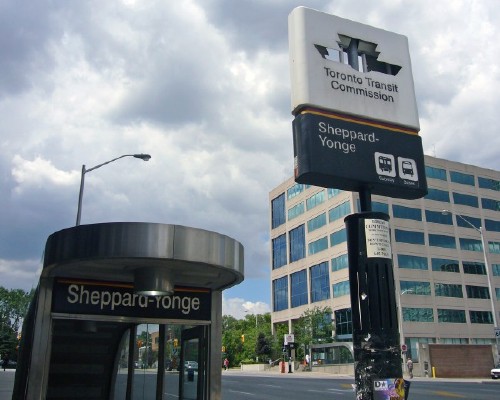
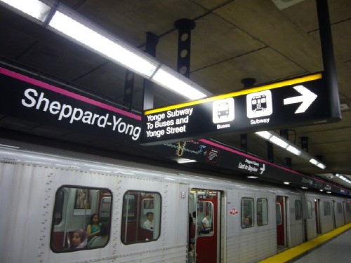
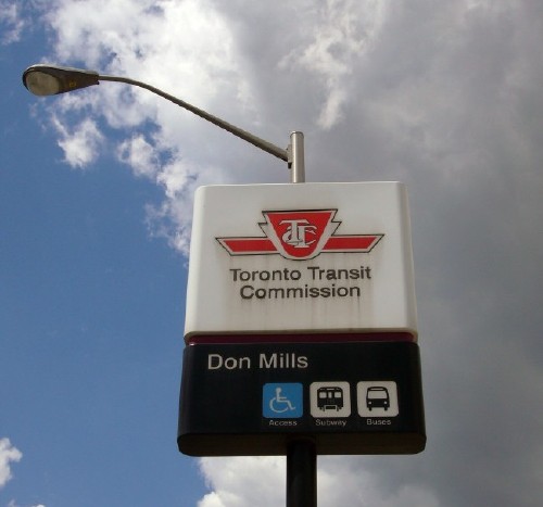
TTC drew up plans for subway expansion in the mid-1990s. New lines along Sheppard Ave. in the north end and Eglinton Ave. West in midtown were proposed and initially approved. A newly-elected provincial government cancelled the Eglinton line and reluctantly permitted construction of a stub of the Sheppard line. It would intersect with the existing Sheppard station on the Yonge-University-Spadina line and run east, terminating pretty much in the middle of nowhere at the corner of Don Mills Rd. and Sheppard Ave. East.
The five-station Sheppard subway cost $933.9 million to build (TTC 2007, E-mail). It opened in 2002. Noticeably underused, the Sheppard line carries 43,000 passengers per weekday compared to 646,000 and 478,000 for the Yonge-University-Spadina and Bloor-Danforth lines.
Bessarion station, Sheppard subway
(Craig James White)
Sheppard’s line colour is a shade of magenta or fuchsia that does not have an obvious single name, though one nickname for Sheppard when it opened was the Plum Line (Munro 2007). (The colour is also confusable to colourblind people, though intensity of colour might make it different enough to distinguish from the yellow and green lines.)
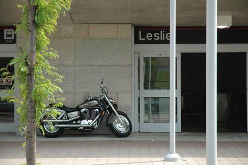
Stations in the Sheppard subway were an improvement over old stations in some respects. All stations have wheelchair access. Stations were partially heated to avoid ice buildup, the cause of a previous subway breakdown. All stations have a public-art component, and one station, Leslie (by artist Micah Lexier), uses typographic art – tiles showing dozens of examples of the words “Sheppard” and “Leslie” handwritten by residents.
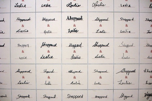
(Craig James White)
Tile was used on most walls, but not on the far side of the tracks (the train-wall side), which used bare concrete. Some older stations, like Wilson, already had concrete walls, though not as well finished and visibly intentional as the Sheppard line. But concrete walls meant that the TTC’s unique font could not be blasted into tile.
It was, moreover, decided that a new subway line needed new signage. Although a different licence might have been required, TTC could have simply implemented the Paul Arthur system. But the manager of marketing and public affairs at the time, Bob Brent, did not know the Paul Arthur system existed (Keenan 2007a), even though the St. George test had been carried out only two years earlier. Nor did any other staff point out the Paul Arthur system.
Not only did the TTC refuse to implement a tested improvement to its signage infrastructure, TTC forgot it existed almost immediately.
Instead, a new signage system was drawn up for Sheppard. (One could not really say it was “designed.”) The exact development methods have never been documented, and the manager at the time has little recollection of how the design was arrived at. Nonetheless, it is obvious the Sheppard signs are derived from Massimo Vignelli and Unimark’s system for the New York subway circa 1966 (Vignelli 1981).
But by a twist of events, another new subway station opened before the new Sheppard line opened – Downsview, the northwesterly terminus of the Spadina branch of the Yonge-University-Spadina line. The station, modelled after aircraft hangars in recognition of the area’s aerospace history, opened in 1996 to great acclaim. (TTC chair Adam Giambrone describes it as “a work of art” [Clark 2007e].)
Like the terminus of the Sheppard line, Downsview is located in the middle of nowhere (a barren field near an underused park). Downsview features a vaulted glass roof and carefully chosen tiles, including a tile wall mosaic by artist Arlene Stamp. The luxe factor caught the attention of the provincial government (Ashenburg 2002):
When it was built, in 1996, Downsview raised alarm bells at the Ministry of Transportation. David Lawson[, architectural coördinator of the Sheppard line,] summarizes the bureaucrats’ reaction to the chic, column-free layouts: “How much did this flash cost?” The designer details – what they considered “fripperies” – had accounted for 10% of the total, so when it came time to plan the Sheppard line, the ministry cut the budget accordingly. The austerity meant much less high-end terrazzo and much more exposed concrete on the floors and walls.
Downsview was the first station to get the new signage designed for the full Sheppard line. All the directional signs in the station more or less conform to the Sheppard model. There is a significant difference: Banner signage above subway platforms is backlit and shows halation. Those banners provide barely any information apart from the word “Downsview,” a few pictographs, and an arrow.
The Vignelli system used Standard Medium as typeface. Vignelli did so because actual Helvetica was unavailable in the U.S. and was certainly unavailable on the system used to manufacture signboards (Vignelli 2007, E-mail). Standard Medium is really Akzidenz-Grotesk.
The Sheppard system did not even bother using real Helvetica, settling for the Bitstream clone Swiss 721 – presumably because it came free with CorelDraw for Windows. The rationale for choosing Swiss 721 was given as follows (TTC 2007):
Swiss 721 Medium Bold Text is a licensed font, with more neutral and contemporary characteristics. It was selected as the base font for reasons of clarity and legibility, and is intended for use in all wayfinding-, information- and safety-signage applications.
TTC has never explained how it arrived at the conclusion that fake Helvetica has “clarity and legibility” or who “intended” the font for use in wayfinding and on signage.
TTC officially uses exactly one weight (Swiss 721 Md BT [sic]; TTC 2002) for all applications; not even italic is used, though some printed signs on paper use bold and, very occasionally, what appears to be Swiss 721 Narrow can be seen. (The TTC sign manual says nothing about condensed fonts and warns against electronically condensing any letters.)
Typical electronically-condensed ‘Helvetica’ (and broken pylon sign)
The New York subway system uses station names that are often just numbers, lending itself to a grid system subdividable into halves, quarters, and eighths. (Vignelli himself described the system [Lahr 1968] as using 1′, 2′, 4′, and 8′ boards.)
The short names of New York subway lines have one or two characters. Colours are important. Toronto has four subway lines that have names of variable length, no short names, and (underused) assigned colours.
Toronto has station names varying from three characters (Bay) to 18 (Scarborough Centre); the name of a proposed future station, again located in the middle of nowhere, uses 23 characters (Highway 407 Interchange). A typical short subway-station name in New York is Bowery (six characters); a typical long one is Westchester Square–East Tremont Avenue (38).
Many New York subway stations are cramped for space. The Sheppard subway was planned from scratch to accommodate future population growth and had relatively vast space available for signage.
New York is not really a model to follow. A rider group, the Permanent Citizens Advisory Committee, has published numerous critiques of functional failings of the system (e.g., PCAC 2002).
The Metropolitan Transit Authority (MTA) simply switched to Helvetica from Standard at an unknown date (in the 1970s, Vignelli thinks). Some stations now have a mix of both fonts on their signs. MTA Sign Manual (MTA 2004) states “Helvetica Medium is the standard typeface for all sign graphics for NYC Transit.... Any other forms of Helvetica (e.g., condensed, regular, etc.) or other typefaces are never to be used as a substitute for Helvetica Medium.”
An organization as big as MTA will occasionally make flat-out errors in signage, like writing “34 Streetn Penn Statio” (Triborough 2007).
Vignelli, an arch-Modernist, is committed to initial research and design integrity, not testing (Lahr 1968):
Vignelli believes that in undertaking a project of this kind, “the wrong approach is to do it on a democratic basis. There can be no democracy in something like this. It should be done in terms of imposition. There should be studies beforehand, but the moment the proposal is presented, there should no longer be anything to test. Transportation is a service, not a consumer product; there is noting to test. If the study is well done, then it’s well done.”
Vignelli is sure his sign system was never tested.
Because everyone in the Western world who can read print at all has been bathed in Helvetica for 50 years, the typeface seems like a self-evident and noncontroversial choice for “objective” communications. A sign in a subway system objectively tells you something.
It seems obvious that Helvetica is a perfect choice for signage. It isn’t, and there is no evidence Helvetica was actually chosen by TTC, which implies a knowledgeable survey of competing fonts.
Helvetica, Swiss 721, Standard, Akzidenz, and all grotesk sansserifs have letters made up of almost geometric shapes – perfectly straight lines with right-angle corners, near-perfect circles, and regular angles of diagonals. As such, all the classic confusable characters really are confusable, including Ili1, eas, cl d, rn m, and numerals.
Classic reversible letters and numbers (bdpq nu 96) really are confusable in grotesk sansserifs, a problem that chiefly affects dyslexics and others with learning disabilities that affect reading.
Default letterspacing is too tight. Especially when backlit, letters glow together (halate).
Helvetica sets too wide for signage applications.
It has already been shown (Clark and Sullivan 2002) that Helvetica performs worse than some other typefaces in signage applications. A test sign was created using text and pictographs, printed in positive (black-on-white) and negative sharp and blurry versions, and shown to skeptical engineers, designers, and marketing reps at GO Transit, the commuter railroad in metro Toronto. The blurred signs represented viewing with low visual acuity, as with cataracts, but did not represent any other visual impairment.
Under conditions of blur, several fonts tested, including Tiresias and Transit, were more legible than Helvetica, while some other fonts, like Profile and Kievit, were less legible. It is at least possible to find sansserif typefaces that perform better for signage than Helvetica does.
Separately, it is not obvious that signage fonts must be sansserif. A quick mental image of a serif font (Times, or a garalde) does not represent the kind of serif typeface that could be used for signage, which might tend toward the slabserif or semiserif model. It is an option that needs to be explored.
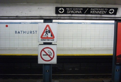
It is easy to find examples of Sheppard-style signs that perform poorly. Take this sign at Bathurst station, blurred to simulate low visual acuity, as with cataracts:
Using another font, it might be readable. But since other fonts were not tested, riders have no choice but to deal with fake Helvetica, which, under conditions of poor visual acuity, cannot be read.
Viewed in sharp focus, the sign reads as follows:
But the only vehicles that run westbound from Bathurst station are trains. Buses and streetcars run northbound and southbound, respectively. If you have poor visual acuity, you cannot read the sign. If you can read it, the sign lies to you (Clark 2007f).
TTC often does a poor job of basic typesetting. We’ve already seen examples of electronically-condensed type (others upcoming). Letterspacing can also be poor.
(David Topping)
Sheppard-style signs often have too much information and organize it badly.
Sheppard-style signs are replete with pictographs, often repeated on the same sign and even when the icons indicate something a rider has no choice but to use (e.g., a stair icon when there is no escalator or elevator).
Sheppard signs cover up old signs.
Signs seem to be created according to a checklist rather than hierarchy of information: Is there a staircase? Use that icon. Is there an escalator? Use that icon. Is there an elevator? Use that icon. Is this an exit? Use that icon. What direction does one go? Use that arrow. Repeat as many times as necessary on the same sign.
In fact, the TTC sign manual displays signs with up to eight pictographs (access, elevator, escalator, stairs, fares, parking, pickup, taxi) plus an arrow. There’s no such thing as too much information.
There is an attempt to use horizontal stripes in the subway-line colours to suggest those lines. But the system isn’t serious about it: The only other place the colours are used is on TTC subway maps, and the stripes look like decorations or dividing lines. The intended usage becomes clear only on rare dual-line signs (with two stripes right on top of each other).
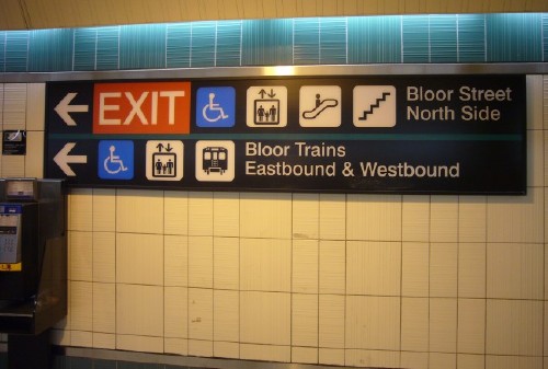
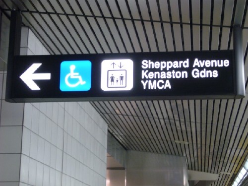
Linebreaks are nonsemantic. Multiple single-line items are stacked on top of each other. They are not differentiated from single items that occupy multiple lines of text. Carriage returns sometimes are meaningful and sometimes are not. Indention, spacing, bullets, or divider lines are not used.
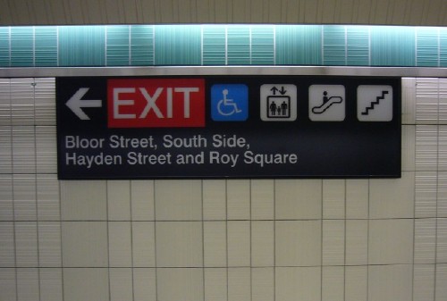
Three items (Roy Square, Hayden Street, and the south side of Bloor Street)? Or four (South Side; Hayden Street; Bloor Street; Roy Square)?
Two items or three?
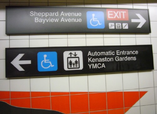
Automatic entrance to the Kenaston Gardens YMCA? Or three items, YMCA, Kenaston Gardens, and the automatic entrance?
Two items or three? (Note electronically-condensed type)
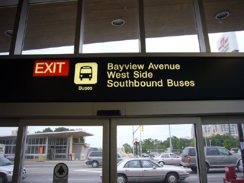
Southbound buses to the west side of Bayview Avenue?
The official Sheppard arrow is not the one used in the Paul Arthur St. George experiment. It consists of three lines, two short ones connecting at right angles and a longer one running at 45° from the intersection of the other two. The lines get thicker where they meet.
The arrow resembles two others – the “Montreal Expo arrow” used by Arthur in 1967 and the arrow officially specified in Canadian standard Z321 (CSA 1996). (The latter is claimed to be identical to an arrow in ISO 4196 [1991].) The Sheppard arrow has a shorter shaft than Z321’s and probably has a shorter shaft than the Montreal Expo arrow, but the business ends of the arrows are the same.
All these arrow types are crow’s-foot arrows. They can be interpreted as pointing backward rather than forward. A chicken’s footprint (or a crow’s) points opposite to an arrow with the same shape. However, the Montreal Expo arrow scored sixth out of 14 arrows user-tested by Garvey et al. (2004). The Sheppard arrow probably functions adequately.
The Paul Arthur arrow might have been used instead had the TTC not forgotten it existed.
TTC attempts to solve the tricky problem of indicating “straight ahead” not by using those words but by using a fake-three-dimensional arrow with forced perspective.
The TTC admitted (2007) that the Sheppard signs were built up from bits and pieces of other systems the TTC managed to notice. In other words, they tinkered – again.
The current TTC wayfinding signage standards were developed with consideration of what was successful in other systems (including the Paul Arthur test), and with regard to government regulated accessibility requirements and Ontario Building Code compliance.
The Sheppard signs were given exactly one user test – at St. George station, where the Paul Arthur signs and all the old signs were still in place. That makes at least four generations of signage, including two prototypes, all installed at the same station.
Two signboards were tested, about which we will learn more shortly. They’re still in place today. The sole reporting of results is as follows (Brent, quoted in Keenan 2007b):
It wasn’t just a matter of developing the signs from the sign manual, because we actually did tests of it. We put them up in mock-ups in St. George. Down on the Bloor-Danforth line there were two hangers close to the west end that we used to put up mock-ups of what we wanted to do for Sheppard, and we must have gone through three or four revisions to solicit feedback. I’d go down every week and look at them, talk to people, but it was basically based on... the uninformed or non-expert [opinion]. It was based on my graphic-design sense, and when I went to take some pictures at Sheppard and compared them to what’s at Yonge and Bloor, I mean, the Sheppard signs are visibly better....
The qualitative, informal research we did said it was better, but it’s not the kind of stuff [where] you can say “plus or minus 3% 19 times out of 20.” In this case it’s really an aid to your judgement.
On the TTC, subway-station names are shown on the train-wall side of the station (across the tracks from the passenger platform). Sometimes the name is additionally given on the platform side. But, as mentioned, station names are not sandblasted into Sheppard’s honest concrete walls but are shown on stainless-steel signboards.
Station names use upper case and a smaller point size than old stations. Letterspacing is so tight it recalls ITC fonts from the 1970s; it doesn’t match the letterspacing at any old stations. The signboards themselves are just big enough to hold the station name with barely any margin.
(Craig James White)
The signs look second-rate, particularly at Bayview station, where the AYV combination, tricky to kern in any font, shows looseness and tightness that would have been minimized with more, or any, tracking. (TTC kerns its font badly in other contexts, like some pylon signs and the monthly transit pass.)
I started making deputations to the Commission, and filing letters and reports, concerning TTC signage starting in January 2007 (Clark 2007a). I had a meeting with TTC marketing and architectural staff on 2007.04.03. I regularly update my Web site, Flickr photo stream, and personal Weblog (Clark 2007b,c,d). These submissions were cheerfully ignored.
St. George was the topic of some controversy in 2007. The station is dirty, and expansion joints on some walls are corroding, so it was placed high on the priority list in a TTC cleanup campaign. A TTC manager told a Commission meeting in April 2007 that some old signs at St. George would be “removed,” meaning removed and destroyed. I wrote a letter proposing that old signs be preserved and a new sign system be developed and tested. The letter was received and I made a personal presentation, but TTC commissioners refused to prevent staff from destroying old signs.
I then started a publicity campaign, which woke up the TTC enough to groggily half-understand the issue. TTC agreed not to destroy the St. George signs, but also decided to simply leave them in place (Kevin Beaulieu 2007, E-mail). As ever at the TTC, there’s no such thing as too many signs. But in fact, TTC has apparently decided that old signs will be removed upon station renovation (exactly what I was trying to prevent). A few signs might be preserved in some kind of “archives,” according to an off-the-cuff remark uttered by chair Adam Giambrone (Clark 2007e).
TTC has been as inconsistent in its response to signage issues as the signs are themselves. No one, at all, has disagreed there is a signage problem at the TTC. But chair Adam Giambrone and general manager Gary Webster went on a publicity offensive, answering every question about signage with a variation of a claim that the TTC has a signage manual, TTC applies it to all new stations, and that is enough to make people “happy.” Giambrone went out of his way to single me out as the sole critic of Sheppard-style signs (Keenan 2007a): “Other signage issues aside, I have not been advised that the current standard itself is a problem, except, of course, by Joe Clark.”
To show that complaints about the function of Sheppard-style signs are more common than the TTC thinks, I solicited such critiques from the public (e.g., Pischke 2007). Much more devastating were the remarks from the manager in charge of development of the Sheppard signs, Bob Brent (quoted in Keenan 2007b), who admitted that he could not find his way out of Sheppard-Yonge station in his walker or wheelchair.
What’s really lacking really hit home to me when I was [at Sheppard station] in a wheelchair in 2005 unexpectedly – I didn’t know how to navigate out of the station. There are all of these elevators, well, which one do I take to get out of the station? They have a sign that tells you where you are and what’s upstairs, but you don’t have a little visual of the station. I was going to North York General Hospital and it took me a half hour to get out of the station.... [I] finally made my way out after half an hour. But I wasn’t very strong, I’d lost a lot of weight after a couple operations. So that was a real striking moment.
And then a few months later I was going to a New Year’s Eve party and my friends were picking me up at the corner and it took me 15 minutes to get out with a walker. I couldn’t find an exit that would let me get out with a walker.
The man who oversaw the development of the Sheppard signs cannot use them.
Let’s look at signage in two stations as it stands at the time of writing (July 2007).
The station with more signage battle scars than any other, St. George has yet another distinction: It’s the only station with giant Sheppard-style signs... typeset in Arial.
As Brent mentioned (Keenan 2007b), St. George played host to two early prototypes of Sheppard signage. Those signs are still in place. They’re each about one subway car in length and they hang from the ceiling right across from each other on the Bloor-Danforth platform. The signboards are angled backward for easier viewing from the platform. The signs have what would be understood now as Sheppard-style features – an illegibly small map, very large type for the station name, an arrow, a statement of direction, and the name of the next station. There’s a band across the top in the colour of the line (green).
All the type is in some kind of Helvetica (perhaps Swiss 721) except the station name (“St George,” with no period), which is set in Arial. This is taking fake Helvetica to new extremes.
The Arial g (not G) in George on one of the signs is misconstructed. The bowl has been rotated 180° clockwise so that the junction between bowl and stem is twice as thick as expected. (The other sign uses a normal g.) It is not clear how such a mistake could be made, as an Arial g is not a jigsaw puzzle with pieces that can be put together upside down. This too is taking fake Helvetica to new extremes.
Remnants of the Paul Arthur signage are still in place:
The yellow and green straplines across the tops of the train walls on both platforms.
Two directional signs on the insides of exit doors (set in Gill in mixed case).
An outside pylon sign.
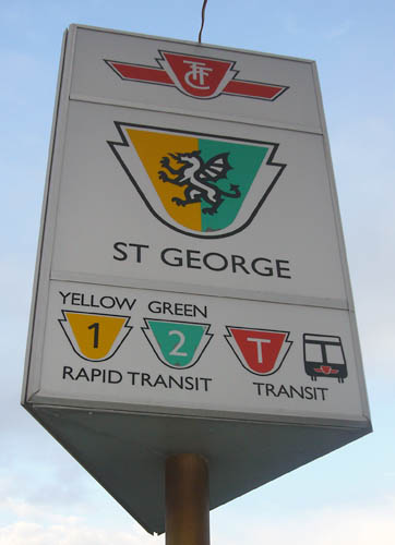
Paul Arthur pylon sign
Paul Arthur’s pylon sign has three sides (unlike TTC pylon signs, which are two-sided and invisible from a right angle); uses Arthur’s redrawn TTC logo; shows the St. George icon (a dragon) half in green and half in yellow; has Transit and Rapid Transit icons and words; and line numbers, names, and colours. A TTC employee surveyed St. George and said the pylon sign “seems pretty permanent to me” (Basso 2007).
Typical current pylon sign (not all of which match)
Mid-century lozenge pylon sign (here shown outside a TTC repair facility and office)
Some signs from the Arthur test are missing, like all the coloured backlit signs at decision points like the top of staircases and the sign on the outside of the station. The whereabouts of those signs are unknown. They were probably destroyed, and the TTC was probably the destroyer. But apparently all other signs that were ever installed at St. George in the last several decades are still in place, including 1990s-era Helvetica signs and a few period relics apparently from the 1960s. Some Sheppard-style signage is visible, as on a recently-installed elevator and on one sign near a staircase.
This little-used station, one stop south of St. George on the University branch, was a well-preserved example of original TTC style. It sits under the Royal Ontario Museum, a museum of natural history that is now known mostly for having been sodomized and parasitized by a “crystal” addition (actually flat aluminum) designed by starchitect Daniel Libeskind. But that is not the only architectural absurdity in the area.
Museum has been the site of signage intrigue twice in recent memory.
For three consecutive weekends in February 2007, in order to carry out necessary repairs, Bloor-Danforth trains were routed around Bay station. (Sections of St. George were also closed, but the station stayed open.) Trains took advantage of two features of subway infrastructure:
A Y junction (or, in TTC vernacular, a wye junction) between Bay station on the Bloor-Danforth line and Museum station on the University branch of the Yonge-University-Spadina line.
Bay Lower, a disused subway station under Bay station.
During the subway diversion, westbound trains passed through Bay Lower without stopping, then terminated at Museum. Eastbound trains passed through St. George normally, then passed through Bay Lower, then stopped at Museum.
Eastbound and westbound passengers had to leave the train at Museum and wait for another one. This became complicated, as Museum station, normally home to northbound trains on one side of the platform and southbound trains on the other, now served six directions on two tracks.
This was a period of great interest to transit fans. Bay Lower station has been in disuse for 30 years and is only ever used for training and testing and, more prominently, for film, TV, and commercial shoots. (Wayfinding tiles accessible to blind people were tested at Bay Lower, for example, a history of testing the TTC would later forget [Reed Tanaka 2000, based on 1991 research].)
Civilians never had access to Bay Lower. During the Museum train diversion, they still didn’t, but diverting trains all passed through Bay Lower. Often the trains had to stop in the station, giving transit fans a golden opportunity to press noses to train windows and snap pictures. Some journeys included history lessons announced over the public-address system.
But the pleasure ended as soon as passengers docked at Museum, where the scene was chaotic through the whole run of the train diversion.
Signs, in fake Helvetica, were posted on columns. But they were endlessly repetitive (subway icons and arrows repeated over and over again). Signboards stood over a metre tall.
A warning sign read: “Listen to Station Announcements for Next Train destination information. TTC Personnel are on the Subway Platform to assist you.” And indeed, one TTC supervisor stood there with a megaphone, unintelligibly barking out the destination of the arriving train. (The terminus station is shown on the front of the train, but it’s easy to miss. And eastbound and westbound trains never gave their termini as Museum, meaning passengers knew in advance that train-front signage could be wrong.) There was no provision for deaf people who could not hear a spoken announcement.
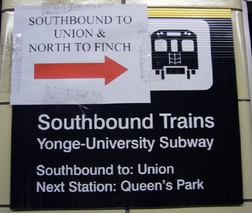
Things changed as the weekends of the train diversion passed by. Homemade signs began to appear, ink-jet-printed in Times and Times Bold caps and with red arrows. New ink-jet-printed official TTC signs also appeared, all showing a coloured line band, a subway picto, an arrow, a direction, a word (“to:”), and a terminus.
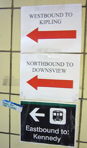
At that point, there were no fewer than four generations of signs at Museum station – the signs originally in place for decades; the metre-high column signs; homemade ink-jet signs; and official ink-jet signs. Of course, these sign types were mixed and matched. These homemade signs were even more repetitive than the original official signs. A stack of three official ink-jet signs showed three subway pictographs and three arrows, for example.
Also, unofficial ink-jet-printed signs were taped right on top of TTC signs originally installed for the train diversion.
Given that this exercise occurred over a month after I alerted the elected Commissioners to the problem of unstandardized signage, the chaos at Museum indicates that even when they know they’re being watched, TTC staff cannot get their own signage right.
But that desecration pales in comparison to an ongoing project at Museum. As part of a tax-deduction dodge for its wealthy corporate benefactors, a local nonprofit, the Toronto Community Foundation, induced TTC to remodel three stations on the University line – Museum first, then St. Patrick and Osgoode.
TCF would ostensibly pay for 75% of the cost (initially only 50%). It was originally claimed that the project “won’t cost the TTC any more money than regular maintenance on subway stations” (McGran 2005), but that was too good to be true, if not an outright lie. The budget is now $5 million for Museum station alone. TTC is on the hook to pay $1.25 million to renovate this already-functional station.
There was no public demand for a remodelling whatsoever – in fact, the typical response from the public was firm opposition (Munro 2006). A full $500,000 was handed to another starchitect, Jack Diamond of Diamond & Schmitt Architects Inc., without a public tender.
For decades, Museum was a well-preserved example of the TTC æsthetic. Nothing was broken and all or nearly all the tiles matched. Like most stations, it is inaccessible to wheelchair users. It had an odd little fenced-off area where equipment was stored. It was otherwise in good condition.
But people who like the TTC tile æsthetic have never run the TTC. The TTC chair at the time, Howard Moscoe, said “Museum station looks an early Canadian washroom, with a jail cell at the south end” (Gray 2005). The grande dame of the ROM, CEO William Thorsell, complained about deteriorating public space (Cowan 2006). “We live in a city that needs to be angrier about the quality of public space.... I think this project shows we are stepping out of the miasma.”
Starchitect Jack Diamond, who “describes the Bloor-Danforth line as ‘English Canada’s poor attempt to imitate the London Underground,’ ” has strongly implied (Bozikovic 2007) that the entire subway line needs a makeover: “There are two ways to go. If you have a remarkable design, like the art-nouveau Paris Metro or the London Underground – and you happen to be building a subway in that period – then by all means keep it all the same. Or you can give a different impression at each station of the subway, whether Bay St. or Bayview, that gives impression of what’s happening aboveground.”
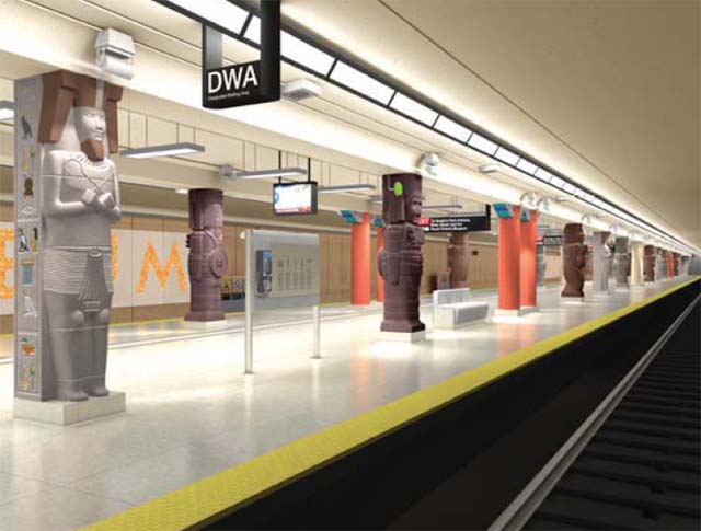
Museum station will be remodelled in keeping with the “theme” of the Royal Ontario Museum. What theme? Ancient Egypt. A public subway station will be renovated, at huge expense, so that its support columns look like mummies and sarcophagi.
The architects produced numerous conceptual renderings that never showed any directional signage at all. Wall signage looked like it came from an overhead projector beamed onto the train walls (using variously “Helvetica” or the old TTC font at six times the point size).
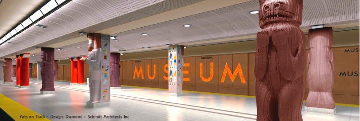
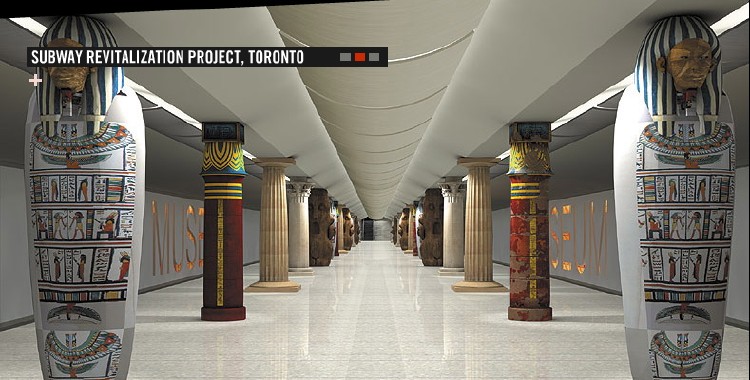
A later rendering finally bothered to include directional signage, which uses the Sheppard model. Just as it was never explained how ancient Egypt suits a 21st-century subway station built in the middle of the 20th century, it was also never explained how fake Helvetica suits ancient Egypt.
In the 1990s, TTC commissioners refused to spend $8 million to solve the signage problem (by installing Paul Arthur signs). A decade later, commissioners were willing to spend $1.25 million dolling up a functional subway station in Egyptian drag.
Ontario College of Art and Design student José Ongpin (2006) has concisely encapsulated 50 years of typographic history in four information-dense illustrations, reproduced here (PDF) by permission.
joeclark.org/design/signage/TTC/docs/PaulArthurTTC.htmljoeclark.org/atypi/2003/joeclark.org/design/signage/TTC/docs/goodrepair.pdfjoeclark.org/ttcflickr.com/photos/joeclark/collections/72157600001722464/TTC. blog.fawny.org/category/ttc/blog.fawny.org/2007/07/12/metro-moderne/joeclark.org/design/signage/TTC/docs/Webster-standard.htmlblog.fawny.org/2007/07/13/dedans-dehors/, 2007.07.13joeclark.org/design/signage/GOTransitType.pdfeyeweekly.com/eye/issue/issue_09.14.06/city/news.phpeyeweekly.com/eye/issue/issue_07.12.07/city/news.phpeyeweekly.com/daily/?p=649TTCRider.CArobotjohnny.com/2006/02/22/anagram-ttc-map/stevemunro.ca/?p=38stevemunro.ca/?p=442spacing.ca/wire/?p=2079#comment-60709OpenandClosed.orgflickr.com/photos/neuroticjose/tags/ttctypehistory/pcac.org/reports/pdf/2002%20Signage%20Report-text.pdfquadrat.com/tsr.htmlScreenfont.CAspacing.ca/intransit/torontoist.com/2006/09/69.phptoronto.transitcamp.org/ttc/, 2007.02.04flickr.com/photos/triborough/566384132/
I am a journalist, author, and accessibility consultant in Toronto. I’ve written nearly 400 articles for magazines and newspapers. My first book, Building Accessible Websites, was published in 2002. I am writing other books, none of them computer-related.
My interest in typography dates back over 25 years and coevolved with my interest in accessibility for people with disabilities. I watched open-captioned TV programs in the mid-1970s and would write a letter to the captioners asking why the w was taller than the other letters and why the quotation mark was nothing but two dots.
I worked as a typesetter, on CompuGraphic equipment, in the 1980s. I have an extensive portfolio of critical writing in publications like Print and Emigre. I wrote an irregular column on design for the Toronto Globe and Mail in the 1990s, where I first covered Paul Arthur’s work on TTC wayfinding. I gave a presentation on typography of TV captioning at ATypI Vancouver 2003 (Clark 2003).
I am setting up an accessibility research project, the Open & Closed Project (OC-Pro 2007), which will write and test standards for captioning, audio description, subtitling, and dubbing. One activity of the Project, the design and testing of new fonts for captioning and subtitling, has already started (Screenfont 2007), with some candidate alphabets already developed. I have written extensive critiques of the existing research on captioning and subtitling fonts.
My current interest in TTC typography originates in Spacing-style transit fandom. But the tipping point was my getting sick and tired of tacked-up Helvetica signage at Bathurst station, which for months advised of a route diversion that had already concluded. Even after I briefed the TTC about the signage problem, using those exact signs as an example, they would stay in place for two more months. And while writing this article, Bathurst station hosted yet another diversion that was advertised with tacked-up signs.
Will these people never learn?
Send E-mail to joeclark@joeclark.org.
I extend thanks to Arlene Gehmacher, who gave me access to the Paul Arthur Archive at the Department of World Cultures – Canadian, Royal Ontario Museum, Toronto.
Of the roughly 10,000 TTC employees, only a fraction of whom I have dealt with, I can point to Susan Reed Tanaka, manager of engineering, as being particularly helpful and informed. Unfortunately, she doesn’t run the signage program.
A special commendation to the leading transit advocate in Toronto, Steve Munro, who agrees there is a signage problem (Munro 2007) but disdains me and my approach to it. Keep reaching for that rainbow, Steve.
Copyright © Joe Clark 2007. All rights reserved. This paper and my original photographs are not licensed under Creative Commons. ATypI has a licence to distribute this document and its attachments to attendees of ATypI 2007 Brighton.