Proposal: Inexpensive, practicable typographic improvement for the Yonge line
Through neglect and intentional blighting, the Yonge line’s design consistency – Vitrolite tiles and original TTC typeface – has been destroyed. The line’s typographic consistency could be improved, though not exactly restored, without elaborate difficulty and at reasonable cost.
Use of metal sign plates
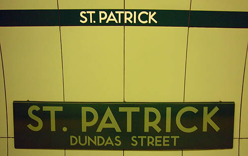
While many Yonge-line stations show their names with typography sandblasted into the walls, there is another form in use on the line – metal plates attached to the wall that show the name of the station. You find them at Queen’s Park and St. Patrick (in enamelled steel and falling off the walls) and at one end of Bloor station (in stainless steel).
My proposal is simple: Use new steel panels to cover up the Univers and other mismatched typography of the Yonge line and replace it with the original TTC typeface. That way, at the level of the visible name for each station, the entire line would be consistent.
Stations that need it include:
- King, College, Dundas (using Univers)
- Union (using Univers in a different way; see separate submission concerning a design competition)
- Queen (using an awful scrunched Helvetica)
- Rosedale (using Univers on unique tiles)
- Davisville (using Univers, with unique hanging signs between tracks)
- North York Centre (a difficult case due to the use of two lines of large Helvetica type)
We wouldn’t touch the Spadina line, which was designed as a unit to use Univers.
Downsview uses mixed-case Helvetica and doesn’t match anything in the system. It too should be retrofitted.
Procedures
- For stations other than North York Centre and Downsview (with their lengthier names), measure, design, and fabricate enamelled-steel panels matching the dimensions of St. Patrick’s and Queen’s Park’s panels. (The goal, after all is design consistency.)
- Number of panels would match the number of station names already on the walls plus three: We need extras to replace damaged signs in the future.
- Colour is an issue; the St. Patrick/Queen’s Park style, which we are emulating, uses a different shade of the wall colour.
- Develop permanent hidden mounting brackets, which will probably fall into three categories – one for textured tiles (Dundas, King, College, Davisville), one for Rosedale, and one for smooth tiles (Queen, North York Centre).
- Install.
- Host a public tour of the station upgrades.
Cost
In the high hundreds per metal sign. They’d probably have to be manufactured outside Canada. They’ll last at least 40 years.
Prohibitions
- No fake Helvetica. No Univers. No font other than the TTC typeface.
- No plastic.
- Enamelled steel, not stainless.
- No tight letterspacing (not “kerning”). Use the correct wide spacing (approximately 0.33em) rather than jamming letters as close together as CorelDraw can manage. (That’s what’s wrong with the Sheppard line, which could also be repaired as part of this project.)