In the mid-’90s, the TTC paid for a redesign of its signage system by Paul Arthur. The new system was shown to work better than the old system for all groups of riders tested. Then the TTC refused to come up with the money to implement the system across the whole subway. The new designs were shelved and ignored.
That was bad enough. But in the mid-1990s, TTC managed to make matters worse. For the opening of the Sheppard subway in 1995, TTC staff – all of them nonexperts and nondesigners – hacked together a signage “system” for the new line and, we would later see, for every future station refurbishment.
The current sign “standard” is a half-arsed clone of the New York City MTA system, designed by Massimo Vignelli and Unimark circa 1974. It looks like a copy of the New York system if all the TTC ever saw was a photo on TV. It isn’t even a decent copy.
But before discussing that, a few words about Vignelli. An arch-Modernist, Vignelli could be the most extreme living proponent of the philosophy of Less Is More. As demonstrated in his books Design Is One and Design: Vignelli, and in his appearance in the documentary Helvetica, Vignelli scarcely ever imagines a scenario in which more than one typeface needs to be used (well, two at most), and if at all possible those fonts should be Helvetica and Bodoni.
He didn’t quite get his wish with the New York subway, as, according to legend, Helvetica was not available on the systems they used to produce their signs at the time. So he had to settle for a precursor to Helvetica, Akzidenz Grotesk, sold under the name Standard Medium. (The MTA graphics manual clearly dictates the use of Standard.) Typeface was not actually “chosen” for the MTA system; there was never a choice between alternatives, because Vignelli ideologically believes Helvetica, or one of its antecedents, is the only plausible option for signage.
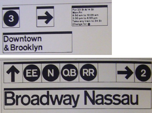
Vignelli’s design made sense for New York in some ways. Signboards were divided into halves, quarters, and eighths, which fits the often numerical station names and the single- or double-character line names just fine. There really isn’t an attempt to give a lot of information in signage, so signs can be small, which also works with ratios of two.
But there are problems.
In an interview, Bob Brent, the former TTC manager who oversaw the Sheppard signs, says:
What’s really lacking really hit home to me when I was [at Sheppard station] in a wheelchair in 2005 unexpectedly – I didn’t know how to navigate out of the station. There are all of these elevators, well, which one do I take to get out of the station? They have a sign that tells you where you are and what’s upstairs, but you don’t have a little visual of the station. I was going to North York General Hospital and it took me a half hour to get out of the station.... [I] finally made my way out after half an hour. But I wasn’t very strong, I’d lost a lot of weight after a couple operations. So that was a real striking moment.
And then a few months later I was going to a New Year’s Eve party and my friends were picking me up at the corner and it took me 15 minutes to get out with a walker. I couldn’t find an exit that would let me get out with a walker.
The man who approved the signs cannot get himself out of the subway station that uses nothing but those signs.
This may come as a surprise, but not all sansserif fonts are created equal.
It’s been 30 years since Vignelli designed the MTA system. In that time, we’ve learned a lot more about readability and legibility of signage, particularly for low-vision people. The New York signage system was the subject of not one but two comprehensive reports on its deficiencies written by rider groups. (Read one such report [PDF].) And, importantly, we’ve got way better fonts now.
The MTA quietly altered its sign standards to use actual Helvetica sometime in the 1980s. The result? Two different fonts in the same system, sometimes in the same station.
Not satisfied with merely ripping off somebody else’s design, the TTC cannot even clone Vignelli right. The current TTC sign manual clearly states that the font to be used is Swiss 721 – Bitstream’s unlicensed copy of Helvetica. In other words, TTC requires the use of a pirated font design.
TTC also pirates the actual font files. The same manual instructs staff to hand font files to printers, a clear case of illegal copyright infringement.
If the Vignelli system was ever tested, at all, with anyone, those results have not been published. In another duplication of New York, the TTC’s Vignelli clone was also never tested.
We could waste our time writing a whole treatise on what’s wrong with the Sheppard-style system. Let’s just make a list.
You may also look at illustrations extracted from the current signage manual.