
Updated 2005.03.14
Here are some notes and references on Web accessibility. If you’re looking for my 2005 presentation, it’s somewhere else.
How many people with disabilities are online?
Figures with greater scientific credibility are hard to find, but they exist.
The Survey on Income and Program Participation (SIPP, 1999, carried out by the U.S. Department of Commerce, Economics and Statistics Administration, National Telecommunications and Information Administration) found the following basic statistics on disability groups:
The number of people with certain disabilities and “access” to the Internet was also surveyed.
By contrast, 56.7% of nondisabled people have Internet access.
A University of California, San Francisco study from the year 2000 [PDF ¶ HTML] uses a broader definition of disability (“work” disability, which, for this topic, does not break down specific disability categories, like blindness or deafness). In that study, “[o]nly one-tenth (10%) of people with disabilities connect to the Internet, compared to almost four-tenths (38%) of those without disabilities.... Of the 21 million Americans with work disabilities... only two million ever use the Internet.”
This same study also finds very low usage rates of adaptive technology other than white canes: “A very small number of people (3% of blind persons and 0.1% of those with low vision) specifically [mention using adapted] computer equipment.” It is likely that many low-vision people do not need adaptive technology, but these numbers are still surprisingly low.
The World Wide Web Consortium’s Web Accessibility Initiative (WAI) publishes the Web Content Accessibility Guidelines (WCAG, annoyingly pronounced “wikagg”), the only international standards available for Web accessibility.
These Version 1.0 guidelines are old and out of date, but the new Version 2.0 is nowhere near ready, so we’re stuck with 1.0.
For a more extensive listing of accessibility laws, see the Web AccessiBlog: Government requirements; Lawsuits.
§6 states:
The Government of Ontario shall provide its Internet sites in a format that is accessible to persons with disabilities, unless it is not technically feasible to do so.
No other Web sites are covered by this legislation – just the provincial government’s.
In the U.S., Section 508 of the Rehabilitation Act requires most government departments and agencies, some contractors, and some recipients of government funds to meet certain accessibility standards, which are functionally equivalent to the Web Content Accessibility Guidelines in most respects.
Human-rights codes almost certainly apply to the Web. In Australia, Bruce Maguire pursued a successful complaint against the Sydney Organizing Committee for the Olympic Games. No similar complaints are known to have been filed in Canada, but the relevant legislation is nearly identical.
Recent cases in the U.S. under the Americans with Disabilities Act have been mixed. A complaint against Southwest Airlines was dismissed (see counterargument), while another case against the Atlanta transportation authority was upheld.
The two most important mailing lists in Web accessibility are WAI-IG (Interest Group) and Webaim. If you’re interested in working on the Web Content Accessibility Guidelines, read the WAI-GL (Guidelines) list.
Feel free to post question and URLs for site critique to the WAI-IG or Webaim lists.
My Web AccessiBlog, which I really ought to update more (anybody want to automate it?), contains listings of hundreds of accessibility-related topics, with an entire page of other Weblogs on accessibility. One-stop shopping.
You can look up various screen-reader models at the AccessiBlog, too.
My other sites:
You might find my glossary of accessibility terms useful.
First, you may simply wish to download the PDFs I used as extremely persuasive visual aids:
A few other PDFs you could look at (which I have on hand in case people ask related questions):
Or you might wish to read these explanations of selected images, only some of which were used in the presentation:
| Category | Issues and examples | |
|---|---|---|
Tab order |
This huge and neglected topic looms large over Web accessibility – at least as soon as accessibility to images (through Nondisabled visitors can experience a site in random order, picking and choosing where to look and what to do based on a range of heuristics that are at least passably understood by usabilitistas. But if you’re using a screen reader or Braille display, or if you have a mobility impairment that precludes moving anywhere you like on the screen at whim, then your experience of a site becomes serial – one item after another after another. |
|
Here, a New Brunswick homepage stacks multiple upper navbars atop an impenetrable nest of non-obvious blocks of links. You have to get past the navbars and somehow navigate among the blocks. |

|
|
Merely to fill out the form on this PEI page, you’re stuck tabbing past the upper icon navbar (which traverses in rather surprising right-to-left order), then the PEI wordmark and the full left-hand navbar, and then finally arrive at the first |
 |
|
Tables |
Contrary to popular belief, it is not forbidden to use tables for layout – either in the HTML spec (which states merely that tables “should not” be used for layout) or under WCAG (“should avoid”). Current screen readers contain a plethora of commands to navigate within tables. There’s even some intelligence to detect a navbar and give the option to skip that. Tables are still moderately inconvenient to use for this disabled group, but only moderately. The issues, then, are:
|
|
This Ontario-government form seems to be a worst-case scenario in numerous ways:
|

| |
|
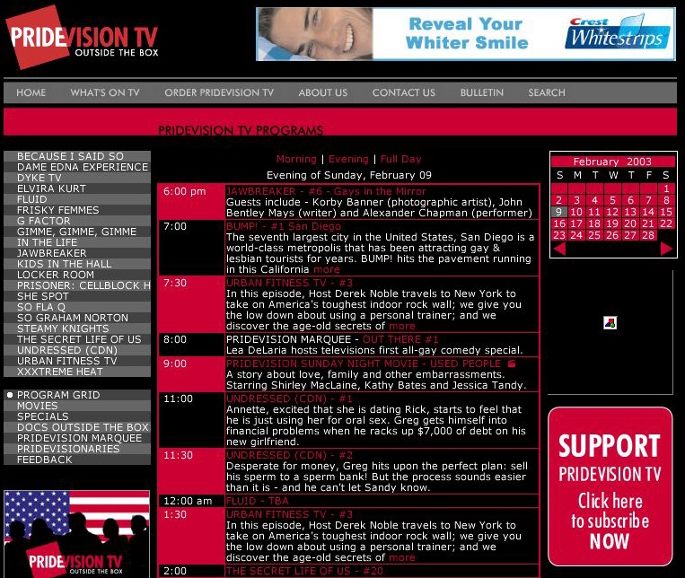
Here, the PrideVision schedule:
Moreover and the two data tables on the page, namely the program schedule and calendar, lack adequate table-header markup. |
| |
Forms |
Forms can be somewhat inconvenient for a mobility-impaired person in that simple movement among fields is as tedious as movement in general. However, the big issue is accessibility to screen-reader users. (I don’t have a clue how to fill out an online form using nothing but a Braille display.)
HTML offers several elements and attributes, including It then becomes at least possible for a screen-reader user to know what the form control he or she is using actually refers to because the underlying HTML includes an unambiguous correlation between the control and the explanation. In conventional Web design, we try to create online forms that look like printed forms – with labels right next to the control, all tidy-like. Generally these layouts are achieved with tables. The problem?
The easiest and most usable solution is to give up on side-by-side layout of form labels and controls and use every HTML accessibility feature to the hilt. The result will, in many cases, be single-column forms. Now, if you’re very committed to print-typography-style forms, can stylesheets position form elements in a quasi-tabular way?
Note that I appear to have given incorrect information at the meeting. It appears that screen readers have no problem associating a These remain hypothetical issues. I don’t know of any real-world commercial sites with really accessible forms. We could do a test case with a SXSW volunteer, if desired – setting up a conventional-style complex tabular form and an analogue using improved design techniques. We could then promote the test pages online and ask screen-reader makers and users to try to break the page. We have some indication, then, that HTML used for forms as typically found on real-world Web sites unnecessarily replicates print typography and is too complex for mobility- or visually-impaired visitors. Phew. |
|
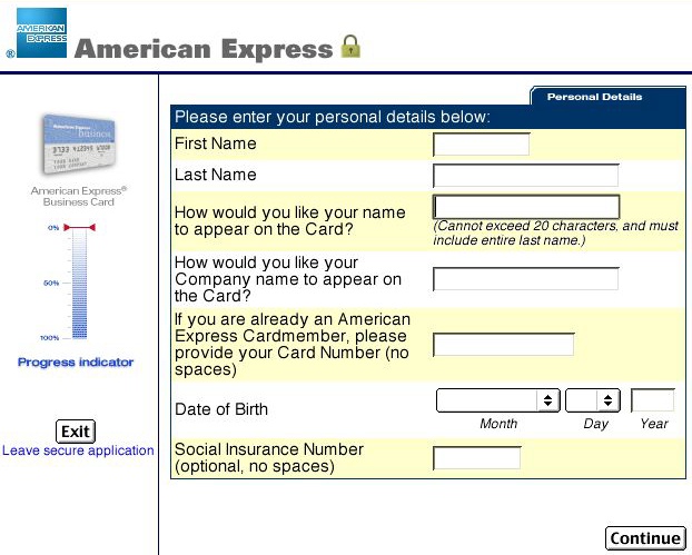
In this AmEx credit-card application, labels and controls span |
| |
|
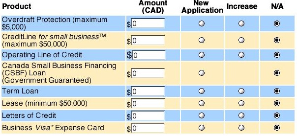
In this Visa example, too many competing functions are crammed into a single table. You the user are expected to:
No amount of accessible HTML markup can salvage this example. It’s confusing for a nondisabled person and essentially unusable in serial access under a screen reader. In a case such as this, it would be preferable to ask a series of questions (product type first? new or increase? amount?) either on consecutive screens, à la a shopping cart. Or use a form that auto-expands based on the context of the visitor’s responses. For a non-corporate example of the latter (PlanetOut personal ads!), see p. 294 of my book. |
|
|
You were here: joeclark.org → Media access → SXSW presentation