![[Joe Clark: Design] Joe Clark: Design](/design.gif)
![[Joe Clark: Design] Joe Clark: Design](/design.gif)
1. The National Captioning Institute’s registered service mark identifying the programs which they (and only they) have captioned. This symbol is recognized throughout the television industry. Designer: Cheryl Kaplan, Diana Graham/Graphic Design, New York.
2. The Caption Center’s logo for closed-caption[ed] programs. This design is not copyrighted and may be used to identify any closed-captioned program. The legibility suffers somewhat in small sizes, but the “CC” within a television frame is immediately understandable.
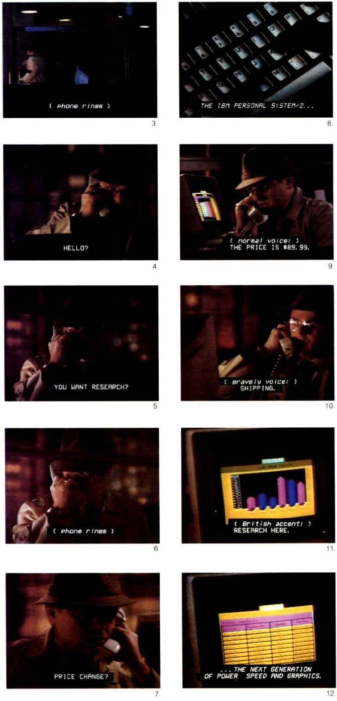
3–12. Commercial for a microcomputer in which the actor’s versatility suggests the computer’s flexibility. The telephone rings (note Caption Center’s standard style for sound effects: Lower-case italic between parentheses) and the actor changes his voice with each call to make believe he is more than one person. In Fig. 8, we know the narrator announcer is speaking because the captions are italicized. In Figs. 9–11, the captioners did the sensible thing and wrote out the voice changes; the colon isn’t really necessary inside the parentheses. NOte also that “gravelly” is misspelled.
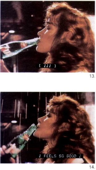
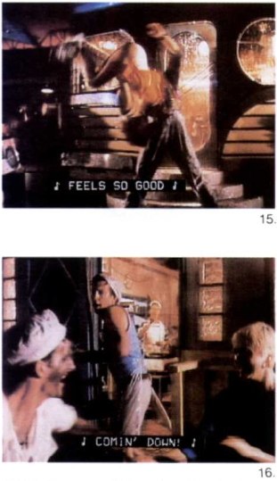
13–16. A song-and-dance-in-a-thunderstorm commercial for 7Up, captioned by the Canadian Captioning Development Agency. The [|||] in Fig. 13 is superfluous since the singing doesn’t start till the next scene. According to CCDA custom, the only end punctuation is at the finale of the song (Fig. 16), where the exclamation point is essential. These captions are ambiguous: The singer in the commercial is actually offscreen, so a more rigorous captioner might have set the lyrics in italics. In Fig. 14, the caption is displaced to the right slightly to avoid covering the product.
17–20. In this United Kingdom commercial for Heineken, a satire of black-and-white Eastern Bloc art films, the actors speak in Czech with English subtitles in the first half, and Cockney English with Czech subtitles in the second half. The BBC uses the font shown – complete with proportional spacing, upper and lower case, and variable colours – for its subtitling and captioning. A very important advantage of the BBC font is its enormous range of accented characters.

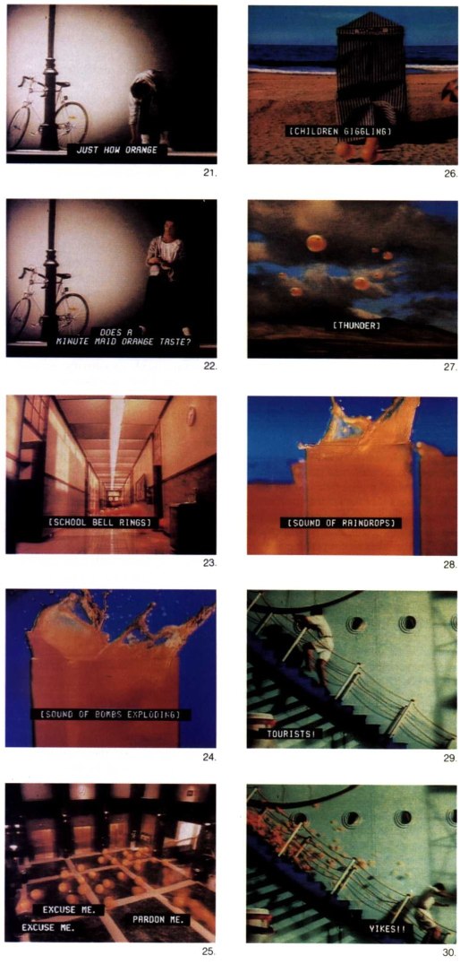
21–30. Commercial for Minute Maid, in which oranges cascade from every corner to show how intensely orange the soft drink is. Italicized captions in Figs. 21 and 22 show that the narrator, not the actor, is speaking; note the centring in four-space blocks (Fig. 22). As the commercial proceeds, a range of sound effects is introduced, all of which the National Captioning Institute captions as descriptively as it can, given the fleeting nature of the images. As the oranges pile out of the elevators (Fig. 25) and bump into each other, viewers see how captioners typically show simultaneous speech – in discrete little caption blocks. In this case, it really isn’t important exactly who said what, so caption placement isn’t critical. Finally, the captions follow a man as he runs from left to right down the steps (Figs 29, 30).
31–35. Commercial for Canada Dry features Grace Jones singing “Ain’t She Sweet.” Note the eighth-note characters which indicate music. The captions are set at centre bottom since it’s obvious who is speaking. The Canadian Captioning Development Agency’s annoying habit of setting parallelogram-shaped captions (not centred and with no flush margins) shows up in Fig. 31; captions like this look more like mistakes than design. CCDA omits a lot of punctuation: Figs. 32 and 33 need a comma and quotation marks. The double eighth notes denote the end of the song, but look out of place so close to a single eighth note. In Fig. 34, CCDA moves the caption to screen top to avoid obscuring the product. It could, however, have been made to fit at screen bottom on the right. Here, the actress is humming a tune – a significant fact not necessarily obvious to the deaf viewer. (There are such things as insignificant sound effects, but this isn’t one of them.) Here, we see CCDA’s unique and unattractive practice of setting spaces inside the brackets. The lack of accent marks, an annoying fault of North American closed-captioning, is also evident. Fig. 35 shows how French looks in white-on-black upper-case letters without accents; note that the second line is indented by four spaces, which is the smallest increment closed captioning allows. (The black spaces at the extreme ends of each line are part of the technology.)

36–39. In this commercial for Ontario Racing, even though there is ample room at the bottom of the screen for the captions, CCDA sets them at the top. Logic suggests that covering up wardrobe would be less jarring than covering up a forehead. This series illustrates CCDA’s bad habit of italicizing arbitrarily (Fig. 36). Finally, Fig. 39 shows how CCDA very sensibly avoids obscuring the on-screen graphics by pushing the caption to the right.

Updated 2003.08.17
You were here: joeclark.org → Design → Print articles → Typography and TV captioning → Illustrations