
The Captioned Media Program (CMP) is an arm of the National Association of the Deaf that uses U.S. government monies, and a few other minor funding sources, to caption audiovisual media for home-video, educational, and online use. CMP is, for some reason, located in Spartanburg, South Carolina, though it uses many accredited outside captioners. In fact, CMP’s process of accreditation is sometimes viewed as a model for other efforts in captioning standardization.
CMP has published its “style guide,” as such documents are somewhat derisively called, for a number of years. As far back as 1989, CMP refused to mail me a copy of the Captioning Key because I was outside the United States. Fortunately, CMP has come to its senses somewhat and now publishes the Captioning Key online – in an untagged, overlarge, ill-designed PDF with unnecessary prohibitions against even copying and pasting text from the document.
The Captioning Key is, additionally, often cited as a reasonable and research-based manual on how to caption. In fact, it has a wide range of problems and needs urgent revision.
This review concerns the 2006 Captioning Key: Guidelines and Preferred Techniques by Jason Stark. I got the author’s name from the PDF metadata; it isn’t in the actual document.
Captioning is the process of converting the audio content of a television broadcast, Webcast, film, video, CD-ROM, DVD, live event, and other productions into text which is displayed on a screen or monitor.
“Converting”? What we’re doing is transcribing, not “converting.” (Additionally, it’s “or other productions,” not “and.” As written, we aren’t truly doing captioning unless we’re doing it to seven or more genres all at once.)
“Captions... display words as the text equivalent of spoken dialogue or narration”: No, they do not. A text equivalent is an alt text and applies to images and other “non-text content.” Captions display a transcription of speech. (Narration is “spoken dialogue.”)
“It is important that the captions be... equivalent and equal in content to that of the audio”: Apart from being as grammatically questionable as many other sentences in the Key, this declaration essentially precludes editing and mandates verbatim captioning. Yet, in the very next paragraph, we read:
The CMP captioning philosophy is that all media should incorporate as much of the original language as possible; words or phrases [that] may be unfamiliar to the audience should not be replaced with simple synonyms. Extreme rewriting of narration for captions develops problems of “watered-down” language and deleted concepts. Do not censor language unless previously done in the audio. Editing should only be done if required to meet the specified presentation rate.
Again, the writing is poor here (“rewriting of narration for captions develops problems”) and CMP is simply not being consistent. Either we edit or we don’t; in the former case, it becomes a question of when and how, and this paragraph gives blanket permission to caption for reading rate.
(By the way, what does “unless previously done in the audio” mean? If one uttered “damn” was overdubbed with “darn” but a second “damn” was not, which word do we caption? If we’re trying to say “Do not attempt to alter the caption transcription by replacing swear words with other words,” then say that.)
Later, we are told that “[m]any educational, special-interest, and theatrical videos are not scripted to allow the time necessary for the process of reading captions and often have extremely rapid narration/dialogue. Therefore some editing may be necessary.” Define “some.”
The next point states that “lower- to middle-level educational videos should be captioned at... 120–130 wpm.” Upper-level videos “may be captioned slightly above” that. “No caption should remain onscreen less than two seconds” in any case listed in the manual.
“Adult special-interest videos” – this is apparently CMP jargon; it isn’t defined – “require a presentation rate of 150–160 wpm.” But so do children’s movies, paradoxically. “Adult movies should be captioned at a near-verbatim rate, but no caption... should exceed 235 wpm.”
“[C]aptioning agencies are expected to research spelling, capitalization, and punctuation. Company scripts are not always reliable.” What “company”?
CMP has onerous requirements to report the research carried out to verify spellings. Not only do you have to do the research and spell the word right, you have to reproduce the word on a list and cite your source. While I do not disagree with the approach, it is a lot of work.
The Key resorts to lazy ready-made phraseology when it states that “Closed Captions (CC)... are invisible without a special decoder.” Many kinds of captioning are closed, and nowhere is it stated that decoders ceased to be “special” in 1993, when the Television Decoder Circuitry Act came into effect.
The claimed “Closed-captioning sample” is an atrocity. It would be a 30-second job for someone to pull out a digicam and snap a picture of a real TV screen with real Line 21 captions. Instead, CMP falsifies reality and uses a still picture overlaid with Arial (!) type in a huge rectangle.

It always amazes me when people try to fake the appearance of closed captions. There always seems to be an attempt to make them look better than they actually do. CMP has a fair-use right under U.S. copyright law to reproduce one frame of a television production for this purpose.
The Key recites blandishments about HDTV captioning:
But we’re not done yet. A section entitled “Subtitles for the Deaf and Hard of Hearing (SDH)” reiterates various half-truths. (Incidentally, Lee Jordan of Captions, Inc. claims to have coined that term.)
These are similar to subtitles used for foreign films
I don’t see how they are, unless the comparison is one of typography, which I’ll cover in the next section.
but also include information such as sound effects, speaker identification, and other essential “nonspeech” features. The CMP captions are this type. Sometimes they are called “open captions,” though this term most often refers to “closed captions” made permanently visible by duplicating copies of a closed-captioned video while [a] decoder is engaged.
Captions of many kinds can be “open” or “closed.” When discussing analogue TV, “closed captions” can only be Line 21. But other media permit closed captioning, and you can use open captions anywhere. Open captions are rare, but I can attest from experience that they are seldom, if ever, decoded closed captions. (The last time I saw such a thing was when I set up a project for CBC reusing Line 21 captions online. Those were decoded TV closed captions.)
The Key then goes on to explain that subtitles, “as well as some SDH captions, are displayed using the mediums menu option [sic] on DVDs and the Internet.” I see.
The illustration for SDH uses Arial Black in mixed case and is almost as fake as the “closed-captioning sample.” The whole section is bookended by claimed “definitions”:
- Types vary according to how the captions appear, how they are accessed, and what information is provided.
- Methods vary according to when the captions are created or displayed.
Aren’t “access[ing]” and “display” the same thing? (Do you not “access” captions to “display” them?) Are closed captions a type or a method?
First, the typography of the document itself is dreadful even by the standards of Windows users, who never met a font they couldn’t misuse. (The Key is actually a Microsoft Word document in disguise.) Pretty much the whole document is typeset in Verdana, with full justification (always “classier”), too large a point size, and too little leading.
More pressing are the Key’s requirements for typography of captions. It’s a complete mess and needs to be rewritten from scratch right away.
The CMP requires pop-on captions in upper- and lower-case letters with descenders. Characters must be Helvetica Medium or a font similar to it. These captions have good resolution and fit the requested 32 characters to a line.
CMP reveals its poor understanding of onscreen reading in its seemingly absolute requirement to use not merely Helvetica but Helvetica Medium.
The grotesk family of sansserif fonts is unsuited to captioning and subtitling. Of course second-rate subtitlers use it, or its bastardized cousin Arial, and will swear up and down that it’s just fine. It isn’t, and I’ve documented the reasons elsewhere. To sum up:
It is not clear why Helvetica Medium is specified. I assume it went something like this: At one point, some captioning contractor used Helvetica Light, or a lousy knockoff of the book weight of Helvetica, in a captioning job; one person complained; and then CMP overextended its near-nonexistent typographic knowledge and issued a new rule.
Sometimes bolder type works better onscreen, sometimes it doesn’t. Readability of onscreen type is heavily influenced by spacing. Helvetica Medium is not guaranteed to be more legible than the book weight, and probably will be less legible because the default spacing will be the same and counters will be filled in. That certainly seems to be happening in one of CMP’s illustrations:
It’s the wrong solution to a problem that CMP cannot even articulate properly.
In any event, CMP blows its own requirement out of the water by permitting “a font similar to” Helvetica. Why not just be honest and give up any pretext of supervising captioners’ font usage? CMP must know perfectly well that allowing “a font similar to” Helvetica is a license for two-bit captioning shops to use Arial, a bastardized Helvetica knockoff seen as an atrocity by type experts. (The illustration above uses Arial Black.) While that exemption also permits, for example, Univers or Akzidenz Grotesk, in practice they won’t be used.
Additionally, explain what a font similar to Helvetica might be. Optima? Syntax? Balance? Flyer?
There are further redundancies: “Characters must be sansserif, have a drop or rim shadow, and be proportionally spaced.”
The manual then goes on to say “If possible, translucent box is necessary.” Do you want drop (or “rim”) shadows, or a character mask, or both? Around the minimum outline of characters or around the full rectangle of all lines?
And yet further redundancies: “The font must include upper- and lower-case letters with descenders that drop below the baseline.” Descenders always do that. Few typefaces are all-caps.
The spec goes right on to blow a discussion of leading: “Pick a font and spacing technique that does not allow overlap with other characters, ascenders, or descenders.” Well, of course you aren’t going to do that. To avoid it, even the 1px or 2px extra linespacing used by default in typographically substandard captioning software will suffice.
“If possible, use accent marks, umlauts, and other indicators.”
CMP states, out of nowhere, that “[c]aptions that have two or more lines must be left-aligned.” Why? In a nature documentary with only a single narrator, why not use bottom-centre positioning? A case can be made for flush-left positioning, but it has not been made.
The rule also permits centred single-line captions (which “should be centred on line 8,” the bottommost line). But later we are instructed that, “[i]f speaker is offscreen, place captions to the far right or left, as close as possible onscreen to the offscreen speaker” (sic). So you can caption a show with centred single-line captions alternating with flush-left and “far-right” two-line captions and still pass muster.
The handbook almost urges captioners to edit captions down to two lines even if the third line could merely be a speaker ID. (“When a speaker cannot be identified by placement and his/her name is known, the speaker’s name should be in parentheses.” Well, there goes one line of caption text.) Later explanations contradict that requirement, e.g.: “If essential sound effects are used simultaneously with captioned dialogue, they must be placed at the top of the screen.” Suddenly the viewer must read top and bottom of screen simultaneously, and how are we going to manage this configuration while also hewing to two lines of captioning?
The Key continues to contradict itself: “For media with one offscreen narrator and no pre-existing graphics, captions should be left-aligned at centre screen on lines 7 and 8.” How does one left-align a caption at centre screen? Perhaps they’re trying to tell us to take the width of the longer line of the finished caption, centre that line, and make the other line flush left with that line’s left margin. If so, what this produces is a series of flush-left caption blocks at unpredictable and jumpy horizontal locations.
CMP betrays its ignorance of psychology of reading by showing an example of acceptable and preferred captions:
- Acceptable
- I wish to seek your approval.
- Preferred
- I wish to seek
your approval.
Six easy words like that should really be one line. Forcing them into two lines increase the number of fixations required and makes reading slower (in general, 40 milliseconds vs. 30 milliseconds, according to Taylor and Taylor’s Psychology of Reading, p. 123).
CHUM has this same nonsense in its own style guide. I’ve seen them turn five-word captions into two lines.
CMP replicates Captions, Inc.’s nutty and risible requirement to indent a line by two spaces if its words are the same as the preceding line’s. “However, if two caption lines begin with the same word – but are not identical sentences – the second line should not be indented.” Where is the evidence of psychology of reading to back up this nonsense? And why don’t we see this effect anywhere else in written English?
You are forbidden from mixing roman (misspelled as “Roman”) and italic type in the same caption “except in cases of word emphasis.” You have to italicize a word “the first time [it] is being defined.” You have to italicize a speaker ID if the dialogue is italicized, for some reason. (The speaker ID is not an utterance and is not coming from an onscreen or offscreen source.)
But the very best part? The very best part is this: “Excessive slanting of italics should be avoided.” If you use a real italic (or, in the case of Helvetica Medium “or a font similar to it,” a real oblique), the problem goes away.
For sound effects, we are told to “[a]void use of discriminatory terms.” Whatever might those be?
Do we need two guidelines for the following?
- Sound effects necessary to the understanding and/or enjoyment of the video should be captioned.
- Caption background sound effects only when they’re essential to the plot.
Do you know what a “concrete” vs. an “abstract” term is? Which category would you assign to the words in the pair running/galloping or bird/robin? Yet the advice is “When possible, use concrete rather than abstract terms to describe sounds.” Clear as mud. (Or concrete.)
CMP commits the common mistake of captioners who are halfway there: “When people are seen talking but there is no audio, caption as [no audio].” You may do that only if there is absolute silence. If there’s any other sound, then there really is audio and [no audio] lies to the audience. Alternatives include [no voice], [no audible dialogue], [mouthing words], [mouths “Call me”].
And this advice is another example of being halfway there: “When a person is already identified and is not onscreen but has started speaking again” – are you still with us? – “caption as [voiceover].” What’s wrong with being much clearer, viz. [Vincent narrating] or [girl thinking]?
CMP also seems to be in love with onomatopoeia. In an illustration, a wolf is captioned thus: grrrrrrrrrrr (yes, 11 ns). They’re trying to use research from a Gallaudet study to back this up, but it really only works for kids. (An interesting example is NCI’s captioning of Sesame Street, in which sound effects are captioned by the standard onomatopoeia used in English, like RING RING or MEOW.)
Then of course there is the issue of disagreement in writing onomatopoeia. If you see [mortars exploding], do you automatically associate it with the onomatopoeia kerboom! (including the r)? Well, that’s the example they give.
Ongoing sound effects are mishandled. The following advice is correct but insufficient:
If description is used for offscreen sound effects, it is not necessary to repeat the source of the sound if it is making the same sound a few captions later. Examples:
- First caption
- [pig squealing]
- Later caption
- [squealing]
In fact, what the second caption should say is [squealing continues]. If the squealing keeps on going for a long time, perhaps interspersed with other sounds or dialogue, it does indeed become necessary to remind us of the source: [pig continues squealing]. The example, in any event, conjures unpleasant connotations and should be replaced.
The Key gets its grammar wrong. “When describing a sustained sound, use the present participle form of the verb.” It’s actually the progressive aspect (dog barking). “When describing an abrupt sound, use the third-person verb form.” That’s the indicative aspect (dog barks).
Unsurprisingly, the manual counsels poor typography, suggesting speaker IDs like female #1 (omitted parentheses sic). Don’t use a number sign, and “female” may be more appropriate for captioning dialogue from aliens or animals than people.
The manual is weak at best about copy-editing and authorities to use for it. It recommends an online dictionary, i.e., a free Web-based dictionary rather than something actually authoritative like the Oxford American or an online Oxford English Dictionary subscription. The Key contradicts itself and states that “[c]aptioning agencies are expected to... [u]se a reputed dictionary.”
“Only as a last resort are proper nouns researched on the Internet,” which may be a bit of a limitation when captioning videos about the Internet.
Then we have these gems, which simply give up the ghost:
Written English rules on capitalization are difficult. First of all, there are a seemingly endless number of rules to master. Second, the authorities themselves don’t agree on the rules. Try to remember the basic purposes of capitalization: To load special significance into words and to give importance, emphasis, and distinction to words [not “special significance”?]. [...] It is not easy to determine the appropriate punctuation for written language. Spoken language sometimes appears improperly constructed when put into written form and can be even more difficult to punctuate.
Essentially, this advice boils down to “Jeez, is English hard or what?” We are paying you the big bucks to be competent at written English. The advice sounds like an apologia to a remedial reading class.
Transcription of [certain] speech constructions sometimes requires use of punctuation that is unique to the captioning process.
I know of very few examples (quotations extending beyond one caption, >> in live captioning, rendering of numbers, dashes in Line 21). But no examples are given.
CMP permits comic-book-style extended exclamation points. Actual example: aaaauuuggghhh!!! (Was that found in their online dictionary? And are they unaware that we tend to repeat letters at most twice, resulting in three, not four, letters?)
The concept of en and em dashes completely eludes these Windows users, as it so often does.
Nonetheless, under no circumstances save for discussions of such dashes themselves does one use hyphen-hyphen, as the CMP manual counsels and illustrates by example. (It says “double hyphens or a single long dash,” but “single long dash” is not defined, probably because they don’t know what it is and how it differs from other dashes. And only double hyphens are shown, without spaces on either side.)
Question for CMP: How many captioning jobs come through the door in which the double hyphens produce a linebreak between the hyphens? You may be further unaware that hyphens and nonbreaking hyphens are two different things, neither of which is an en or em dash.
The manual covers the issue of stuttering (“caption what it said” using hyphens), but CMP does not understand the problem well enough to differentiate between beginning- and middle-of-sentence examples. (Are the repeated letters capitalized at the beginning of a sentence or are they not?)
The rare example of fingerspelling is covered, which would only be captionable if an interpreter or the signer actually spoke the letters separately. The hugely more common example of spelling a word out loud is not covered. Nor are spelling bees, dictées, and quizzes, where spelling of words is the point.
The manual initially doesn’t tell us what to do with ellipses. Space afterward? (The example given has none. Later there’s a section forbidding the use of spaces on either side.)
It does very sensibly tell us not to “use ellipsis” – actually called suspension dots in this context – “to indicate that the sentence continues into the next caption.”
The Captioning Key actually permits neutral quotation marks! It also misapplies quotation marks to “titles of books, periodicals, plays, films, videos, short stories, and other titles of complete works,” all of which titles are italicized save for short stories. We are also incorrectly told to use quotation marks for “names of individual ships, trains, airplanes, and spacecrafts [sic].”
The following advice is incomprehensible:
Use quotation marks for onscreen readings from a poem, book, play, journal, or letter. However, use quotation marks and italics for offscreen readings or voiceovers. [...] Italics should be used to indicate: A voiceover reading of a poem, book, play, journal, letter, etc. (as this is also quoted material, quotation marks are also used).
The manual correctly instructs us on the use of quotation marks in passages quoted across captions (opening on all but the last, closing on none but the last).
The staffnote, ♪, is misnamed as “music icon.” It isn’t an icon, among other things. And we have the usual nonsense that we are to use two staffnotes at the end of the last line of a song. Why, exactly?
But we’re not done yet: “For background music, place a [staffnote] in the upper right corner of the screen.”
In a rather bizarre practice I see replicated at CaptionMax and at a few mom-’n’-pops, speaker IDs are in all lower case “unless the character is being used as a proper name.” (It uses the infelicitous example of iguana/Iguana. Several examples from The Simpsons might be applicable here, or the several fictional characters named Horse or Cat.)
Multi-caption utterances “should be broken at a logical point where speech normally pauses.” Speech does not normally pause; it is a continuous stream. (No, there are no pauses between words. Listen sometime.) But you can break a caption anywhere if any part of it might occupy 33 or more characters.
The Key completely blows it in giving advice for multiple speakers. This exceedingly important practice, one of the few that distinctly differentiates captions from subtitles, is glossed over in a single bullet point.
When people onscreen speak simultaneously, place the captions underneath the speakers. Do not use other speaker-identification techniques like hyphens.... If this is not possible due to length of caption or interference with onscreen graphics, caption each speaker at different time codes.
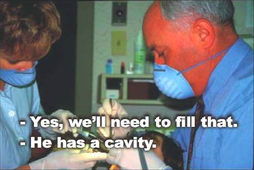
— HYGIENIST: He has a cavity.
— Yes, we’ll need to fill that.
Next we are forbidden to move captions to correspond to a speaker’s movements onscreen – “one placement... must be used. Confusion occurs when captions jump around the screen.” No, it doesn’t. Why not just require invariant bottom-centre positioning? If you can’t clearly see moving mouths or other proof of who’s talking, “confusion occurs” when a character moves but the caption doesn’t. What if the caption is now superimposed over somebody else? The speaker isn’t necessarily the only character moving.
This segment also fails to handle the case of a sequence of caption with onscreen and offscreen views of the same speaker. Do captions stay in the same relative place? Or do they attempt to magnetically follow the speaker around, moving to the edge of the screen closest to the character’s position? (NCI does it the former, or incorrect, way; WGBH tends to do it the latter, or correct, way. The manual slightly leans toward the magnetic method in its discussion of speaker IDs.)
“When a person is thinking, dreaming, or the like, list the description in brackets and place italicized captions above the head.” But the head is not the source of the voice. Helvetica Medium does not per se have an italic, and the instruction is not clear about whether or not the “description” (actually non-speech information) has to be italicized, too; in the accompanying photo, it is. (We are later told it must be italicized.)
Guidelines in this manual have evolved over the 47-year history of the CMP program [sic]. However, captioning research and technological developments continually dictate changes and improvements in the captioning process. The CMP staff, with a combined near-century of captioning experience, rely heavily on consumer input when incorporating these changes.
If we take the above at face value, then the critique you are now reading will be used to improve the next version of the manual. A half-century of experience means little if you’ve been making mistakes the whole time.
And “consumer input” is dangerous. I know for a fact that Captions, Inc. habitually typed a space before question marks and exclamation points (and inside inverted bangs and question marks in Spanish) because one person complained. This is not, however, how we actually write English or Spanish. If we relied on “consumer input,” we’d still be using all-upper-case captions and editing to 130 words a minute. Individual deaf viewers voicing complaints can be and are in the wrong sometimes.
“Consumer input” cannot be discounted. If somebody writes in to complain that a tape that was supposed to be captioned had no captions, you need to pay attention to that. But what should be emphasized in the Key is captioning research. The passage above almost, but not quite, promises to give “consumer input” a veto over research findings. This is no way to run a railroad, let alone a captioning operation. CMP needs to be clearer about what it is actually saying.
Advice on numeral handling is incomplete. I’ll give only a few examples:
Posted: 2006.06.06