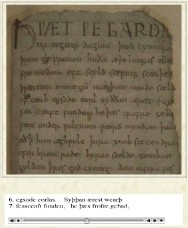
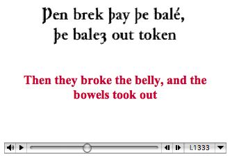
Captioning is a medium that is all about written words. Typography is the instrument of captioning. But throughout the history of the medium, typography has been overlooked or mishandled. That history has reiterated itself with online captioning.
Captions (and subtitles) are typographic forms with a unique set of properties.
This activity did not have a mandate or funding that encompasses a full exploration of caption typography, but we will note that custom-crafted screenfonts for captioning and subtitling are all but nonexistent.
The RNIB/Bitstream typeface Tiresias Screenfont has received attention as a claimed solution to every “subtitling” problem, but the typeface has a host of design flaws. It lacks even an italic, and Tiresieas has not been fully tested with representative audiences (deaf/hard-of-hearing, visually-impaired, and hearing).
In the field of online captioning, no custom-made and tested screenfonts exist. (Type designer David Berlow, however, tells this activity that his Charcoal font for Apple was designed in part for such usage.)
In closed captioning using video players’ own files, authors must specify a font and hope it exists on the viewer's computer system. For RealPlayer, things are worse still, since, according to Magpie documentation, RealPlayer understands only a predefined list of Windows fonts, with other predefined lists of substitute fonts for Macintosh and Unix. Font sizes, foreground and background colours, and alignment cannot be reliably specified across all platforms.
Some typefaces custom-designed for onscreen viewing are easy to find, notably Verdana and Georgia by Matthew Carter and Trebuchet by Vincent Connare. Nonetheless, those faces were not designed for reading captions and have not been tested for those functions. Captioners may, unfortunately, select any font they wish, including typefaces intended for printing (e.g., Palatino, Bookman), or 0lder system fonts imperfectly converted to outline form (e.g., Geneva).
Online captioning, then, gives authors no custom-made and tested screenfonts, lets them select any font they want, yet also does not guarantee that the font will actually be displayed for the viewer. While this is probably not the worst imaginable scenario, it is bad enough.
It is interesting to note that Tiresias was developed as a captioning font for visually-impaired people. Yet the font was only lightly tested with that group, and the fact that most captioning viewers have normal vision was not considered.
Online captioning has advantages over television in that fonts are somewhat mutable. Authors can present normal- and large-sized fonts if they wish, for example, though that is often technically difficult. (Sometimes entirely separate streams are needed.) Colours can be selected, too, with reasonable reliability.
These facts confer some advantages to low-vision people who read captions, since they usually require bigger type at higher contrast than people with normal vision. However, neither players nor the underlying file types like SMIL make it easy to select different forms of type. In essence, not only has typography been ignored in the entire system, even the idea that a viewer may wish to customize the type has also been ignored.
Rendering means the presentation of a typeface in a form perceivable to a viewer. On today's computer screens, fonts are rendered as dots or pixels. In some cases (as on liquid-crystal displays), those pixels can be divided into subpixels and individually manipulated to improve the appearance of a font. ClearType is most prominent technology, but CoolType can be found in Adobe Acrobat, and subpixel rendering is built into Mac OS X. (See articles at Typographi.ca and by Gruber and Riley.)
Rendering issues that impair legibility and readability include:
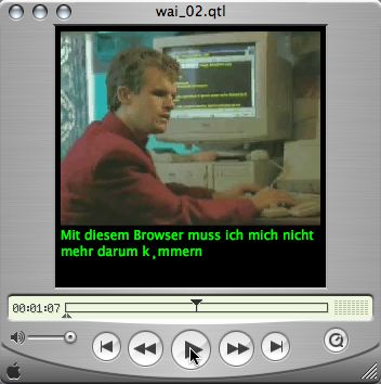
Captions require reliable character encoding in order to survive the many-step process from authoring to storage to transmission to rendering.
In principle, Unicode character encoding can be used in captions.
While Unicode encoding is preferably because of its higher reliability (especially when using character entities), Unicode also encompasses some older encodings that can themselves be sufficient. Anything that can reliably transmit characters from author to viewer suffices.
Incorrect character encoding is an especially pressing issue:
Unfortunately, these problems are not easy to solve for grassroots caption authors. Unless the characters they use are solely limited to those printed on the keycaps of a U.S. keyboard, trouble can arise. And once the character encoding of a file is destroyed, it’s hard to recover the encoding.
Not only is fixing the problem difficult, so is explaining it, which should not be necessary in the first place. Authoring tools should make no mistakes with character encoding.


Clearly, caption typography pressingly requires research and development.
Thorn, F., & Thorn, S., “Television captions for hearing-impaired people: a study of key factors that affect reading performance” Human Factors, 1996.