Type & colour
Here we will discover the design system, with its unified typography and colour palette, both of which can be quite varied within themselves.
Everything expands outward from the sanctuary
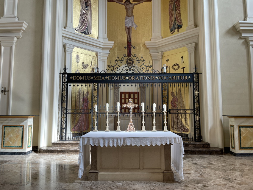
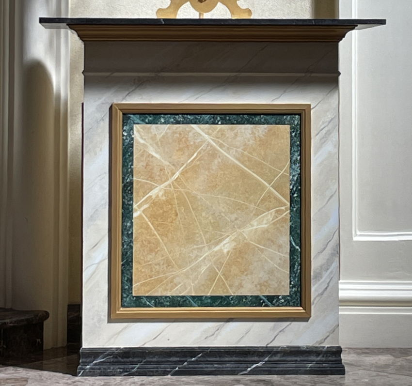
To the extent the post-fire edifice has any design at all, it is found in the sanctuary. The banner spanning the tabernacle, and tiny strips of marble found on side pediments, will be the seed for a flourishing design schema.
Fonts
First, a bit of vocabulary. Display type is the kind one finds in large headlines, on banners and posters; it’s big by definition, and relatively few words are presented. Text type is for lengthy copy – really, almost all typesetting that isn’t in the display category is said to be in text type. These broad categories of typefaces have implications that aren’t obvious – fonts designed for lengthy typesetting look ridiculous at large sizes, while display type is basically unreadable in small sizes.
Another category is relevant to the Oratory. Text for sight-reading has to be set in high-legibility typefaces. Altar cards, vesper booklets, and lengthy prayers meant to be spoken (psalms, litanies) require text designed for high legibility.
Display type is the core of this redesign project

DOMUS MEA DOMUS ORATIONIS VOCABITUR is rendered in metal (surely brass) Times Roman capitals on a sintered metal panel welded to the cage or fence safeguarding the tabernacle. Stars used as wordspaces are consistent with historical usage, but there shouldn’t be stars at very beginning and end. (They’re dividers, functioning as space characters. We don’t render line-initial and ‑final spaces. Plus these are the wrong stars, and too big at that.) Type is inconsistently spaced, not least at baseline.
Times Roman is a newspaper typeface. Though its origins are indeed in metal type, that means reversed metal forms that press into ink and paper. It’s a text face, not a display face. It’s the wrong font for its usage here.
Ideally this banner would be ripped out and retypeset, but that’s not going to happen. So we use this indelible and ineradicable metal lettering as the basis for an entire typographic system.
Too many fonts, and not enough of them
Holy Family does not have “typography.”
Setting aside posters for one-off events (discussed below), which have no cause to be over-formatted or to look the same, every publication uses different fonts even though the underlying application is of a piece – documenting a Catholic church and its masses and events.
-
Some of the typefaces chosen, while failing to match other fonts in the first place, are not chosen well. The Garamond version used for vespers brochures does not reproduce legibly by photocopying or xerography, and, while Windows offers a version with bold and italic, the variant actually used does not have a bold italic. It also doesn’t match the Garamond used for Latin-mass propers (an out-of-house product to be brought in-house, then sold to other churches – but we shall get to that).
-
There is no attempt at typesetting, and overall copy-editing is poor. Worse, pairing Times with Arial, a Helvetica knockoff, all the while using neutral apostrophes and quotation marks, underlining, hyphens as failed dashes, and other straightforward errors, is literally a worst-case scenario of inattention to type and copy.
There is nothing good to say about current type and copy, which, to reiterate, makes every beginner mistake over and over again. (Things get worse than worst-case in exterior signage; see “.”)
No more Times
Over the century since the design of Times Roman, there has emerged a small industry in typefaces inspired by Times. Most would be nearly undifferentiable even by experts, and, since a lot of these font families date from earlier type technologies, these Times-like typefaces offer little more than bold and italic.
Tiempos by Kris Sowersby et al., designed from 2010–2018, is a reinterpretation of Times and another design from the metal-type era, Plantin. (If you have the Angelus Press Latin missal, it’s set in Plantin.) With “3 families, 32 styles” – italics and small caps included – Tiempos enables the creation of a design system for Holy Family, one that derives from and compliments the sanctuary’s permanent banner in Times.
In a design system, positions or roles of components stay put while their specific form might change. We know this all too well from corporate logos transformed into rainbows: You still recognize what the underlying logo represents.
For Holy Family, the house typeface will be Tiempos – but we will vary the families and styles used. For the reimagined church bulletin, for example, we can typeset the words “Holy Family” differently each week. But because they’ll be located at the same spot on the page, and because Tiempos is a unified, if not precisely “holy,” family, the effect will be one of variation within consistency. It will also look like actual effort was put into design, because it will have been.
For applications where uniformity makes no sense, like those posters for one-off events, Tiempos will be used in more of a classic branding manner – to typeset “Holy Family,” its address and logotype, and the like.
Contrasting type
If we’re standardizing on a serif typeface like Tiempos, we’ll still need sansserif for certain applications. For this, we adopt a design system within our design system – Thesis by Luc(as) de Groot. TheSans is the sansserif font; TheSerif is self-explanatory; and TheMix is a semiserif design, with an assortment of serifs intermediate between TheSans and TheSerif. Variants number in the dozens. (Plus there are related display faces, like TheStencil, that may or may not prove useful.)
We will exhibit yet more contrast by avoiding the usual combo (sansserif for headings, serif for text) and by running nearly everything in Tiempos. The Thesis typeface family will be used selectively, according to a style guide that will be produced as part of the project and tested over a number of months.
Typography for sight-reading
For any body copy that the reader is expected to utter out loud, we will use Sitka. Greatest living type designer Matthew Carter designed the typeface, which was continuously redesigned over a period of months based on user testing in Latin, Cyrillic, and Greek scripts. (Indeed, proportionately greatest effort was expended on making Greek text legible.)
The issues here are simple but poorly understood. People race through text they are expected to read aloud, even if it’s in Latin. Mildly unexpected words are misread as the expected word (through/though/thought; causal/casual). Almost no one puts in the needed rehearsal work (three full out-loud readings), nor should they be expected to have done so while sitting in a pew at church on a Sunday morning.
But even Oratorians, well seasoned in reading rarely-changing texts out loud, will make errors, because Oratorians have the same psychology of reading as everyone with normal or corrected-to-normal vision does.
So we sidestep the whole problem by using the most elaborately engineered and tested screenfont ever designed.
Sitka comes in five variants and multiple weights. It’s built into – and, for some sense of the term, lawfully available only within – Microsoft 365. And no, none of these five variants of Sitka is a variant of Tiempos, or of TheSans, TheSerif, or TheMix. The sight-reading application (e.g., scripts for vespers) is different enough that it requires its own font. Headline and similar typography can, of course, draw from regular house style.
Colourways
Holy Family is among Toronto’s least-decorated Catholic churches. The narthex isn’t beige, but nearly every surface in the nave is beige or brown. Plain maple is just that – plain.
Like the banner over the tabernacle, nothing permanent can be changed. (We may be able to hang temporary objects – e.g., RESERVED banners on pews, to be discussed in due course.) But just as we picked up on the typography of that banner, and then, as it were, riffed on same, we pick up on the only spot of colour in the building and build on it.

Side tables alongside the caged tabernacle have inlaid marble facing, one strip of which is green. There’s arguably also a usage of brown, at least in the marble steps and sanctuary floor. Hence compatible greens and browns – not just one shade of each – will become the Holy Family colourway.
Typographically, it becomes possible to use dark green as the colour in which headlines are typeset on handouts, and to use variously green and brown as accent colours on business cards and letterhead. Some of the physical plant will be repainted in green or brown, not least to give everyone a visual break from fluorescent-lit beige.
Logotype
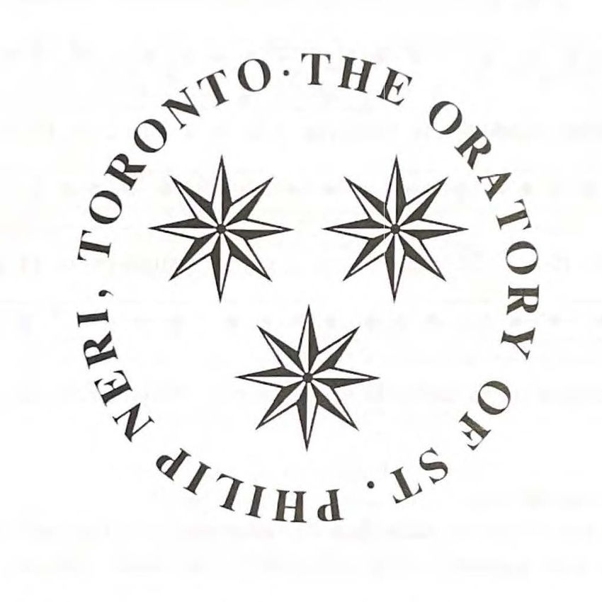
A logotype is, as the compound word suggests, a logo that relies on typography. Holy Family almost has one:

The overall circular design brings to mind sealing wax and Papal rings. It is slightly at odds with the construction of the building, in that nothing else really is round (not even rose windows).
Redrawn and retypeset, the logotype can suddenly become useful, as on the exterior stele and narthex signage. This may be a good usage for new Close Ave. signage.
Note that the logotype can be professionally modified (here we would hire Iconfactory) to be functional in online or onscreen environments at many sizes and resolutions.
Similarly, letterhead, cards, and like collateral must be rationalized. No more Palatino, in other words.