Signage & identity
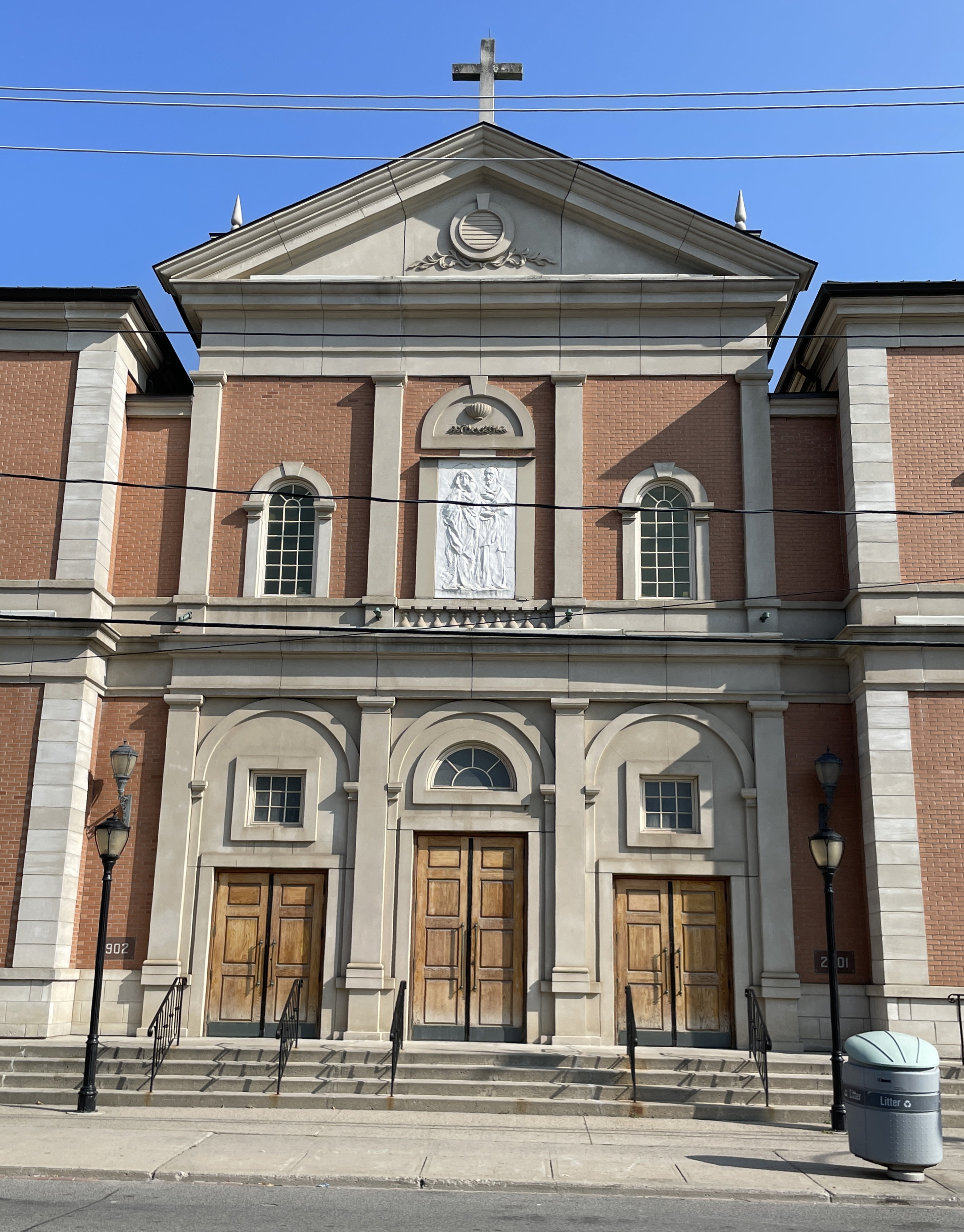
Holy Family has, in practice, no exterior signage. Nor does it have anything resembling graphic identity or branding, though there is more than a kernel to work with there.
No guessing
Our first principles are as follows: Absolutely no signage, and nothing graphic anywhere, will be ad hoc, banged out by untrained persons, or bought off the shelf.
“Where am I?”
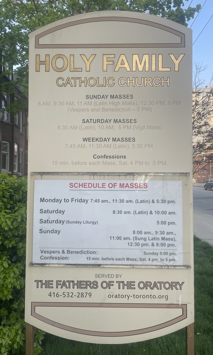
If one stands at the foot of the stairs to the parish office and turns right, one is able to see the only sign that identifies Holy Family. It is invisible from all other directions, including the other side of that sign, as it is obscured by a tree.

Stand across the street and you have no indication what you’re looking at.

Walk down Close Ave. and your hopes will be dashed more than once as you pass a community centre and a Catholic public school both named Holy Family. The real church has no signage.
The building has to be identifiable from the outside and from all directions. A competing church sits kitty-corner. People do get confused: I’ve had friends who were looking for St. Vincent’s stop and ask themselves why this church running an Ordinariate has a rainbow staircase. It doesn’t – they were looking at the United Church across the street.
Stele
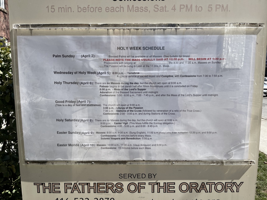
The stele itself has nothing going for it. Rendering Arial in outline does not negate the use of Arial in the first place. The sign isn’t illuminated. Come Holy Week, we tack up Arial signage listing special masses, with annual variations in days of the month basically pencilled in.

As elsewhere, someone looking for Latin mass, low mass, or high mass will not really know that all of those are celebrated at Holy Family.
The stele needs to be completely rethought and replaced, and the obscuring tree cut down or moved to the west side by the fire exit. Of course all the typography will match the new style guide. And the sign will be illuminated in some manner.
But we will go one step further and include replaceable panels, in enamelled steel or like material, that match the liturgical colour of the season. (Or the day – yes, we will install rose panels two days a year.) The obvious use case for such panels is the nameplate reading HOLY FAMILY.
Close Ave. signage
A small but legible north-facing sign on the Close Ave. frontage will tell those walking down the street they’re heading to the right place. This signage too will conform to the style guide and be illuminated.
Interior signage
The narthex, which is too dark as it is, also has to identify the building as Holy Family. All doors that the public would encounter – even all the way through the inner hallway that leads to the private chapel – need their own custom-made nameplates or number plates, all affixed in the right spot. (There are established specs for that.)
All the signage near the porter’s desk needs to be rethought and rationalized (and retypeset and remanufactured).
Priests’ confessional nameplates will need to be redone. The sign banged out in Times Roman (all caps, no less) on what is taken as the wheelchair-accessible confessional room requires a change.
Signage for votive candles is aged and has visibly fallen apart in the last year. This too must be redesigned and made permanent.
RESERVED signage for special events cannot really be made to work if the substrate is any kind of plate because the edges of the pews are not flat like walls. Plus they’d be too wide. (Any kind of paper substrate is a non-starter; that’s what we have now.) Instead, custom-made fabric RESERVED signs can be hung over the edges of the seatbacks. We have a number of options there, including embroidery, quilting, and brocade. We’d need a dozen.