The TTC is hell-bent on destroying the intentional architectural design and symmetry of the Bloor line. Under the guise of station “modernization,” it proposes to remove and destroy every vestige of cream-coloured structural glazed tile at Pape station and replace it with “artificial stone,” which has fake right there in the title.
I discussed this in person with Chair Giambrone’s political operative. He asked whether retaining the current (i.e., correct and intentional) appearance of Pape station even after it is renovated might not be “kitsch.” (That was the exact word.) In at least one person’s eyes, maintaining heritage is déclassé and tacky in some way. Old things, it seems, are vulgar.
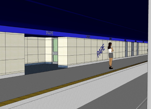
Let’s compare and contrast, shall we?
Here is a current rendering of a “modernized” Pape station. We really are intended to take seriously the word PAPE plastered at a 45° angle in the wrong colour and in the wrong kind of fake Helvetica.
The unwanted and egregiously expensive “renovation” of Museum station – little more than a tax dodge for the benefactors of a foundation nobody had ever heard of – is “well underway.” When it will be completed is anyone’s guess. But it includes rhinestone-quality gems like structural columns tarted up as Egyptian caryatids.
As if to shout out to the world that the TTC and its expensive starchitect really do take TTC signage seriously, at intervals on the walls the word MUSEUM is typeset in letters about a metre and a half high. No other type is that big anywhere in the system, nor is the TTC typeface forced to act like a monospaced font anywhere else. But that’s not the most interesting feature. What glitters like cubic zirconium is the fact the letters are filled with cute little hieroglyphs. They’re ancient Egypt’s BeDazzler!
(Does anyone know what those hieroglyphs actually say? Or were they just downloaded and stepped-and-repeated into place in CorelDraw?)
Really, Steve Martin couldn’t write a song that does justice to this tiara-bedecked homage to Egypt. (Oh, wait.)
$2.1 million later, Museum station still isn’t finished. It will not have an elevator or the second exit required by the fire code. The Museum renovation is a project championed by Toronto elites (a tax-dodge foundation, city councillors, the grande dame of the ROM, newspaper columnists), most of whom never use the subway and certainly haven’t paid their way into Museum station in living memory. They think other people’s money should be spent dressing up a subway station in drag even though they never actually use it.
Yet all the while, there is an insinuation that preserving the appearance of a station that elites don’t give a damn about – Pape – is “kitsch.” What’s really kitsch here?