At the TTC meeting of 2007.06.13, Commissioners ordered staff to “report back by the end of the year on the status of the project to replace temporary handwritten signage at collectors booths.” The report (PDF) report has been published.
Handwritten signs were not and are not the problem. They’re a problem, but only inasmuch as they show the weakness of the TTC’s signage system. The weakness is there is no TTC signage system.
Removing a few handwritten signs at collector booths does nothing to clear up the signage mess found everywhere in the TTC. It also doesn’t touch handwritten signs found outside collector booths; home-printed signs; and signs made of duct tape on the walls (which really existed – at St. Clair West).
TTC knows this because I met the supervisor taking care of the handwritten-signs issue (twice). I explained that a handwritten sign indicates a local need that the signage system isn’t addressing – because there is no system.
The staff report gets this exactly backwards, stating that “[u]nique signage for a specific booth is not encouraged because[,] if the sign is not used regularly by the [c]ollector[,] it is most often thrown out.” The opposite is true: Collectors create handwritten signs because the same issue keeps coming up over and over again. Some of these signs are so often used they have their own plastic laminated holders, a fact TTC somehow isn’t aware of.
The idea of incarcerating a worker into a glass cell to dispense a few cash fares over a lengthy work shift became outdated in the 1980s. Some of us strive to retain many of the TTC’s mid-century features, but this shouldn’t be one of them. The staff report admits that “many transit properties” have entirely automated entrances. The report, then, admits that other transit properties managed to keep up with the late 20th century. (TTC’s newest fully-automated entrances, as on the Sheppard line, still require a human collector to buzz you in or out if you’re using a wheelchair.)
I wish TTC staff would stop using the word “wayfinding” as though it were a classy synonym for “signage.” Wayfinding is a process of the mind: You are finding your way through an environment. Signage can be part of wayfinding, but signage is not wayfinding.
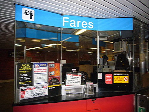
The complete absence of a signage system is never more clear than in the claimed solution to the problem at hand – a “package” of standard signs to be tacked up at every booth. They don’t match, they’re inconsistent, and there are too many of them – in fact, up to three of them can be “marketing” messages, i.e., ads.
TTC’s solution to collectors’ tacking up little signs is to tack up its own little signs. The only difference is the new signs are “official.” None of that helps.
The report claims that collectors can apply to have a custom sign made. Such applications will, of course, be ignored. The entire thrust of the staff report is that headquarters always knows best, a truism that applies everywhere in the TTC.
We don’t need a “pilot station” with electronic signage. TTC will get this as thoroughly wrong as it always has, viz the Metron and OneStop signage. Even electronic destination signs on buses can be and are spammed with marketing messages (THE FUTURE IS HERE; I’M A NEW BUS; GO[,] LEAFS[,] GO; or lengthy explanations of new fare rules).
I’m just trying to imagine an LCD panel at this pilot station – surely a low-usage station like Ellesmere rather than a maze like Eglinton where it could really be tested – and the only mental image I get is a nice new electronic means of confusing passengers with bad type, nonexistent information architecture, and subpar copy-editing.
The second motion at the June meeting read: “Commissioner Saundercook moved that staff be requested to include in their report examples of signage and wayfinding from other cities.” I was there – it was another of my deputations being cheerfully ignored – and I know the motion was reported accurately. The staff report acts as though the request was to find out what other cities do about collector-booth signage. That isn’t what was requested.
This is a blessing in disguise, as TTC staff would have cherry-picked other transit systems that use the same fonts it does. That would make the TTC’s official, but completely untested, signage “standard” look reassuringly world-class. One difference here is that other transit systems at least license real fonts instead of using clones that came free with Windows software.
I made a point of photographing nearly every handwritten or homemade sign I could find after the June meeting. Trust me, there are many; see the attached photographs. And the claimed improvement, a collector booth festooned with “official” signage, doesn’t look any better.
I draw especial attention to one pair of signs: One handwritten sign giving new subway fares posted alongside a home-printed sign that shows Chair Adam Giambrone’s official bio and the handwritten truism THIS MAN MUST LOVE TRANSIT RIDERS.
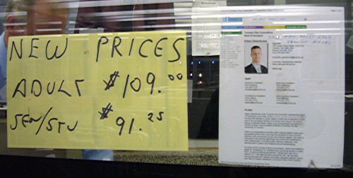
If it’s time for new fares, it must be time for a new sign, too. The sign on the right is a printout of Chair Adam Giambrone’s bio and reads THIS MAN MUST LOVE TRANSIT RIDERS.
After spending $932 million on five new stations, what could be better than a handwritten sign saying the same thing as the preprinted sign right next to it?
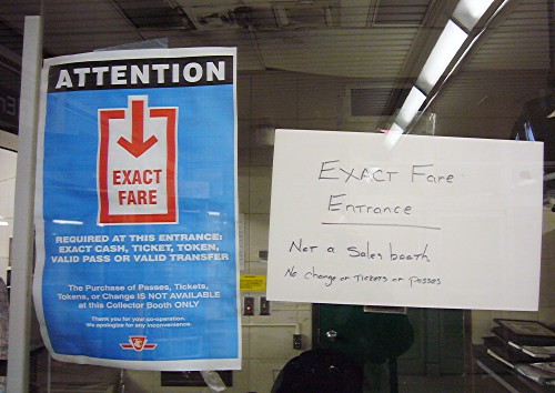
Even a busy station cannot resist the urge to update us on new TTC fares. We need the information somehow, since there isn’t a collector at work to tell us.
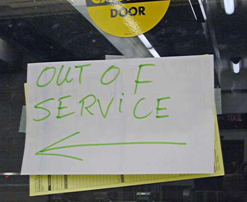
If all you’re concerned about is “handwritten” signs, then you’ll miss the signs printed at home. You’ll also miss the posting of signs that aren’t supposed to be posted, and of course general clutter. There’s no such thing as too many signs. Still.
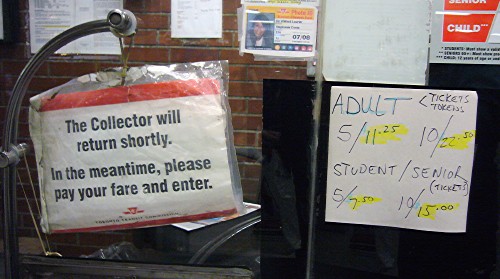
I’m pretty sure this is what TTC really wants its farebooths to look like. After all, we’ve solved the handwritten-signs problem. Instead, we’ve got a dozen different signs that don’t match. Surely that’s still better?
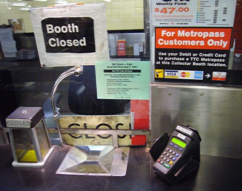
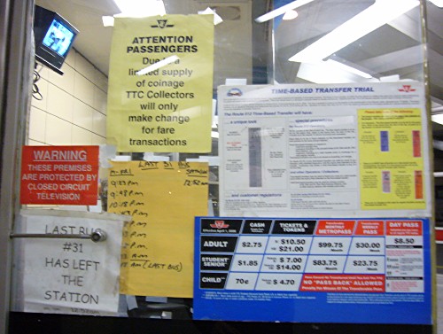
There’s always a new kind of clutter, or in this case, several – a PIN pad with its own label, a 1960s-era sign in the original TTC font, and a range of semiofficial printouts. Clutter, like water, finds its own level. But look – no handwritten signs. Job done!
Worrying about handwritten signs at booths does nothing to eliminate handwritten signs everywhere else.
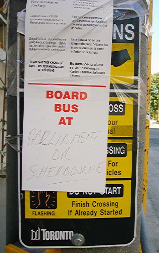
What happens when you focus on “handwritten” signs is you miss the signs written in duct tape.

The problem is not now, and never was, “handwritten signs.” The problem is a complete lack of system.
And you still haven’t fixed that. Nobody wants it to be fixed, because then the TTC’s corporate talking point –“We’ve got a standard and people are happy when we apply it” – would be obviously false to everyone, not just the experts.