Until we intervened, TTC planned to remove and destroy old signage, including irreplaceable signs and signs that are apparently working fine. After a write-in campaign and some publicity, TTC staff unofficially decided to preserve the Paul Arthur signs at TTC indefinitely (not what I wanted, but at least they aren’t being destroyed), and Adam Giambrone has mused that old signs will be preserved.
Let’s call that a partial victory. For historical interest, the rest of the original campaign was as shown below. But check the new campaign to write in with comments on how new signage works.
When cleanup means destruction
At a TTC meeting on 2007.04.18, the late Don Léger described TTC’s plans to clean up its filthy subway stations. St. George is a priority for the summer, since its walls are grimy and many expansion joints are corroded.
Almost off the cuff, he mentioned that there were some old signs there that would be “removed.” He meant “removed and destroyed.”
When renovation means destruction
Pape (drawings; photos), Victoria Park, and Islington/Kipling stations are scheduled for renovation. In all cases, and explicitly in the case of Pape, old signs will be removed and signs of the current “standard” will be installed. What is meant here is “removed and destroyed.”
When safety means destruction
- Original version
The walls on the outside edges of the platforms at Eglinton station do not leave enough room for workers to stand as trains pass by. The walls will have to be taken down and displaced by up to two feet. Not only does Eglinton have much-beloved Vitrolite tiles, it has a unique version of the TTC typeface, which is itself unique in the first place (photo). The exact design of the words EGLINTON on the walls is not found anywhere else. But those walls will be removed. What is meant here is “removed and destroyed.”
- Update (2007.07.11)
According to what TTC staff have told Steve Munro, alcoves will be installed in the walls for the same safety purpose. Indeed as Steve says, if they do that right, most or all of the sign panels could remain in place.
When sarcophagi mean destruction
At the behest of a little-known nonprofit group, TTC has committed scarce dollars to a harebrained and contemptuous scheme of dolling up three stations, Museum, St. Patrick, and Osgoode, in some kind of drag that relates to their locations or themes. Museum will have something to do with the Royal Ontario Museum, for example, largely through turning columns into sarcophagi.
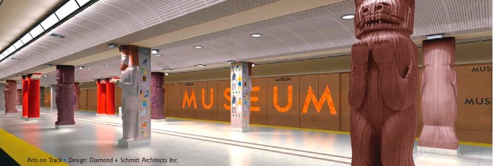
Rendering by Diamond & Schmitt architects (from a Toronto Community Foundation report [PDF])
If that sounds ridiculous, imagine what the themes for St. Patrick and Osgoode are going to be like.
While this is the sort of frivolous megaproject that only the idle rich who never ride the subway could possibly think is a good idea, TTC is still going for it. But not only will signage be removed and destroyed in these plans, new signs may match the theme. In essence, the new signs at Museum station may use fonts and design that ask you to walk like an Egyptian.
Instead of destroying signs
I explained to TTC, via two letters to the Commission, that:
- Signage at St. George (photos) is the only example of Paul Arthur’s redesign from the 1990s. As such, they are irreplaceable artifacts that must be preserved at all cost, not simply “removed” and destroyed. Options I offered included donating signs to the ROM, where Arthur’s papers reside; displaying them in planned TTC memorabilia cases; offering them to Arthur’s widow and children; and giving them to transit fans like me.
- Signs on the walls at Eglinton could be sectioned out and maintained as museum pieces, even if they are heavy.
- I told TTC staff to their faces and put in writing that subway renovations can be used as testbeds for multiple signage redesigns. We’ll have the old signs and one or more sets of new signs in place to test. (Paul Arthur tested only one new redesign; we can test several.) I made a presentation to the Commission on 2007.06.13 that made this point.
TTC staff, commissioners, and even the executive assistants of commissioners have ignored this issue completely. While they have not explicitly authorized or barred staff from doing anything to old signs, they have implicitly authorized the destruction of signs. And you can do something about it.