Æsthetics of thirtysomething
Or, if you will, “Thirtysomething æsthetics.”
Circa 2011, I had set up one of my stack of VCRs to record reruns of Thirtysomething on Showcase, a digital specialty channel from the era in which those were actually differentiable and fun to watch. I handwrote a 300-page Thirtysomething episode guide.
(I kicked myself for failing to set the VCR that time I tried out to be a comedy writer at TSN. I had to wait ages for a re-rerun of which to take notes, rendered out of place in the page flow.)
I had watched the series when it originally aired. I did so as an old soul, not as a high-income yuppie, the latter being notoriously the sole reason ABC kept this low-rated show on its roster. Indeed Thirtysomething got so much press (cf. Spy) that the series eventually parodied itself (again cf. Spy [PDF]) when Michael and Elliot endured a focus group telling the yuppies in the test video to just go “drink your French water and shut up.”
Design influence
Originality makes for readily recognizable mockery. The show’s title was a perennial issue, with the initial lower case oft-lampooned. The suffix ‑something, in this context and regardless of rendering, antedates to 1981 per OED, which adds (sic throughout) “Popularized as a catch-phrase by the U.S. television programme thirtysomething, first broadcast in 1987.”
Moreover, Thirtysomething’s design was well parodied, not least its titles by Kathie Broyles, set chiefly in ITC Garamond, an early reviled font that was pretty good in its intended contexts. (If one looks not even very closely, end titles, and a lot of what we now call “merch,” did not even manage to render the show title in that typeface.)
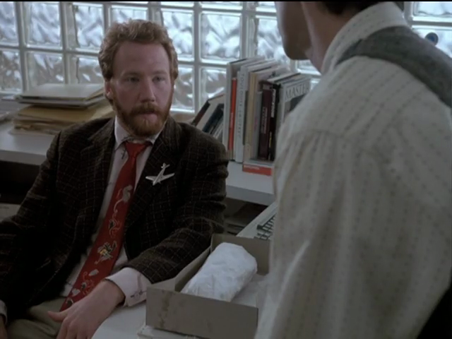
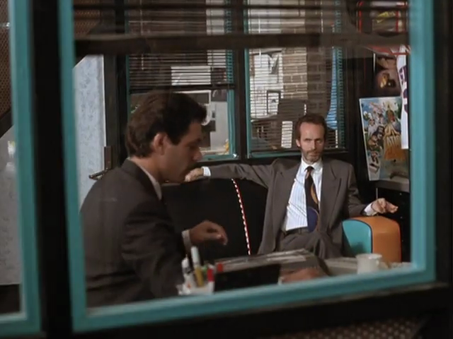
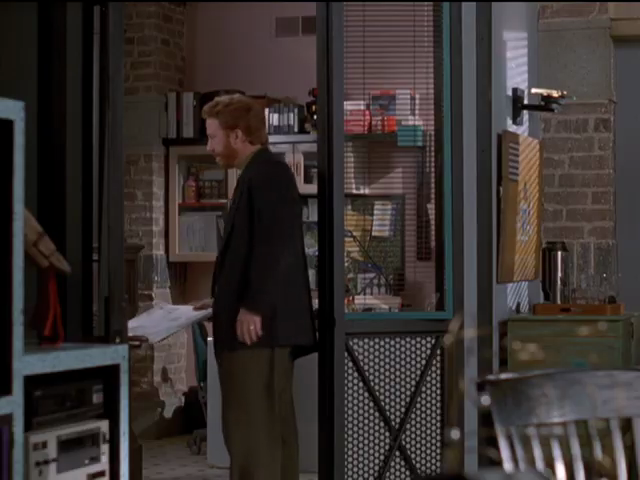
What few have noticed are the elaborate attention to menswear, and the creation of an echt-’80s office environment I could actually live in. In fact, I demand to live there.
Suitings
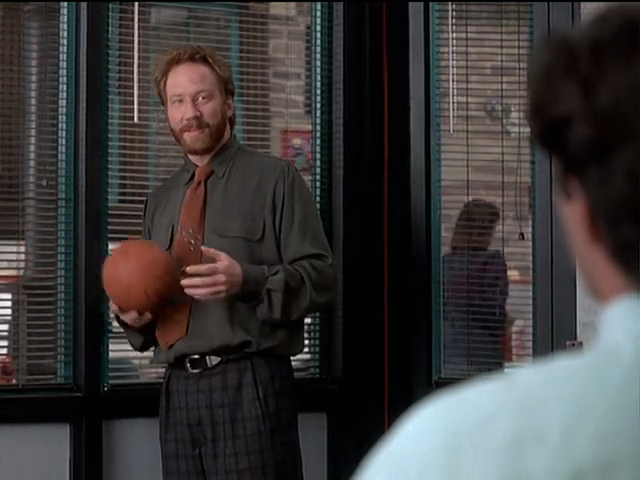
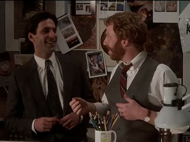
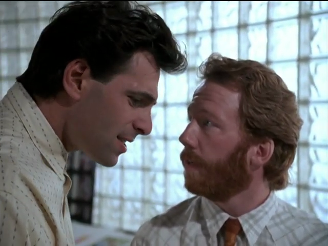
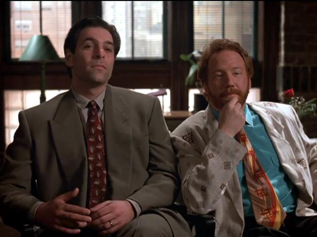
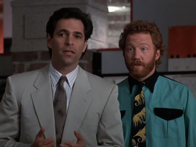
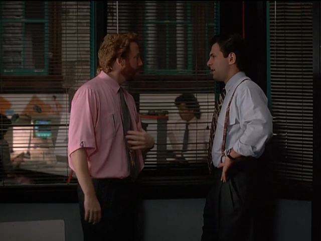
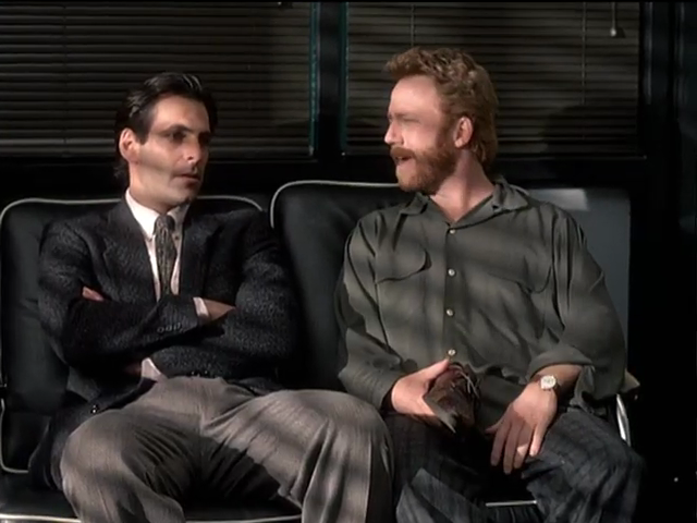
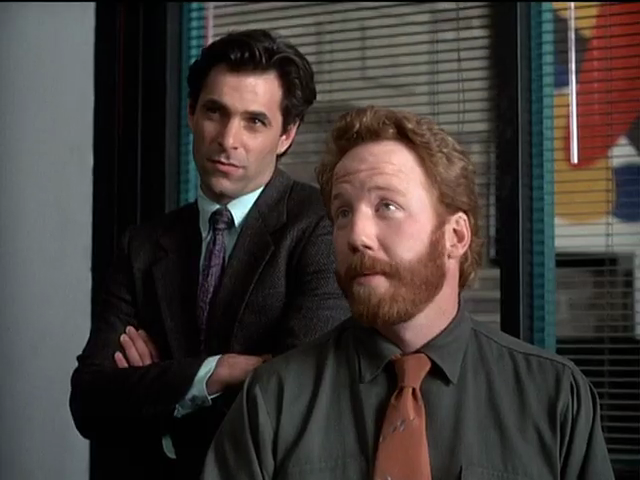
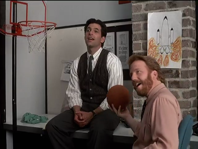
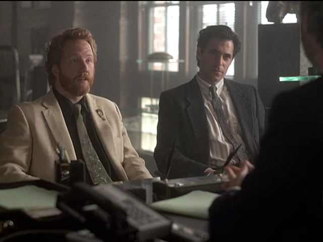
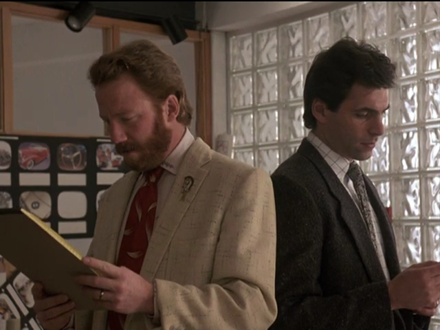
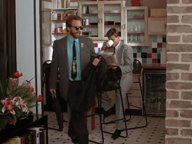
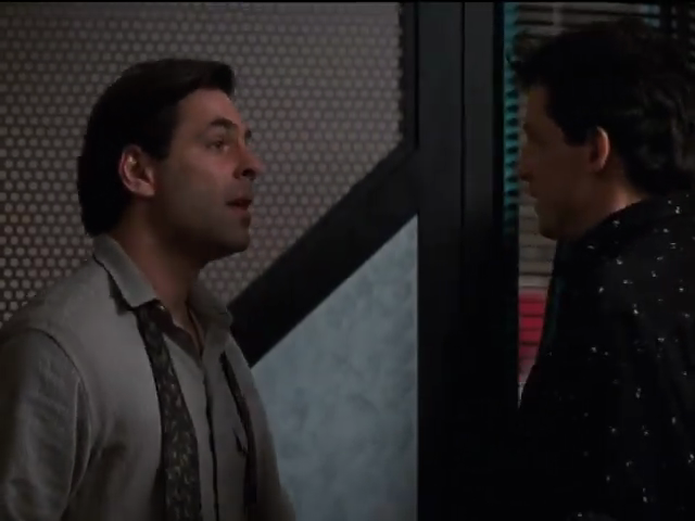
Thirtysomething was created by Jews and stars a Jew as the Jewish copywriter half of a Chiat/Day-redolent art-and-copy (or Art & Copy) duo. Michael Steadman’s partner Elliot Weston was embodied by a chaotic ginger, which phrase is tautological.
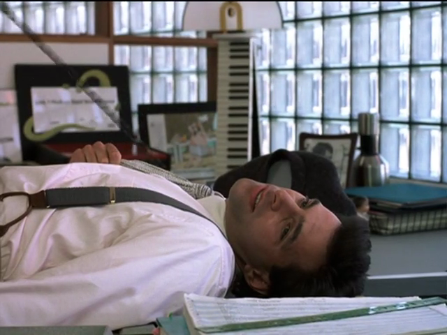
It’s well remembered that Ken Olin looked fantastic as Michael, and that Timothy Busfield was a walking eyesore as Elliot. But that is conventional wisdom half-remembered. Though Thirtysomething was an early adopter of putting gays in its midst, this was the most hetero show on television. (There just weren’t any cowboys or roughnecks or nerds. Of course yes, these breeders were yuppies.) As such, we saw Michael at home or off the clock half the time, where he looked like a Jew in a sweatshirt. Nothing to write home about. (To his credit, he drove a perfect vintage Volvo 1800.)
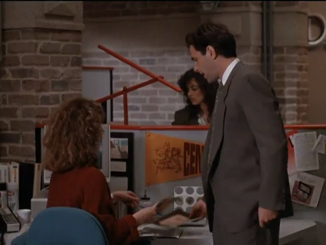
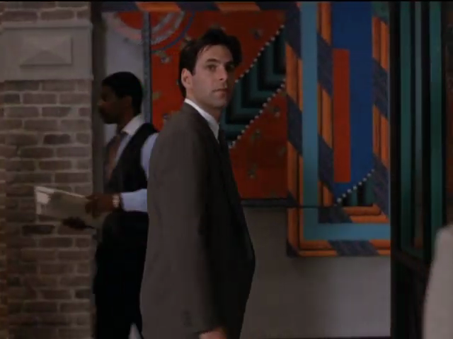
Then there’s how he looked at the office. Michael Steadman should be right up there with David Byrne as a suit-wearing icon of cinema. (With, I guess, Crockett and Tubbs – but if we’re going to go there, only Crockett instigated an entire æsthetic. See 100 Years of Menswear.)
I look back on Thirtysomething the way I look back on the Michael Keaton Batman. I realized only decades later that everything I had been looking at was genuine... even if it was part of a movie set. Every single object was made of real materials, and what I was watching, even on what we now call standard-definition television, was captured on real celluloid by real lenses. I think back to the jewel-like mechanisms of Sony Betamax VCRs, of which I had a separate stack.
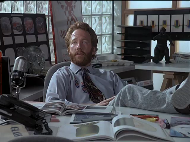
Michael
In current era it is straightforward to outfit oneself in cotton shirtings and pantalons, wool suitings, and leather belts and shoes. Except what I mean is it can be done with diligence and effort. Nowadays everything is a polycotton or like synthetic blend, and even shoes are crapola. I have very recently touched and inspected Zegna blazers with four-figure price tags that contained artificial fibres.
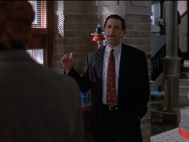
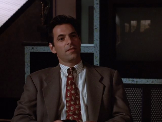
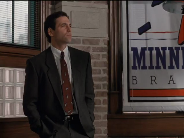
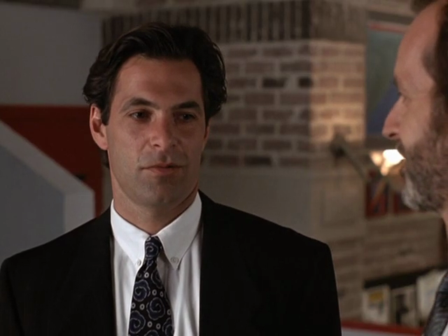
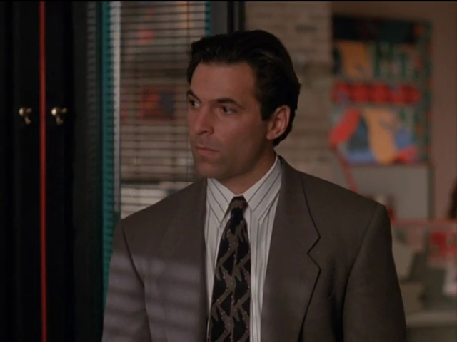
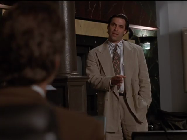
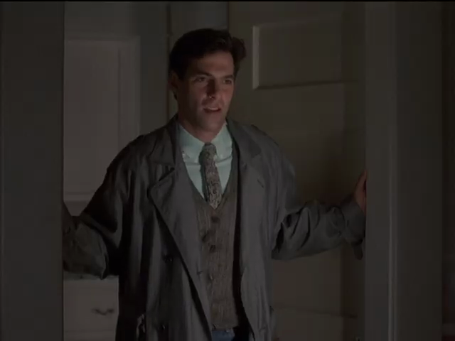
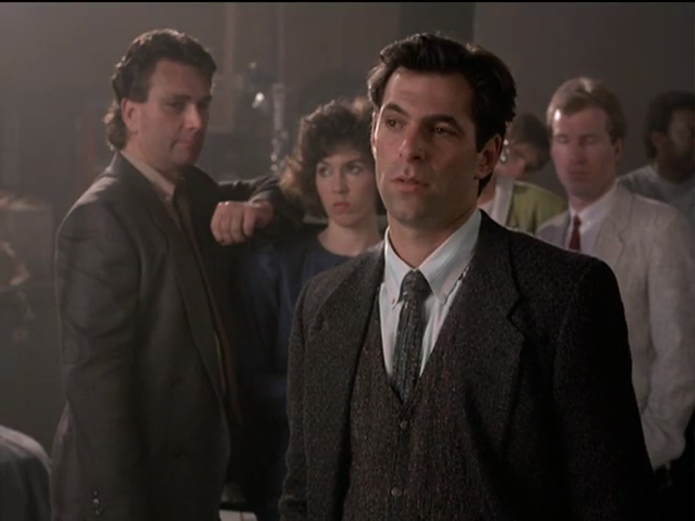
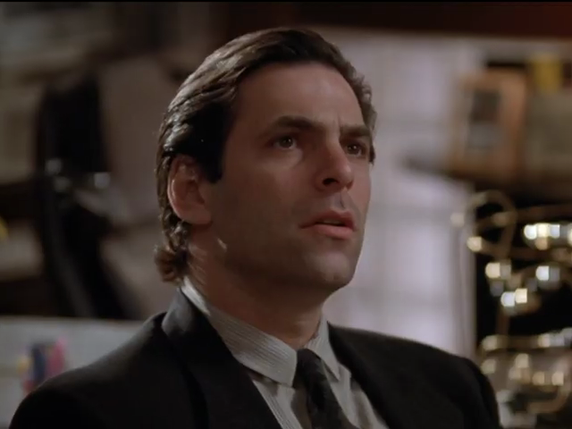
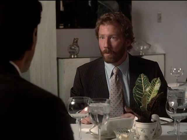
And then we have Ken Olin as Michael Steadman.
Patrick R. Norris deservedly won two Emmys (1989 and 1991 – out of seven nominations) for Thirtysomething’s costumes. Nobody gives a shit what Hope or Melissa was wearing. (Or whether they lived or died. I was rooting for Gary to flip his car early on once I knew it was possible, and Nancy should duly have croaked of the cancer aids.)
-
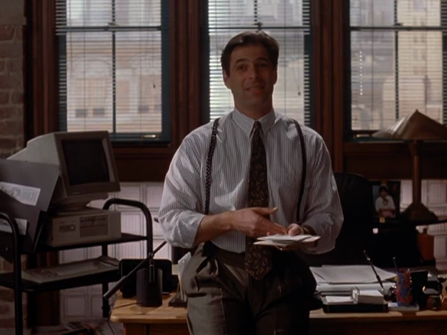
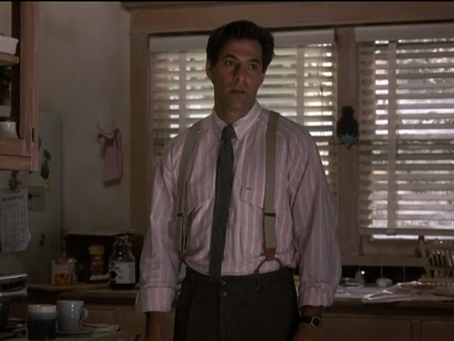
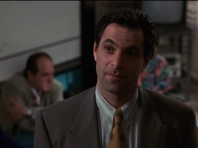
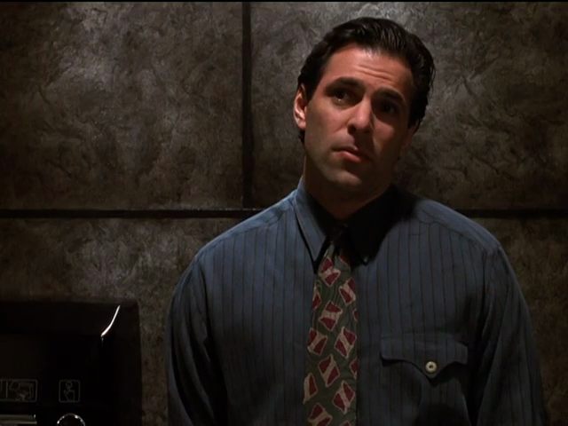
In cold light of day I see that Michael was not given an infinite wardrobe. Some pieces make recurring guest appearances, not least a shirt in a shade reminiscent of mint chocolate ice cream.
-
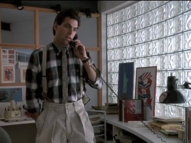
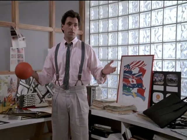
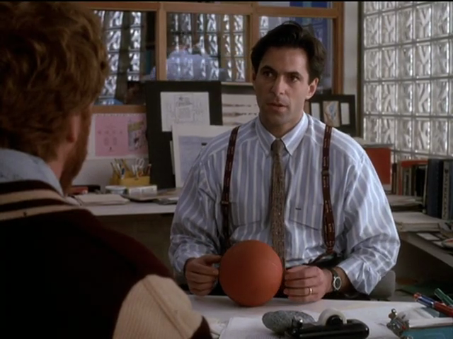
When outfitted in suspenders, these too were real and not clip-ons. Here we see the same pair of dramatically pleated woollen pantalons. (I have something like these, but lack Olin’s Hebraic panache, shall we say.)
-
Olin avoids American Psycho redolence in shirt, tie, and braces but no jacket. He indeed never goes full Patrick Bateman. (But what colour would you say those pleated trousers are? “That’s bone.”)

-
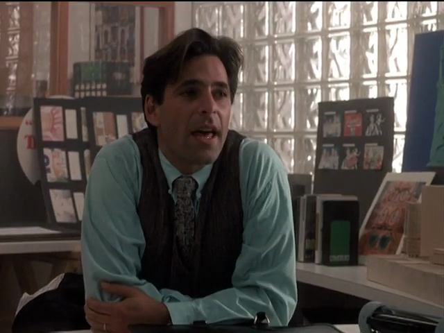
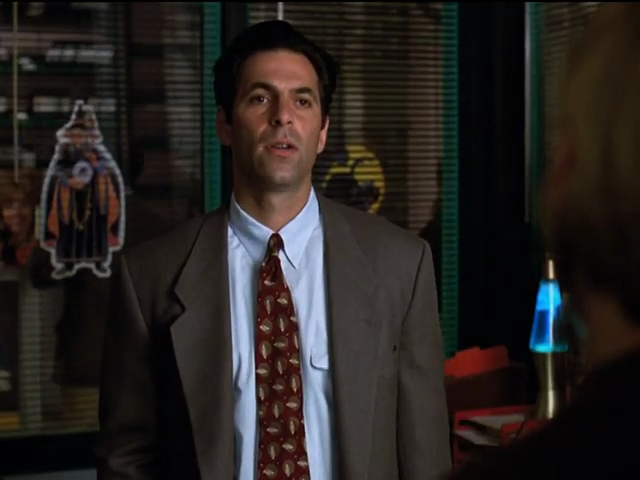
Fitted suitings.
-
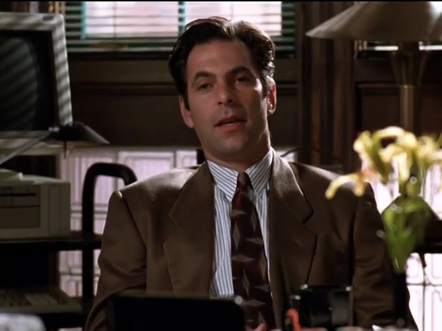
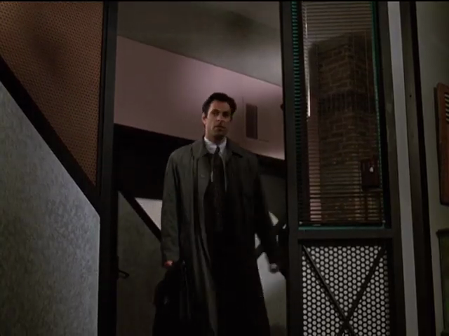
An overlong, overly roomy suiting Michael shouldn’t be wearing every day, and did not.
-
Rare three-piece suits.
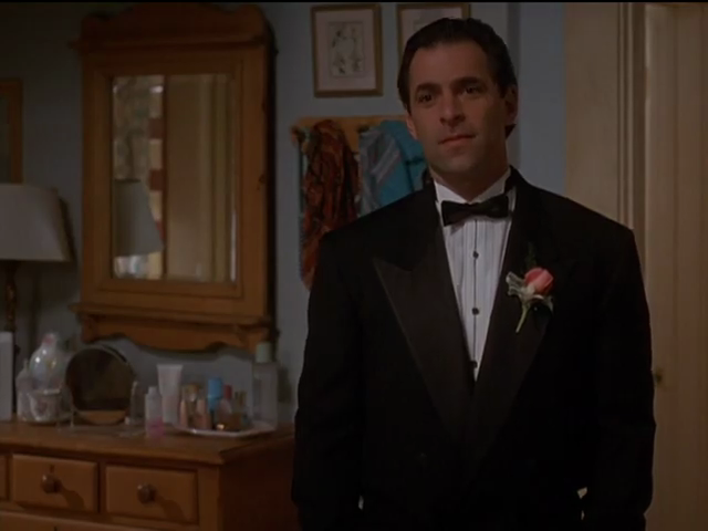
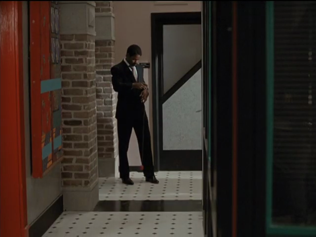
And, while we’re here: Michael in a tuxedo.
-
Waaay better hairstyle.
We do see ancillary characters in well-chosen wardrobes, viz Miles, Karl Draconis (sic: Stanley Tucci!), Lee Owens (the late Corey Parker).
From the sublime to the ridiculous:
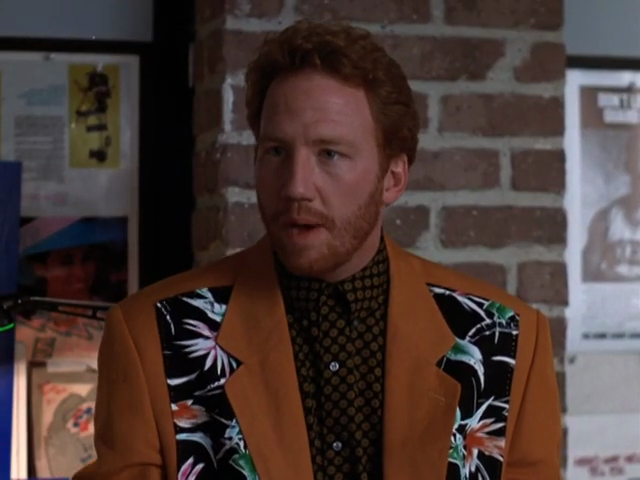
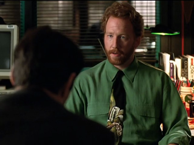
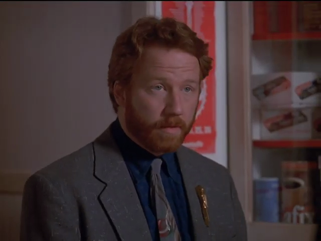
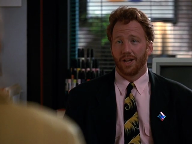
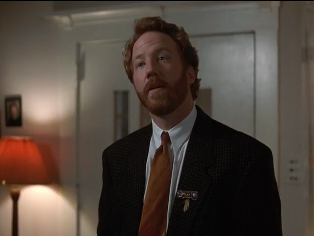
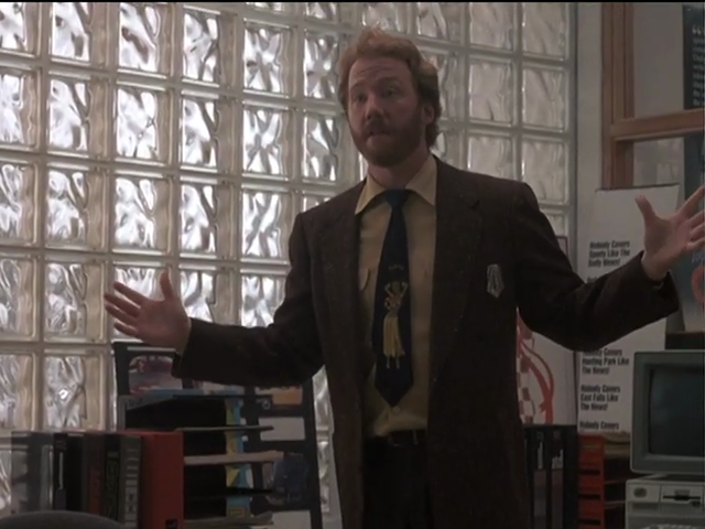
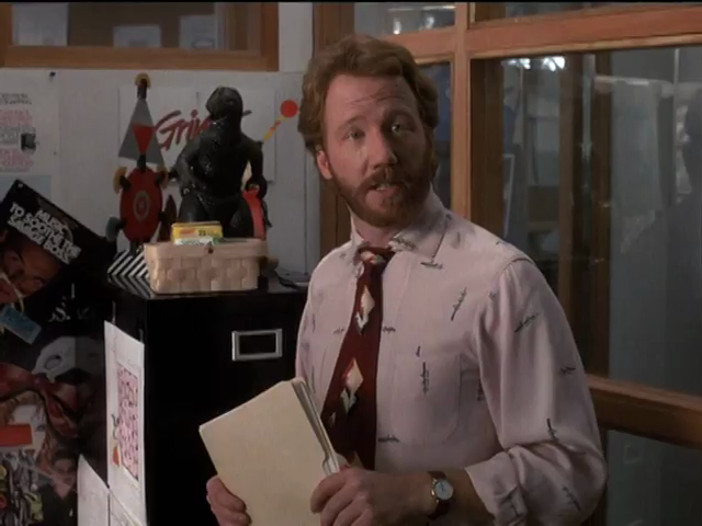
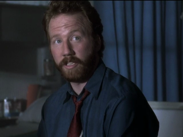
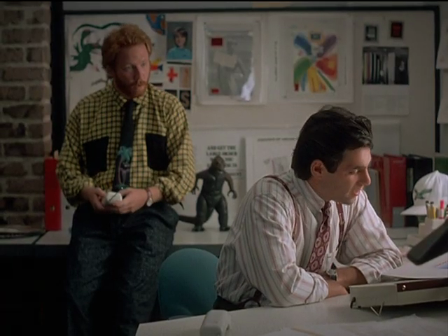
Elliot
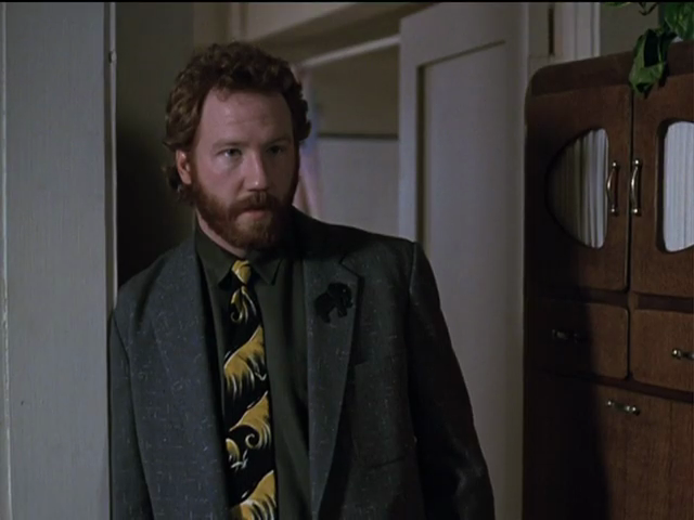
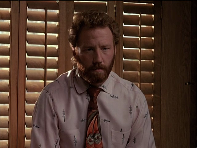
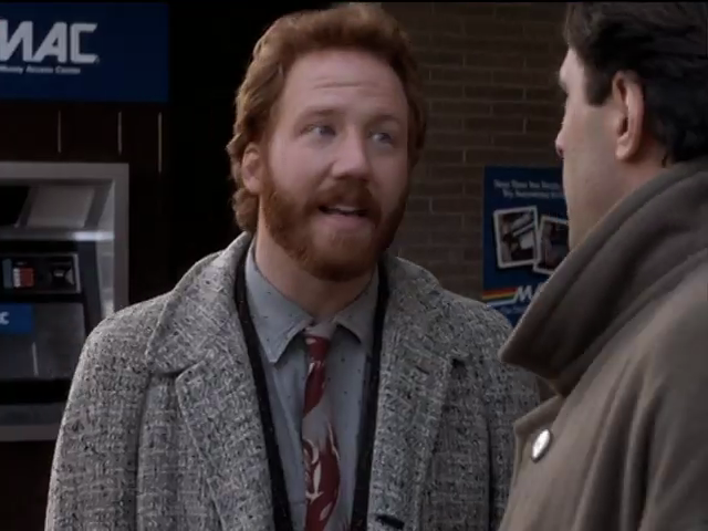
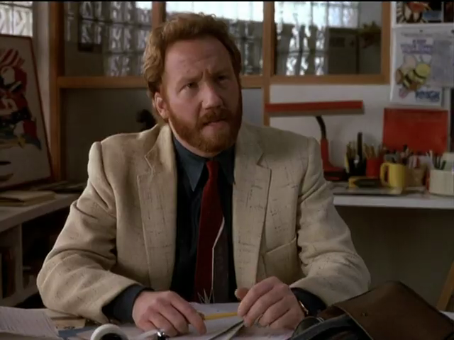
Hard to discern levels of (self‑)parody at work here, either within Elliot or from the showrunners and/or Norris.
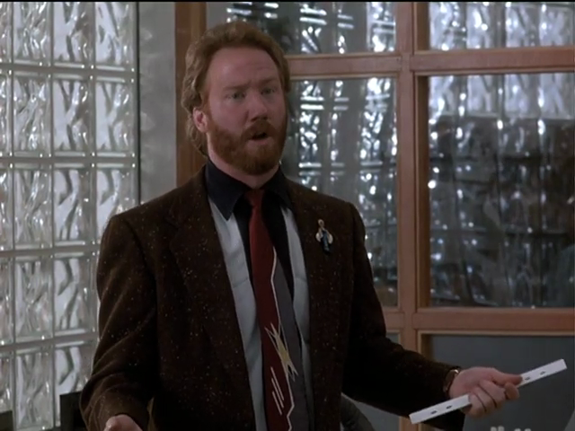
But really only there. Elsewhere, Elliot looks loud but in-character. Half the time I’m as bright and sparkly as this at church, and I fail to be a ginger.
All-but-erotic counterpoint
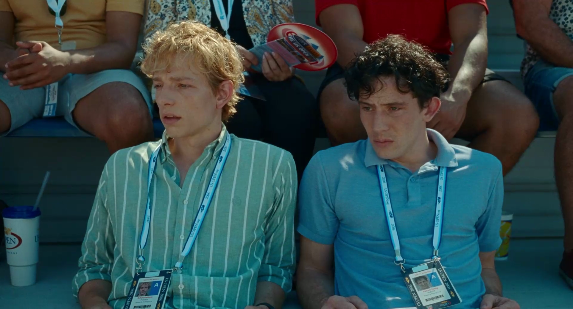
The temptation when presented with “Semitic good looks” and with a ginger is to place them side by side. This near-fetish pairing can be traced back to Boris Becker and Pete Sampras –
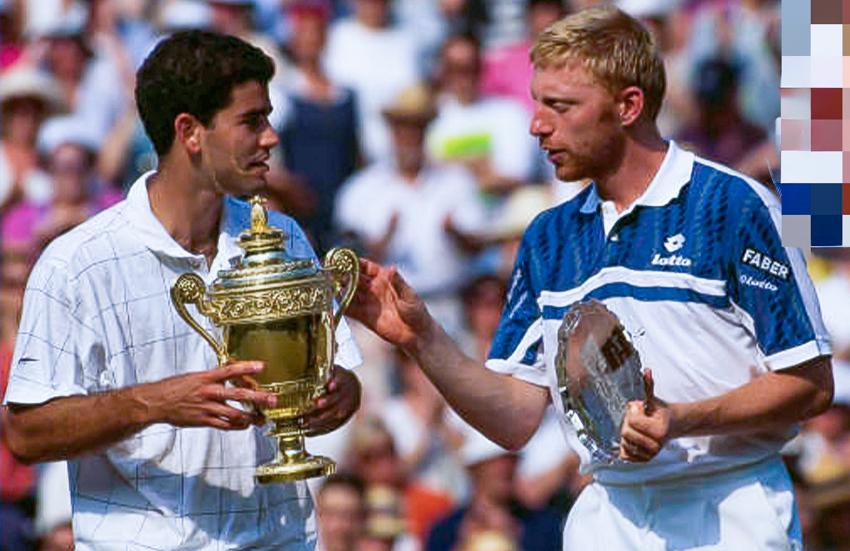
– which duly “inspired” ravenously homosexualist cinéaste Luca “Alphabits” Guadagnino. Fresh offa making Matthias “Alphabits” Schoenaerts look amazing, in Challengers, he juxtaposes lissome, highly sexual, well-hung Josh O’Connor and a honey blond. Talk about your casting couch.
(The psychology at work here is dreaming you have two boyfriends in your stable, one a redhead, the other olive-skinned. [Couldn’t you split the difference with a ginger Jewboy?] Now, try following that flowchart past the misplaced-teenage-girl moonings of its origin and all the way to mature adulthood. What happens precisely? Is God shining beneficently down upon the three of you?)
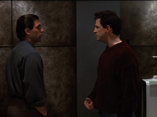
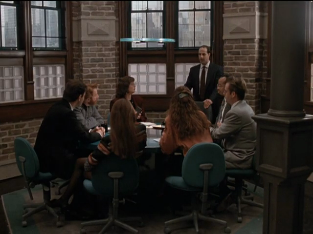
Michael and Elliot in company
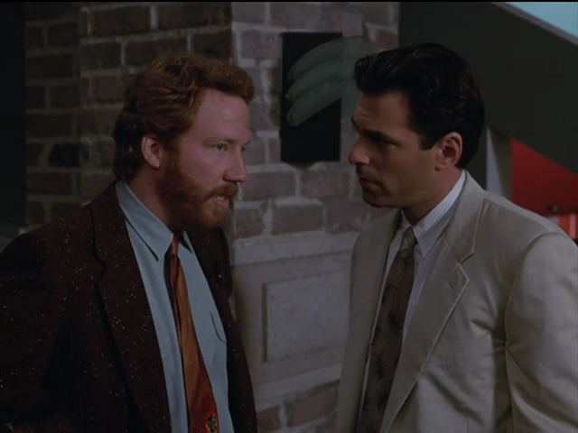
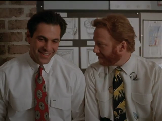
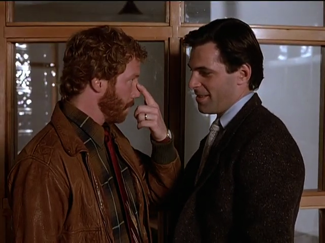
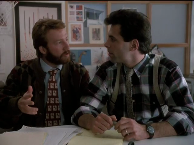
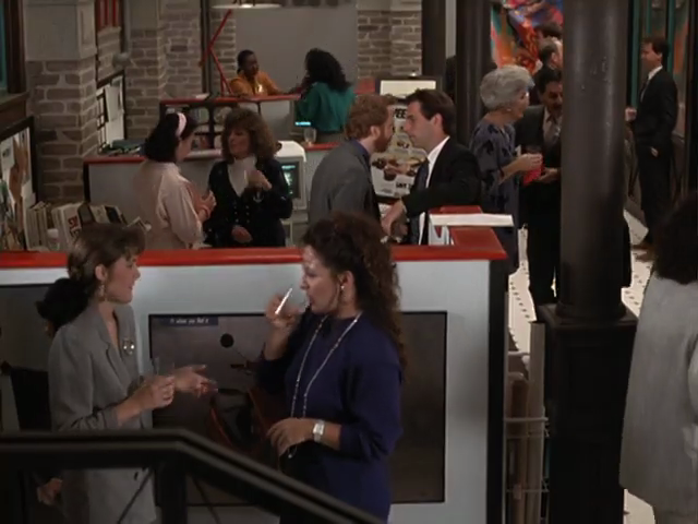
Aaanyway: Thirtysomething does a good job of depicting the affection Michael and Elliot have for each other, at least at the outset of the series.
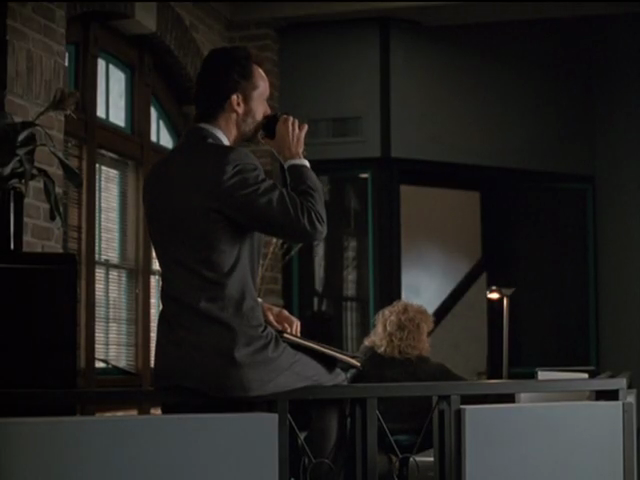
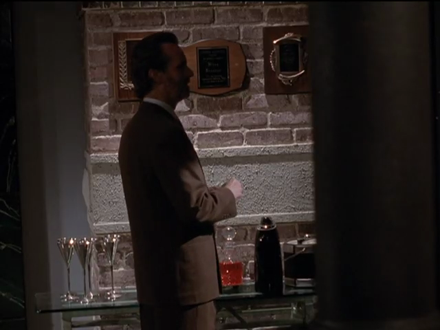
Office surfaces
We return to my realization that everything I’m looking at is, indeed, real.
I enjoyed 1980s æsthetics even à l’époque. That’s why I loved Spy enough to become its “obsessif.”
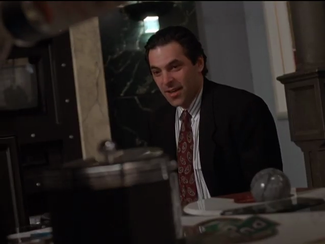
The angles, the punch of colour, the materials (especially mesh), and above all the combination of the above – think Memphis furniture with its tangible thicknesses – are all on display in Thirtysomething.
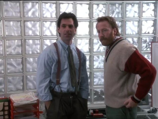
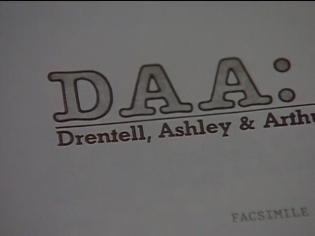
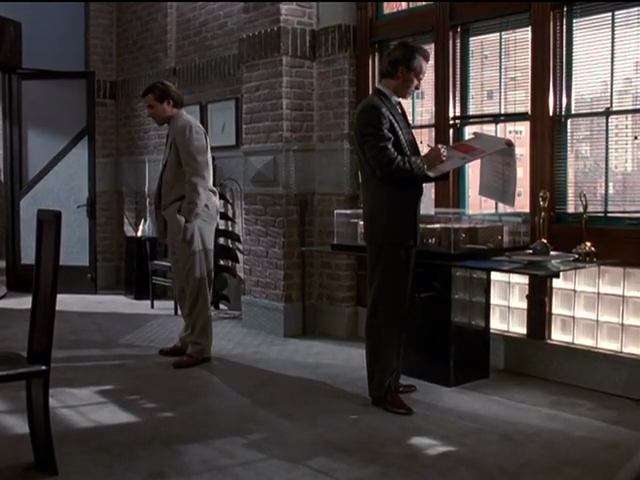
At the outset, Michael and Elliot’s agency, the Michael and Elliot Company, uses curved glass-brick walls. That Company goes tits-up, as it had to for dramatic purposes, and this Chiat/Day-manqué pair is forced to become wagies at a Doyle Dayne Bernbach or DDB manqué, DAA. Here glass brick barely begins to scratch the literal and figurative surface.
Style characteristics of an echt-’80s office interior
The design language can be summarized as surface entertainment.
Ostensible opponent colours, canonically orange and teal, combined, with enough standoff between them to give a feeling of contrast, not clashing (and not as a déclassé trope of colour-tuned digital cinema, as would emerge three decades later)
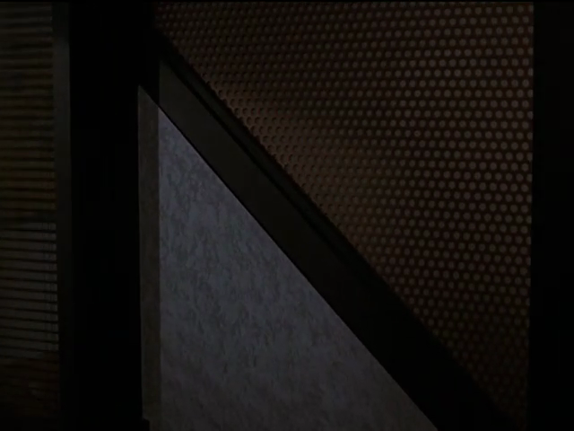
Combination of materials within the same object, viz panelling with mesh. Instantly if subconsciously apprehensible juxtaposition of textures therein
Mouldings connoting thickness, but applied to (orange or patterned) melamine. (That concisely describes the language of Memphis)
Where patterning of surfaces is used, such patterns either evoke natural randomness and defy mathematical description (scattered mottling that recalls veining of marble) or are rigorously mathematical (mezzotints, dot fields)
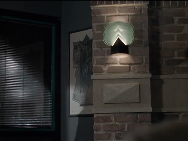
Retention of natural materials like exposed brick on structural walls
Anything decorative that can have a noticeable, pleasingly unexpected shape does, like wall sconces
Everything is designed, including the office kitchen and washrooms
(Cf. “A Spy Guide to Postmodern Everything.”)
Obviously we’ll be needing proof.
-
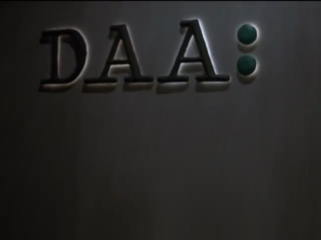
First of all, in a significant lapse, the show cannot decide how DAA’s logo(type) should be (type)set. Low-effort Courier, as seen on the office wall, or distressed ITC American Typewriter, as visible on letterhead exactly once?
-
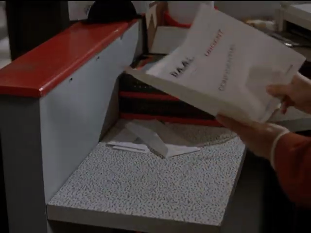
We do get a glimpse into the now-forgotten design mechanism of paste-up, very much poorly explicated in Graphic Means.

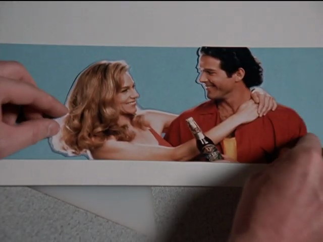
Those are of course comps, not finished layouts.
-
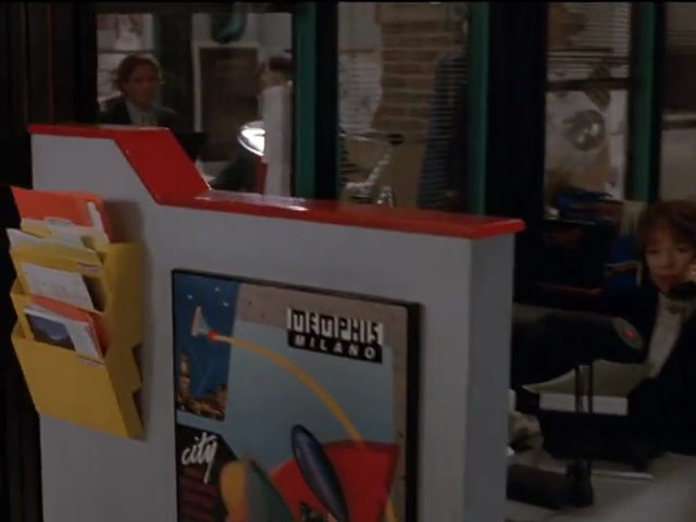
Second, yes, they have one piece of Memphis-manqué furniture.
-
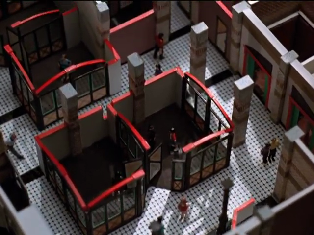
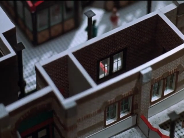
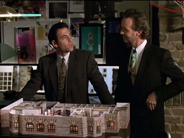
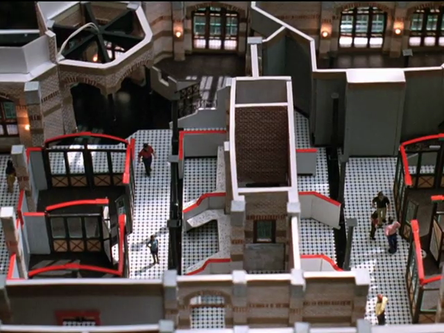
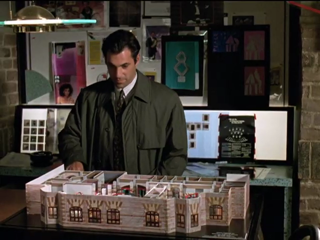
Company founder Duncan Arthur (one of the As in “DAA”) comes back to haunt the place just after Miles Drentell unearths a maquette or diorama of the selfsame office. (Where is this precious and irreplaceable prop now?)
-
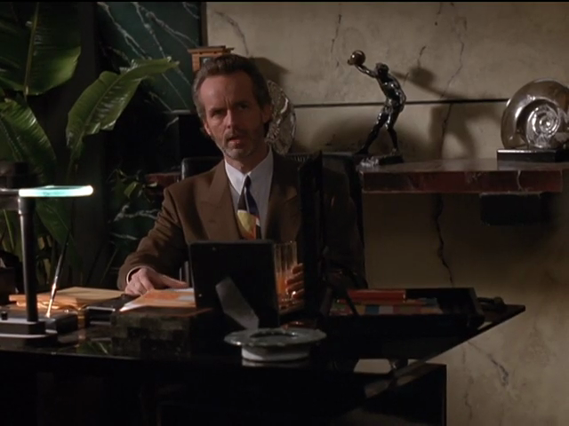
The heavens and the netherworld have their own design languages, comprising exposed brick, panelling, and sconces.
Elsewhere:
In harsh light of day
Here in the 21st century, Ken Olin is a gargoylish shitlib of Rosie O’Donnell dimensions, while Timothy Busfield, having never acquitted himself well on talk shows, surprises no one as an oft-accused sex pest. He’s lost a shocking degree of pigmentation even by the norms of the aged ginger. (Boris Becker looks like Rutger Hauer now, par exemple.)
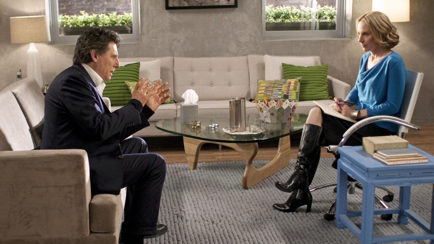
Runner-up office environment
If you need “deadly serious,” hire a comedian. Or, with In Treatment (Season 3), a comedienne, Amy Ryan. I demand to live here, too.
Except Saabs were never Jewish
“Thirtysomething was like a Saab – an intelligent, sensitive, worldly creation for intelligent, sensitive, worldly people.”
Posted: 2026.04.23 ¶ Updated: 2026.05.05