
 [The cover of Very] was a packaging concept (starting in 1993). It was conceived really as a presentation strategy, because when I worked it out, it was a lot to do with being more than just [downscale] from a 12″ traditional record. Trying to get the CD to escape the photograph archetype.
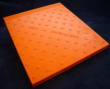
Sort of reflect a new time of some sort. Was no working title at that point either. One idea was one soft object (as on Very Relentless), another hard, so producing it is a way or to create another object. Like perfume in a bottle as an identifiable pack as opposed to an identifiable image inside a pack. By doing that, it becomes a sort of a tile. Intent was to use as a big promotional wall. The package itself was a message in a way. Wanted a diamond shape on the wall.
Also reoriented on diagonal unlike other left-to-right CD cases. Turns square into diamond. Started as magenta. PSB in brought Mark Farrow, a graphic designer. EMI had been happy with the idea at first (compatible with automatic packing, tooling, etc.). Is polystyrene. Director David Fielding was the basis of the colours.
Flat little studs. And to reassure myself from any decision I make in the meaning and the way the meaning connects to other areas. Both colours were ambiguously unrelated to a Lego brick; Lego never produced orange or magenta. Orange is the colour of health – orange juice, vitamin C. And it’s a warning for hazardous chemicals in U.K.
As opposed to the sensory deprivation with a typical CD cover, it stops being just a technologic image as bits appearing behind a screen. It is a real thing.
This is where it all broke down. Would have done the same for cassette, which is just graphics. Was internationally acceptable because it wasn’t an image on the cover. Proved that it didn’t need to be flat during manufacturing. Big names can design packaging as a product in the future. It would be putting something into the record business and into a market that had become very traditional, very conventional, very reactionary, really. Tooling costs were too high to put a legend on the spine. Wanted injection-moulding process in videos, even.
Two months to bring it to a presentation to marketing people at EMI; whole process took six months.
Consults with Swatch with packaging and stores. He designed the Irony packages. They injection-mould stainless steel, hence new process to make the cases.