Is TTC signage in
“a state of good repair”?
by Joe Clark
- Arrow keys, spacebar, Return, or mouse click moves from slide to slide
- Hover over the lower right corner for a menu
- Press t to read a simple outline view
- Want a hardcopy? Just print as normal from your browser
V1.0 ¶ 2007.01.31
← Back to TTC signage page
Special note to Tufte ideologues
This is a slideshow of actual slides – that is, photographs – with a few words at the beginning of each. I know PowerPoint corrupts absolutely, as I have read Eddie Tufte on the topic and agree with him. However, this is not an inappropriate use of the slideshow format and we are not reducing the information flow to a trickle compared to other methods. This is the best method.
Designers long ago began pointing out that the TTC uses a jumble of typefaces, but even a casual visitor will notice indications that signage in the TTC has recently slipped to seriously dysfunctional levels. In some stations you come upon hand-lettered signs pasted on pillars by TTC employees: Obviously they’ve been hounded for directions by baffled riders, have given up waiting for assistance from the signmakers at head office and have taken matters into their own hands. Their sloppy signage makes the whole system look seedy, like a store that’s about to go bankrupt.
That isn’t an original quote from 2007. It’s from Toronto Life in November 1994.†
Things couldn’t still be that bad 13 years later, could they?
† “Can’t you read the signs? Wayfinding, the art of telling people where to go, is failing miserably in Maze City,” Robert “Wedgie” Fulford, Toronto Life, November 1994, pp. 45–48.
What’s the problem?
- Signage is one of the many things the TTC has neglected
- We have a treasure in our midst in the form of the unique font used on many subway-station walls. But all the other signs have been built up piecemeal
- Taken together, not only do the signs not match, they don’t communicate
Aren’t the newer signs better?
- The TTC commissioned, installed, and tested a new signage system in 1994, which was then ignored completely
- To coincide with the Sheppard subway, TTC staff cooked up another new signage “design.” It looks like a hazy memory of New York’s subway signage, designed way back in 1966
- Copying New York is a Toronto cliché, but it’s even worse here. In the 40 years since Massimo Vignelli designed the New York signage, we’ve learned a lot more and our fonts have improved
- The Sheppard-style signs look fine to an untrained eye, but that’s the only kind of eye they work for. If you’re visually impaired or if the sign is illuminated, they’re hard to read
Are signs really that big a deal?
- Not yet, they aren’t. While the TTC has had several serious and even fatal accidents, we haven’t had happen to us what happened to Düsseldorf airport in 1997 – a fire in which people died because they couldn’t find the exits
- Day to day, the mishmash of signs tells riders that the TTC doesn’t think signage is important. It says shabbiness is OK – and that the TTC doesn’t care
Fonts are not decoration
-
Typefaces are not a way to make words look pretty. Fonts have performance characteristics. Some typefaces work better than others for certain uses. And you can prove that by testing with readers
-
The TTC uses too many fonts (usually fonts that came free with Windows software) and ignores the fact that typefaces do things and are not merely decorative
(For further reading, look at an investigation [PDF] my business partner and I did for GO Transit.)
If it doesn’t run on wheels, it must be a frill
- It seems as though the TTC thinks it is impossible to do signage well – that the best we can manage is doing signage well enough
- “State of good repair” works well as a slogan, but it has to apply to more than just rolling stock
- The attitude is “I can read it, so it must be OK.” We aren’t designing signage for you
The good news first
The old subway signs, including the name of most stations and many directional signs in most stations, are beautiful, apparently functional, and a unique treasure. And they’ve been durable, lasting decades of daily use. So let’s not touch those.
Now the bad news.
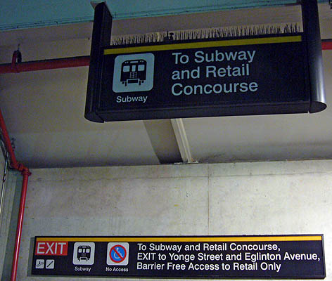
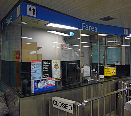
There are too many signs
Not only are there too many signs in subway stations, sometimes overlapping or conflicting –
– a typical collector’s booth has more than a dozen signs (as high as 17 in some cases).
Quick: Which sign do you read first? (Don’t you just ignore all of them?)
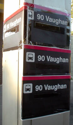
Signs are haphazard
Signs are posted pretty much at random, and there’s no such thing as too many copies of the same sign.
Nothing matches
Let’s take it as a given that the old mid-century signs will stay. They won’t match any newer signs. But that means there should really be two kinds of signs in the system – one old design and one new design.
In fact, there are probably a dozen kinds of signage in the system.
Recent and brand-new signs don’t match
The system has been built up piecemeal over time, and never under informed supervision. So you get subway stations that don’t even use the old mid-century font, then also post a TTC ad, then also install garbage cans, all using different fonts and formats.
Even adjacent signs don’t match.
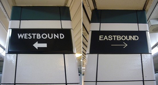
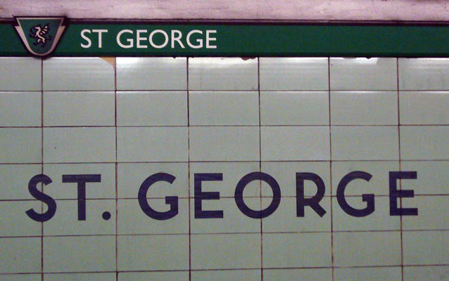
Fonts don’t match, either
One variation of this problem is typefaces. The TTC cannot match the fonts, or even the arrows, on adjacent subway pillars –
– or on two signs on opposite sides of the same platform.
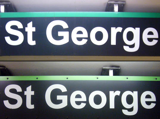
(This isn’t even the right font according to the TTC “sign manual.” And they couldn’t even get that incorrect font right – look at the g in the upper “George.”)
Attempted colour-coding doesn’t work
Some signs have tiny lines in the colours of each subway branch (yellow, green, blue, and, for some reason, pink). The lines are so subtle they look like decoration or dividers of some kind.
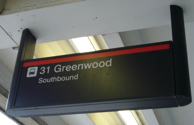
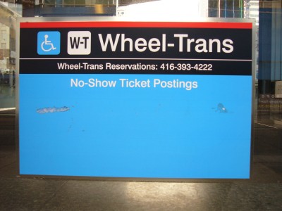
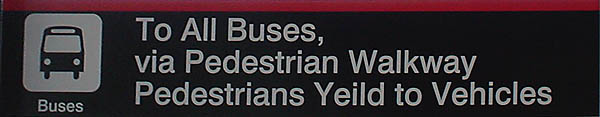
Bus and Wheel-Trans signs seem to be using colour-coding, too
Does this sign mean the bus is on the red subway line?
Does this sign tell us that Wheel-Trans stops are on the blue subway line?
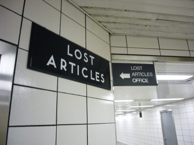
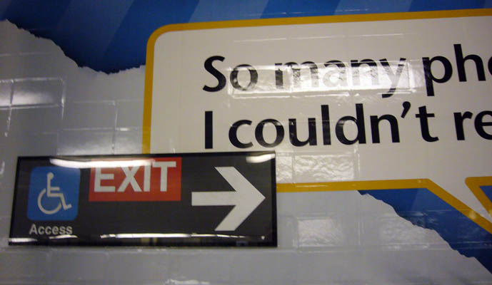
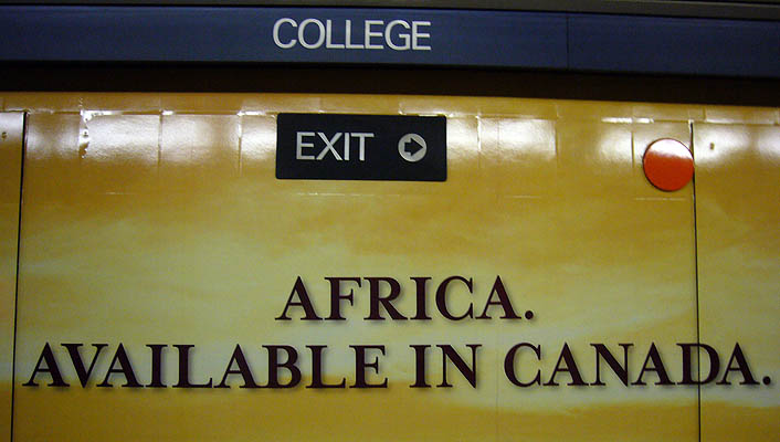
You can’t tell what’s a sign and what’s an ad
Intrusive advertising competes with signage –
– or overwhelms signage to the point where you can barely notice the sign.
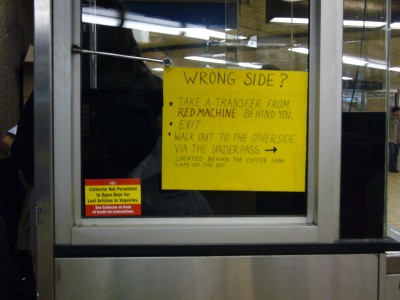
There are too many handmade signs
If TTC staff have to scribble out a sign on a piece of cardboard, then the whole system isn’t working.
Would you really trust a handwritten sign?
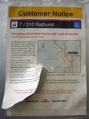
Signs are falling apart
Signs, especially handmade ones, get torn or damaged, but stay in place.
(The route diversion on this sign ended in November 2006. Many copies of that sign were still in place two months later.)
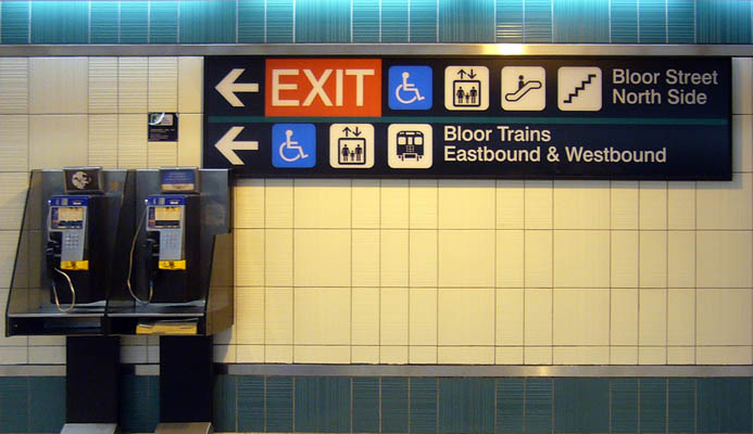
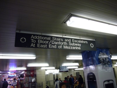
Signs are too wordy and cluttered
There is no effort to reduce the words on a sign to a bare minimum. That’s true for both temporary and permanent signs.
Quick: What’s a mezzanine, and where is its east end?
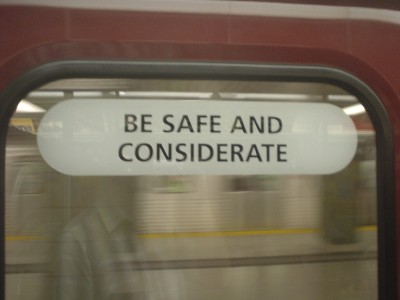
Signs are patronizing
Signs attached to every door on some trains tell us to be safe and considerate. And they use yet another font to tell us that.
These signs block many people’s view through the doors. Again: There’s no such thing as too many signs.
Signs are misspelled
Occasionally, signs cannot even get the spelling right.
(This sign was eventually corrected.)
The TTC ignored a redesign in 1994
In the early ’90s, the TTC hired renowned graphic designer Paul Arthur (1924–2001) to develop a new signage system. A prototype was installed at St. George station.
TTC’s own testing showed that the new signs worked at least as well as the old ones for most riders. They worked better for riders with visual impairments, those who didn’t speak English well, and those with low literacy.
That new system, developed at a reported cost of $250,000, was simply ignored.
Oh, except that the TTC could not even get its act together enough to remove the prototype signs from St. George. They’re still there 14 years later.
New signs don’t work
For the Sheppard subway, TTC’s nondesigners threw together a “standard” for new signage. It looks just fine, but actually it isn’t. It’s derivative and it doesn’t perform well.
The new signs copy New York’s
Surely by coincidence, the Sheppard signs look like a copy of the New York subway signage, or the kind of copy that would result if you only had a blurry photograph to start with.
(From the eponymous Leila and Massimo Vignelli: Design Is One, 2004)
New York’s subway signage was designed by Massimo Vignelli in 1966, a time when much less was known about reading, accessibility, or signage fonts.
New York’s signage has its own problems
- New York subway riders’ groups have published two assessments of flaws in subway signage in the last ten years. New York’s system isn’t a model just because it’s in New York
- The New York transit authority later “improved” the design by changing fonts from Akzidenz Grotesk to Helvetica. And that’s what the TTC copied 40 years later
- Except that the TTC doesn’t even use the real Helvetica font, instead specifying a clone called Swiss 721
For critiques of New York subways, look at “Troubling Signs” (PDF) by PCAC.
And the TTC “signage manual” instructs staff to send font files to whatever printing company is being used, a clear case of copyright infringement.
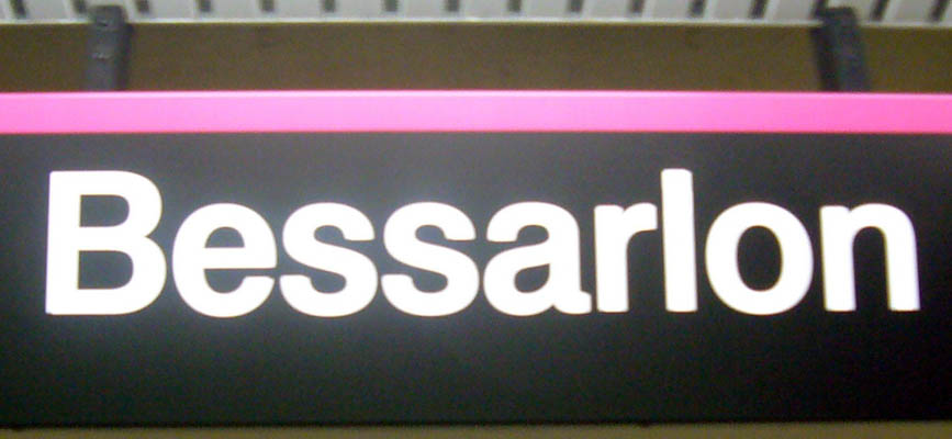
Fonts on new signs have confusable letter shapes
Helvetica, Swiss 721, and Akzidenz are all grotesk sansserifs in which the letters are made up of almost geometric shapes – perfectly straight lines with right-angle corners, near-perfect circles, and regular angles of diagonals.
As such, all the classic confusable letters really are confusable, including Ili1, eas, and numerals.
(Did you notice the preceding sign said Bessarlon, not Bessarion? Letters like i and l are confusable in that font, especially when illuminated or backlit.)
Letters are spaced too close together
Because TTC staff are nondesigners who don’t understand signage and readability, there are no special instructions on spacing out the letters on signs. That means they glow together (halate), particularly when illuminated.
If you were caught in a subway fire, would you want to run toward an illegible blob of glowing letters?
New York subway lines are not like Toronto’s
Vignelli’s design for the New York subway relies on subdividing each sign into halves, quarters, and eighths, which works well for New York’s many subway lines, named with a single letter or number each.
It doesn’t work at all with a system whose lines are almost never named and use up to three words per name (Yonge-University-Spadina).
It also doesn’t work with station names that range from three characters (Bay) to 18 (Scarborough Centre).
The new signs were never tested
Paul Arthur’s sign prototype was tested with subway users. The Sheppard-style signs weren’t.
Conclusion: TTC signage is not in a “state of good repair”
TTC signage was thrown together piecemeal by nonexperts over a period of 50 years. In a single case, those nonexperts did a good job (the original mid-century signage). In other cases, the results have been terrible.
The TTC has shown an antipathy toward any kind of good design. Perhaps the male-dominated culture at the TTC considers “design” the same as “decoration” and thinks it is too girly for a manly transit system. Whatever the reason, to ignore design means that the TTC wasted a reported $250,000 on a well-researched, well-tested signage system that was never implemented. Nor did anyone ever get around to removing those prototype signs.
TTC engineers need to accept that signage is not an add-on and requires expert guidance.
How do we fix it?
An inventory of TTC signage would be a good place to start. What kinds of signs are there, in what numbers?
Then we need an evaluation of what other cities have done in the last 10 years with transit signage. Nothing from the distant past, please, like New York City; it just isn’t applicable.
Ultimately we’ll need a completely new set of signs to replace everything that isn’t the original mid-century signage. More importantly, we’ll need training of staff so that the system will actually be maintained for years to come. A typical design firm won’t be able to train in-house staff, nor would they want to pass up years of steady income from actually producing the signs.
How do we pay for it?
Most of the following proposals do not involve any kind of budget increase, merely a reallocation of existing revenue (sometimes foregone revenue).
- Reduce the in-house advertising budget by half. TTC’s own advertisements are atrocities that are reviled by the press and knowledgeable designers. The TTC doesn’t have to advertise itself that much. Take half that budget and put it toward signage
- Divert a portion of revenues from advertising forms that compete with signage. Video signage and vehicle and station wraps compete with wayfinding. They distract and confuse riders, they cheapen the ethics of the entire system, and, moreover, they don’t even bring in that much money (a few million a year). Diverting even 10% to 20% of revenue from those advertising forms provides a permanent budget for signage development, staff training, and maintenance
- Piggyback development on subway renovations. When rebuilding a subway station (e.g., Victoria Park), use the signage budget, possibly with a slight increase, to fund development of better signage for the whole system
Cancel the Toronto Community Foundation misadventures
Nobody but the Toronto Community Foundation and a few dowagers in mink stoles really wants the Museum station makeover. It’s a waste of money, and signage will take a hit in any such renovation. (Quick: What kind of signs match an Egyptian sarcophagus? They would have to “match,” wouldn’t they?)
If the TTC and the Foundation are intent on wasting that much money, up the budget and use that increase to fund and implement signage improvements across the system.
Keep watching for updates
That’s all for this slideshow. Keep watching the TTC signage page for other documents, including a printable PDF of the booklet I gave the TTC after my presentation on 2007.01.31.
Copyright © Joe Clark 2007. All rights reserved.