The TTC, a billion-dollar enterprise, wants us to take seriously the following rendering of the “modernization” of Pape station.
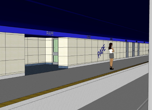
Note the giant mausoleum-style slabs, the bright blue strapline, the fake fake Helvetica, and – best of all – the Honest Ed’s–style PAPE station designation plastered at a 45° angle in that same bright blue. (TTC HERITAGE – NOW 50% OFF!) Again: We’re expected to take this seriously.
Like previous renderings of Pape, these renderings appear to have been drawn by a contractor, Giffels, using Google SketchUp – a freebie online tool that proves the old saw that drawing with a mouse is like drawing with a bar of soap. Someday Giffels will learn of a wonderful new invention, the graphics tablet, and of another one, AutoCAD. Given that the Pape “modernization” is a $15 million to $18 million project, Giffels can afford both of those.
Now contrast what design students at George Brown College managed to create for a role-playing game, TorontoConflict:
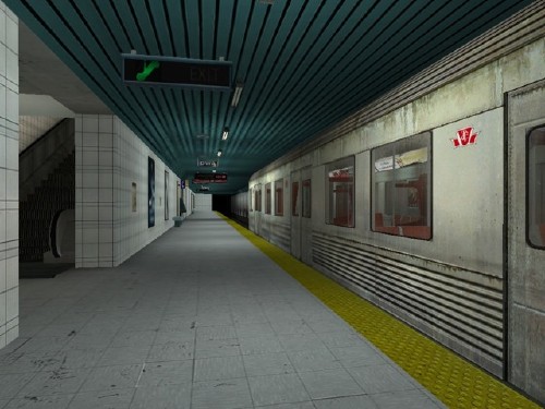
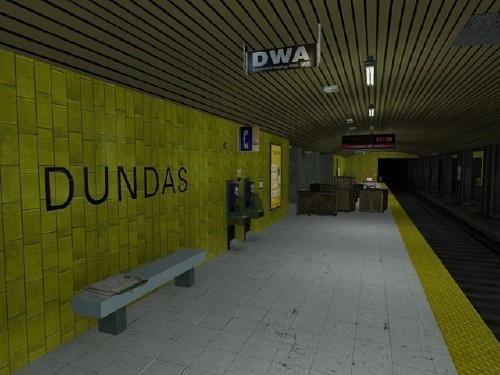
These photorealistic renderings were created on a budget approaching zero. There’s even dirt in believable places.
We already know that the trained archæologist who runs the TTC has an undeclared program of destroying the heritage of Toronto subway stations. (He’ll deny it until the day the last tile is turned to fake stone.) We also know that TTC Commissioners don’t give a damn. But TTC staff could refrain from adding insult to injury by issuing station renderings that look like the doodlings of an art student who was forced to work with half a box of dull crayons.