At the meeting of the Toronto Preservation Board on 2007.11.09 (where the Board would later vote to receive a report on designating many subway stations as heritage properties), Brian O’Neill, a TTC architect, said he agreed with me that the “kerning” of type in the station identifications on subway walls was too tight. He meant letterspacing or tracking and he was referring to the Sheppard line, whose station names, from all appearances, were just typed out by some intern using CorelDraw and they printed exactly as they turned out, with no adjustment. Letters are jammed tightly together, which actually does influence readability from a distance. (If I understand the phenomenon correctly, it involves crowding on the retina, where viewed letters compete for available retinal cells.)
This is the kind of thing that amateurs with no respect for TTC’s typographic history would do. The problem is they all work at the TTC. Or actually, not all: Some of them work for starchitects. Let’s have a look at the latest phase of the rape of Museum station:
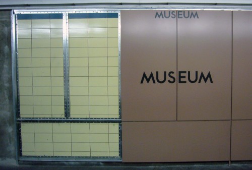
I don’t remember clay-brown walls (like ancient pottery?) in any of the renderings created by Diamond & Schmitt Architects. Here we’ve got black-on-brown type that’s spaced as close together as is reasonably possible from the wrong software carelessly used. The US combination is a problem. So is the huge visible gap between S and E.
Just a quick question here: Had TTC used the correct letterspacing on these boards, wouldn’t the gap between panels have been less of a problem? Shouldn’t at least the strapline station name be white? (Oh, but there isn’t a strapline anymore in the new design.)
What would the “correct” letterspacing have been? Looking only at usage of the original TTC font and not Univers or Helvetica:
Hence there were a range of options, all of them ignored. TTC and its starchitect failed to learn from the system’s history and even from its recent history. Mere weeks after TTC staff admitted they screwed up with the Sheppard line, they made the same mistake all over again.
I saw this and I snapped. Why have I been so nice to them all along? (You probably think I haven’t been.) Can’t these people do anything right? What is the answer to that question?
I’m sure nobody will particularly care about this topic. Nor will anyone admit they made a mistake. In fact, if it ever came up, I’d expect a full-on assault that I was wrong and they weren’t. (Try that if you like. I’m the one who took measurements.)
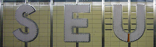
These regular-sized station names are clearly uninteresting to the starchitect and TTC. (Again: Probably farmed out to an intern.) What they’re really hot for are the Las Vegas–style giant letters they’re bolting onto the walls.
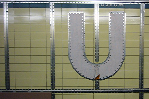
They’re going to spell MUSEUM and we’re supposed to be impressed. (What is this, Honest Ed’s? DON’T JUST STAND THERE, BUY SOMETHING!) I expect the spacing to be monumentally wrong. In fact, based on the renderings, I expect the starchitect to have treated the TTC typeface like a typewriter font, with mathematically identical spacing between centrelines of letters. In fact, the centrelines are clearly being used for that purpose.
Do you still think that spending millions on tarting up an intact subway station, without even making it wheelchair-accessible, was a good idea?