![[Joe Clark: Design] Joe Clark: Design](/design.gif)
![[Joe Clark: Design] Joe Clark: Design](/design.gif)
Illustrations adapted from the printed version.
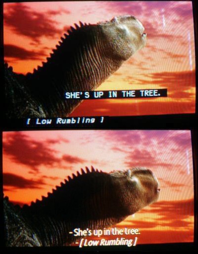
In this image pair from Disney’s Dinosaur (captioned by Captions, Inc.), the differences between Line 21 closed captioning (large white-on-black characters; specific caption positioning; primarily uppercase) and DVD subpictures (in this unusual case, yellow characters, with, as is normal, no background; centre-bottom positioning; mixed case) are readily apparent. It’s also apparent that the DVD subpictures and Line 21 captions were created from the same files, replicating the same errors, like spaces within brackets.
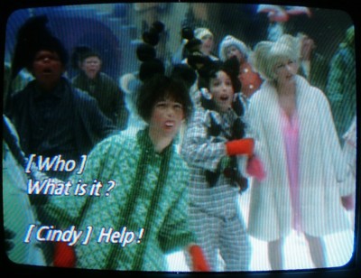
In another of its many styles, Captions, Inc. defaults to flush-left typesetting, which indicates a speaker at screen left. (Duh!) Spaces inside brackets, here as in Line 21 captioning fonts, make the brackets look like the word I. It is quite credible to read these captions as “I Who I What is it?” and “I Cindy I Help!” Note also the vestigial spaces before question mark and exclamation point. (From The Grinch.)
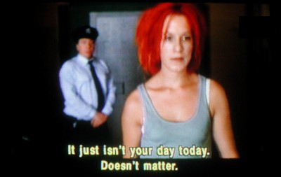
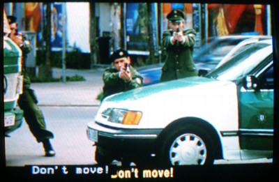
It’s fun to watch a DVD with closed captions and subpicture-based subtitles both active at once. Who’s doing the talking in this case? (The guard, as it turns out.) Why should you put up with any such confusion?
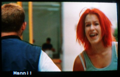
Here Lola is yelling “Manni!” even though the word sits on top of Manni; for any other captioner on earth, that would mean Manni is doing the talking. And note the lack of subtitle: It would patronize the audience to render an uttered proper name in type. (The movie nonetheless does it on lots of other occasions. Consistency is not always a hobgoblin subtitlers have to contend with.)
When do captions and subtitles appear in the same place? When do their texts actually differ? Here, the subtitling convention places all words at bottom centre, while the captioning convention locates everything flush left. Neither convention works. The fact that positioning carries meaning is ignored here; it isn’t enough to tell us the mere text of what is being said.
Updated 2003.08.17
You were here: fawny.org → Design → Print → Reading the tube → Illustrations
See also: Media access ¶ “Eye-gouging accessibility” ¶ Design ¶ Autonominal Fonts ¶ Typecasting