
The Commission solicited comments, albeit indirectly and without a real public process, on the work of a technical working group (PDF) to study digital closed captioning. I am providing the following comments.
If the remit of the working group is to “[i]dentify current and anticipated problems with the transmission and display of digital closed captions and video description,” then the subject is much broader than getting lines of captions to stop overlapping onscreen.
Captions are what is displayed; they are defined by what you see. We cannot separate captions from their display. Captions are something you look at and read. Hence the ten caption-related issues listed in the announcement must be considered suggestive, not exhaustive.
It seems the unstated goal of the working group is to ensure that captions are transmitted perfectly so that they display exactly as the captioner intended. In other words, bad captioners with half-baked practices and little or no quality control want their captions presented precisely the way they were set up at the caption house.
A lousy movie presented in 1080p HDTV with captioning, full 5.1 sound, and audio description is still a lousy movie. A panda in a wedding dress is still a bear, not a bride. Well-transmitted bad captioning is still bad captioning.
Nobody seriously wants to solve this central problem – caption quality.
The Open & Closed Project, a research project that would use evidence and research to develop and test standards for captioning and audio description, remains unfunded.
The FCC hasn’t quite figured out that it is perfectly possible to establish what good captioning is and regulate it.
Captioners are engaged in a full-throttle race to the bottom. WGBH and NCI fired captioners or closed offices; CaptionMax converted to an all-bottom-centred format of glorified subtitling. All captioners adamantly insist their captions are better than everybody else’s, an obvious tautology.
Hence, the working group can be expected to do little more than to ensure that badly-carried-out captioning is transmitted with perfect fidelity to unsuspecting viewers, who are, as always, powerless to do anything about it.
I was pleased to see that cable and satellite carriers and a few hardware manufacturers are represented on the working group. One half of the duopoly that manufactures digital set-top boxes, Motorola, is on the working group; what about the other half, Cisco (né Scientific Atlanta)?
Where are the manufacturers of commodity digital video recorders and the manufacturer of the only DVR brand that is actually usable, TiVo?
I find it unreassuring that the list of industry representatives begins, yet again, with WGBH – a former pioneer, innovator, and standard-bearer, now an enthusiastic competitor in the race to the bottom after closing one of its captioning offices (the original one, in Boston).
WGBH aims to influence or control every aspect of technical decision-making in certain fields, including captioning. If WGBH can’t write every spec, it gives the impression of at least wanting a veto over every one. People seem happy to go along with that, acting as though WGBH were some kind of elder statesman.
WGBH’s weekly newsletter for 2009.05.15 essentially takes credit for this working group, declaring that WGBH “has been a driving force behind this initiative.”
The truth is WGBH is just another commodity captioning service provider, though it remains the highest-quality supplier of audio description (and bills accordingly). Please ensure that WGBH carries no more weight than any other committee member and is limited to one vote.
More substantively, the captioners on the roster represent the same companies that have dominated the industry for years, if not decades, despite their often or occasionally atrocious work. I don’t see smaller captioners like JR Media Services, Aberdeen Captioning, and Captions, Inc. on the list; nor giant captioners the industry pretends it has never heard of, like SDI or Red Bee; nor Canadian captioners that caption shows that air in the U.S., like Mijo or Line 21 Media Services; nor any real-time-captioning shops.
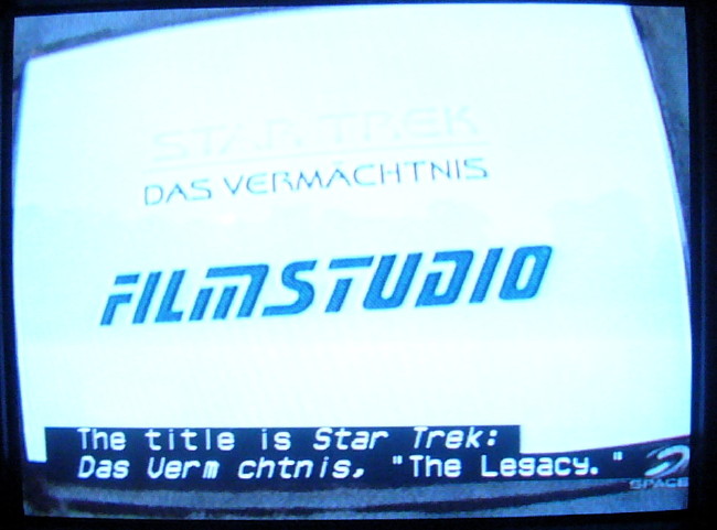
All the captioners listed save for WGBH use nothing but capital letters in their day-to-day TV captioning operations, a practice discredited for decades. All captioners on the list use nothing but upper case for real-time work. It is hard to take seriously any professed commitment they might make to quality of caption display.
To respond to some of the items on the issues list:
Concern that HDMI cables may not pass through the captions: It isn’t a “concern,” it’s a fact, at least for 608 captioning, which HDMI cables cannot and will never pass through. There is no workaround; it can’t be fixed. The working group needs to definitively determine if pure 708 captioning and mixed 608/708 streams survive transmission through HDMI cables.
VPD or station equipment cannot properly deliver up-converted (analog to digital) captions: NAB has previously recommended (PDF) use of the term “translated” (or “derived”) rather than “upconverted” (which isn’t hyphenated).
Highly difficult user interfaces or directions causing users to conclude that captions are unavailable on their TV sets: Analogue captioning is decoded by your TV. Digital captioning is decoded by whatever tunes your stations. This distinction makes sense technically and is easy to explain to people who are comfortable with technology. But it hasn’t been explained at all in the popular literature, and there will always be people uncomfortable with technology who still won’t understand it.
Audio description, misnamed as video description by the FCC, is clearly an afterthought in these proceedings. Audio description cannot be “displayed.”
If there is barely any described programming on DTV channels, it is because:
There is barely any described programming in the United States at all. The country lags far behind Canada and the United Kingdom in this regard.
A whole new constellation of settings, quite separate from the settings needed to make DTV captioning work, is needed to make DTV description work. Few, if any, network and head-end operators understand those settings, which may never actually have been published in a usable (i.e., Googlable) place.
Turning description on and off invariably requires the use of onscreen menu systems that blind people can’t see. At least with analogue description you could just keep pressing an Audio or SAP button until the right soundtrack took over; that becomes functionally impossible with digital TV sets.
These problems are intractable and, in the case of the last one, simply will not be solved for most consumers. Few hardware manufacturers, with the notable exceptions of LG and Panasonic, know this is a problem and care. The duopoly manufacturers of set-top boxes don’t and don’t, and are known to be hostile even to requests from their large cable-company customers, let alone end users.
Seemingly the only thing your working group can do here is to publish, in valid, semantic HTML on easily-found Web pages, the right settings to enable captioning and description at broadcasting plants and everywhere down the line to the viewer.
Given the remit to “[i]dentify current and anticipated problems with the transmission and display of digital closed captions and video description,” I would suggest adding the following issues to the discussion. The working group is not in a position to rectify any of these issues; it cannot solve these problems. But I want them publicly acknowledged.
Character encoding of captioning has always been needlessly confused and has never been specified correctly. Character encoding means the assignment of numbers to the visible and invisible letters, numbers, punctuation, and symbols that make up captions.
The problems are as follows.
There are four versions of captioning character encoding:
Original TeleCaption decoder (circa 1979)
TeleCaption II decoder (circa 1984)
FCC/CEA-608 specification (circa 1990)
CEA-708 specification (circa 2006)
There is no way to actually specify the character encoding of a caption stream. There is no metadata or any other mechanism. The decoder has to guess.
Some shows live forever and it is quite possible to watch programming with captions presented in any of the first three character encodings. I see no evidence that native 708 captions, created in isolation without accompanying 608 captions, actually exist in the wild, hence I suspect there are no actual TV shows on the air using nothing but 708 character encoding.
The situation might not be so bad if each character encoding were truly distinct, but in fact the first three encodings swapped characters at two positions: ¼ became ® and ¾ became ™. A couple of character positions were added, including transparent space.
The character you see depends on how your decoder decides to interpret that numerical position. For shows captioned in yesteryear but viewed today, the displayed character will probably be the wrong one. The only saving grace is the fact the characters in question are rare; that doesn’t mean it’s OK to get them wrong.
708 commits two cardinal sins at once: It sets up its own new set of character encodings and does not follow any published Unicode encoding. For displayable characters, 708 includes:
A version of the 608 character set (G0 code set, falsely billed as equivalent to US-ASCII with one substitution)
ISO 8859-1 characters (G1 code set)
26 miscellaneous characters (G2 code set) chosen apparently at random from various Unicode blocks
A final code set, G3, containing nothing but a captioning symbol
Hence 708 character encoding is actually four kinds of character encoding at once, with additional room for unstandardized expansion. Apart from just not bothering to specify a character encoding, there is no worse imaginable outcome; the committee could not have done a worse job.
Because all the listed character encodings were developed by Americans without linguistics, localization, or encoding knowledge, all encodings are unreliable and insufficient to encode languages other than English, despite overconfident assurances to the contrary. Even English has to be fudged, with quotation-mark, hyphen, and dash characters particularly susceptible to replacement by typewriter-like substitutes.
With the Commission’s requirement that most nonexempt Spanish-language programming be captioned, the issues are serious.
Just the task of encoding and displaying an inverted exclamation mark seems beyond the capabilities of captioners working on many Spanish-language shows I’ve seen. (¡ is not ! or i.)
Captioners not only continue to believe that all-capitals usage is correct, they further insist that capital letters do not require accents, a false assertion everywhere, even in national French. If accented capitals are “difficult” to encode, captioners will use that as an excuse not to set them. Or accented capitals could be available in roman but not italic fonts.
Captioning software occasionally gets character encoding wrong. A persistent example is Softel Swift, the software used by every captioner on your working group. Swift simply misencodes the apostrophe character, using a (legal but unnecessary) double-character encoding method that causes a visible stutter in scrollup captioning. Softel’s British engineers do not understand the problem and insist their way is correct; it isn’t.
Some captioning software permits caption writers to include characters that can’t be displayed on certain decoders, as with ä in the example below, or allows them to be encoded incompatibly (as with asterisk, not shown).
Analogue captioning gives you any font you want as long as it’s the one in your TV set. HDTV captioning allegedly improves caption typography, but not in actual practice.
As described on the Open & Closed Project’s companion site Screenfont.CA, the 708 captioning specification gets typography quite wrong.
708 ostensibly requires eight caption font families. The specification lists eyebrow-raising sample typefaces for each category:
0: “Default (undefined),” hence not really a font style1: Monospaced serif (e.g., Courier, an unsuitable font for captioning)2: Proportional serif (e.g., Times New Roman, also unsuitable)3: Monospaced sansserif (e.g., Helvetica Monospaced [sic])4: Proportional sansserif (e.g., Arial or Swiss [again sic])5: Casual (“similar to Dom and Impress”)6: Cursive (“similar to Coronet and Marigold”)7: Small capitals (“similar to Engravers Gothic”), but not actually a font; small caps can be applied to any typeface category, including cursive (Cf. Zapf Chancery)Hence 708 actually specifies 6½ fonts, not eight. Three are cause for especial concern.
The undefined category is the default font of the system; far from being the least important (the font of last resort), it’s the most important.
Cursive typefaces from print typography come in numerous families and are, with rare exceptions, an unmitigated disaster for continuous reading anywhere, very much onscreen.
It’s unclear what this means; it’s a difficult concept even for trained typographers.
All the foregoing font styles are optional in decoders. You might be stuck with one font after all.
In practice, most DTV receivers attempt to provide “eight” fonts. But in almost every case, they’re off-the-shelf print fonts that have no demonstrable value for onscreen reading, or they’re screenfonts made for personal computers.
In no case have HDTV caption fonts been user-tested, including testing with low-vision viewers. One caption font that claimed to have been tested, Tiresias Screenfont, used testing methods that bordered on scientific fraud.
As there is no such thing, in practice, as native 708 captioning, any captioning you view on your HDTV receiver is analogue captioning with a new coat of paint. Analogue captions assume monospaced fonts and don’t line up right when proportional fonts are used – a problem not only for HDTV but for software decoders on computers and handheld devices.
True HDTV programming tends to be broadcast in the 16:9 aspect ratio (widescreen). Analogue programming, even if letterboxed, uses the 4:3 aspect ratio (fullscreen).
The same show transmitted in analogue and HDTV signals will typically use fullscreen presentation for analogue and widescreen for HD. But there’s only one set of captions – the fullscreen set – and they’re in the wrong places on widescreen video. Actors at screen left and right are much farther to the left or right on widescreen and their captions are too far inboard. Centred lines use an axis that isn’t at screen centre.
Long gone are the days when anyone, even high-end movie studios, felt it was a good investment to pay for different sets of captions for different aspect ratios. Translated analogue captions will continue to be in the wrong places in HDTV for the foreseeable future.
Garbage in, garbage out. Given a new set of toys, caption viewers, like anyone else, will play with them. Not everyone has trouble turning captions on and off and some people have no trouble using the font selections at their disposal. The same people who think condolence letters look great in Comic Sans and that every document they ever write at the office should be written in 10-point Times (“New Roman”) on a seven-inch measure will of course gravitate to the kookiest, wackiest font choices available to them.
Then they’ll play with the available colour choices so captions match characters’ outfits.
They’ll play with opacity settings until captions are illegible, particularly when captioners – 30 years later – still haven’t figured out that captions have to be moved to avoid onscreen type.
Only a CEA committee could solve these problems. I doubt that will ever happen. Even if a committee were formed, actual topic experts would be excluded; what we’d end up with is a new set of mistakes.
Further, I see no expertise on the working group to address these problems. Working-group members appear to have, at most, as much knowledge of typography as those who got us into this predicament.
A wishlist of what we need:
One or more new sets of custom-designed and -tested captioning screenfonts. Screenfont.CA can handle the project, as we know all the type designers in the industry, but the fact remains this costs money. STB manufacturers and others prefer to buy off the shelf and call the problem solved.
Improved default settings and, better still, predefined sets of font, colour, and background that are shown to work well via testing.
Better user outreach, especially to low-vision viewers.
The working group cannot really take any of these steps.
I hope this working group will fully document its work. Normal Web pages, not PDFs, are in order; podcasts or other recordings, with eventual transcription, would be especially helpful.
I hope further the groups will not settle for second best. To restate my original point, the task here is not to ensure perfect transmission of lousy captioning. The task is to improve transmission and display of captioning.
The group also is tasked with improving digital audio description, but I doubt anyone really expects results.
Posted: 2009.05.15
You were here: Homepage → Accessibility; → CRTC filings and other interventions →
Comments on FCC technical working group on digital captioning and description